The signal flying into space is the main message of the Telstra logo. The emblem is a prototype of data transfer, communication, and search for your subscriber. The company shows that it is able to connect with customers over the longest distances.
Telstra: Brand overview
| Founded: | 1 July 1975 |
| Headquarters: | Melbourne, Victoria, Australia |
| Website: | telstra.com.au |
Meaning and History
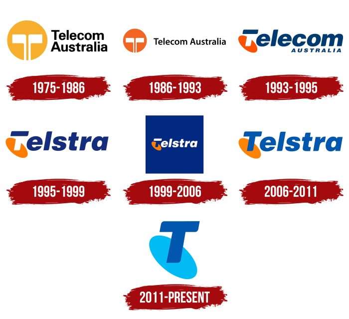
The company has updated its corporate identity many times, but the transformations have always been careful, in some ways even conservative. The designers were not faced with the task of re-acquainting people with the Telstra brand. They only needed to emphasize its characteristic features – something that everyone already knew well. Therefore, logos from different years have a lot in common – particularly the element in the form of a “falling” letter “T.”
What is Telstra?
Its full name is Telstra Corporation Limited. Australia’s largest telecommunications company is active in landline telephony, mobile communications, internet services, and cable TV. It was founded in 1975.
1975 – 1986
Until 1975, only one organization, the Postmaster-General’s Department, was in charge of the domestic telegraph, telephone, and postal services. Then it broke up, and all telecommunication services were transferred to the disposal of Telecom Australia. Designer Pieter Huveneers created an original logo for the company, using a stylized antenna instead of the letter “T.”
The symbol, consisting of two mirrored “clubs,” was placed in an orange circle. On the right was a two-line “Telecom Australia” lettering in black. A light gray rectangle served as a background.
1986 – 1993
In 1986, Telecom obtained a monopoly on the domestic wireless market. In the same year, a small redesign was carried out, after which the background quadrangle disappeared, the circle turned dark orange, and the inscription took only one line.
1993 – 1995
In the early 1990s, the brand became part of the newly formed Australian and Overseas Telecommunications Corporation. At the same time, Telstra Corporation Limited was launched based on the parent company. Despite the name change, the logo used its old version – Telecom Australia.
Developers from FHA Image Design styled the first “T” unusually. They made the vertical stroke invisible, leaving only the horizontal line. Below the letter was an orange oval, which in previous versions was circular. The second word was written at the bottom and in capital letters.
1995 – 1999
The logo’s overall concept was retained to facilitate the transition from Telecom Australia to Telstra Corporation Limited. Only the inscription has changed: after the stylized letter “T,” “elstra” appeared. The oval has taken on a light orange hue.
1999 – 2006
The telecommunications company has greeted the 21st century with a new logo. The designers placed the text in a blue square and made the letters white. This transformation gives the capital “T” a vertical line that was previously invisible.
2006 – 2011
After the redesign, the square disappeared, but the “T” remained. At the same time, all the letters turned blue, as on the 1995-1999 logo.
2011 – today
The Australian telecom operator hired employees from Interbrand to do a small rebranding. Its goal was to unite all communications under one common symbol. Without thinking twice, the designers removed the main part of the inscription and left only the letter “T” – in the form in which it existed since 1993. Also, they repainted the oval in blue and offered six color versions of visual identification. This required 60 specialists, several months of working time, and 6 million dollars.
Telstra: Interesting Facts
Telstra is Australia’s biggest company for phone and internet services. It started in 1901, first handling mail, telegraphs, and phones, and has grown a lot since then.
- Beginnings: It began as the Postmaster-General’s Department, became Telecom Australia in 1975, and was renamed Telstra in 1993.
- Becoming Private: In 1997, the government started selling parts of Telstra to make money and increase competition in the industry.
- Wide Reach: Telstra’s mobile network is huge. It covers most of Australia and serves 99.4% of people.
- Global Work: Telstra isn’t just in Australia. It has a big role in Asia-Pacific and owns a vast network of undersea cables.
- Tech Forward: Telstra is always looking for new tech to use. It was one of the first to offer 5G, showing its keen interest in the future of tech.
- Smart Homes: Telstra is getting into smart home tech, letting people control their home devices, showing how it’s keeping up with tech trends.
- Sports and Culture: Telstra sponsors many sports teams and events, including the popular Australian National Rugby League.
- Customers: It has many customers, offering services to individuals, businesses, and government agencies.
- Innovation: Telstra spends a lot on creating new tech to stay ahead in telecommunications.
Overall, Telstra plays a big role in keeping Australia connected and always looks for new ways to use technology.
Font and Colors
Telstra’s current emblem dates back to the early 1990s. – it was then that the stylized “T” became like the current one. But do not forget about the older versions, where this letter symbolized the antenna. Now everyone sees what they want in T because the changes were supposed to help the company establish a close relationship with customers.
The font for the old “Telstra” lettering was invented by the design studio The Partners. Then the word was reduced to one letter, the outline of which became softer. The developers have cut and rounded the corners, keeping a slight tilt to the right.
For the experiment, the telecommunications company uses six color combinations, but not simultaneously but in turn. The official emblem can be green, dark pink, purple, blue, orange, or blue-green. This is designed to make the brand full of color and meaning to consumers.
FAQ
What is the meaning of Telstra?
The name “Telstra” comes from “Telecom Australia.” “Tel” is from “Telecom,” and “stra” is from “Australia.” This name reflects the company’s origins as Australia’s national telecommunications provider. Originally known as Telecom Australia, the company has grown into a leading provider of telecommunications and technology services in the country. The name change marks the company’s growth and modernization while keeping its roots in the Australian telecommunications industry.
When did Telstra start?
The company began in 1901 with the creation of the Postmaster-General’s Department (PMG), which managed all domestic telephone, telegraph, and postal services in Australia. This marked the start of unified communication services in the country.
In 1946, the Overseas Telecommunications Commission (OTC) was established to handle Australia’s international telecommunications. The PMG and OTC were key in developing Australia’s telecom infrastructure.
Over time, telecom services were separated from postal services, leading to the creation of Telecom Australia. The company was eventually rebranded as Telstra. This change marked the company’s growth and modernization while keeping its roots in Australia’s communication history.
What is the Telstra logo?
The logo combines two types of antennas to symbolize the evolution of telecommunications technology. The design features the letter “T,” resembling an old-style antenna on a pole, representing traditional communication methods. This signifies Telstra’s long history and roots in early telecommunications.
The logo includes elements of a modern dish antenna used for receiving satellite signals. This represents the adoption of modern technology and its role in advancing telecommunications with innovative solutions.
By merging these elements, the logo highlights the company’s journey from traditional to modern communication methods.
Who designed the Telstra logo?
The logo was designed by Pieter Huveneers in 1995 as part of a rebranding when Telecom Australia was renamed Telstra Corporation. Huveneers created the logo to symbolize the company’s transition and modernization in the telecommunications industry. His design established Telstra’s new identity, reflecting its historical roots and forward-looking approach to technology and communication services.
What products does Telstra offer?
Telstra is Australia’s largest telecommunications operator, offering a wide range of products and services:
- Fixed and Mobile Telephony Services: provides extensive fixed-line and mobile phone services for residential and business customers.
- Internet Services: offers high-speed internet, including broadband and NBN (National Broadband Network) connections.
- Pay TV: Through partnerships with providers like Foxtel, Telstra offers Pay TV services.
- Network Services: delivers comprehensive network services such as data and IP networks, managed services, and cloud solutions.
- Media Communications: provides content delivery, digital media, and advertising solutions, helping businesses reach their target audiences through multiple digital platforms.
- IoT (Internet of Things) Solutions: offers IoT services to connect devices and manage data.
- Enterprise Solutions: provides tailored solutions for large enterprises, including unified communications, cybersecurity, cloud services, and IT consulting.
What is Telstra’s slogan?
The company has changed its slogans to reflect its evolving identity. In 1995, the slogan “It’s how we connect” was launched, highlighting its role in connecting people and businesses through its telecommunications services.
In 2016, the company introduced a new motto: “Thrive on!” This new slogan emphasizes empowering customers to succeed in the digital age. It shows the company’s commitment to providing innovative solutions and technologies that help people and businesses reach their goals.
