


![]() Temple Owls Logo PNG
Temple Owls Logo PNG
Ironically, the Temple Owls now have a logo with a stylized “T” instead of an owl, composed of straight lines. The bird emblems became a thing of the past when it was decided to replace the outdated 1990s design.
Temple University teams have been known as the Owls since the university’s early years. Founded in Philadelphia in 1884 by Russell Conwell as an evening school for working people, the institution adopted the owl as a symbol of night learning. Cherry and white became the official team colors.
Football began in 1894, when physical education instructor Charles M. Williams formed an eleven-man student team. The Owls earned their first win against Philadelphia Dental College and first played mostly regional schools. A new period began in 1925 under Henry “Heinie” Miller, then expanded in 1933 when Glenn “Pop” Warner, already famous from Pittsburgh and Stanford, became coach.
In 1934, Warner led the Owls to an unbeaten regular season with seven wins and two ties. The team was invited to the first Sugar Bowl on January 1, 1935, in New Orleans, where it lost to Tulane, 14-20. In 1936, the Owls appeared in the AP Poll. Warner left after six seasons with a 31-18-2 record.
Basketball gave the school another national mark in 1938, when James Usilton’s team went 23-2 and won the first NIT by beating Colorado, 60-36. The Owls later reached the NCAA Final Four in 1956 and 1958 under Harry Litwack and won the NIT again in 1969. Women’s lacrosse, founded in 1975, won NCAA titles in 1984 and 1988. Football joined the Big East in 1991, moved through the MAC, returned in 2012, and then entered the AAC in 2013. In 2016, Matt Rhule’s team beat Navy, 34 to 10, for the AAC title.
Meaning and History
![]()
The name Owls originated with Temple University teams a long time ago. The owl became the institution’s mascot in the 1880s when an evening school was opened in the basement of the Baptist Temple for young men who worked during the day. Because they attended night classes, they earned the nickname “night owls.” By the way, this bird symbolizes knowledge, wisdom, and good luck. In Greek mythology, she was the goddess Athena’s second incarnation; in Chinese philosophy, she is considered a magnet for abundance and prosperity.
The owl is present on many Temple Owls logos, but teams now prefer another sign: the Temple “T.” Its first version was created in 1983 and used for the next 13 years. In 2020, the university’s athletic department recalled its old emblem to give the stylized “T” a second life.
What are Temple Owls?
Temple Owls are sports teams owned by Temple University and are affiliated with the NCAA Division I. Most of them participate in the American Athletic Conference, including men’s and women’s soccer, rugby, basketball, and high school tennis teams. Many of the university’s alumni are Olympic champions, a testament to the success of student-athletes.
1964 – 1972
![]()
In this logo, a frowning and tired owl sits on the letter “T,” clawing at it with long fingers and sharp claws. The artists depicted the beak, ears, and forehead as a single solid figure with protruding corners, and the eyes with half-lidded eyelids surrounded by concentric semi-rings. The bird’s torso appears velvety due to its uneven spots. Gray is used for the owl’s plumage, and burgundy for all contours and shadows. The inside of the “T” is white. The block lettering with massive rectangular serifs makes the letter look like a stable pedestal.
1972 – 1983
![]()
The designers changed the logo’s emotional coloring, adding more aggression. The raptor is now depicted full-length: it is about to land with its paws out in front of it, and its wings spread. The flapping feathers are outlined but not detailed, and the plumage on her chest resembles scales. The head and beak of the owl are poorly drawn, although the main elements are present. The artist emphasized the sharp claws to convey the danger posed by the nocturnal hunter. They used white for the bird and made all the outlines in maroon. This emblem version was first featured in the 1972 Basketball Media Guide.
1983 – 1996
![]()
In 1983, the “T” symbol from the Temple was created. Graduate students from the Tyler School of Art who studied design and graphics worked on this project. They formed the “T” from several white lines, combined into three right-angle figures, and placed one extra short stripe at the bottom. The result was a letter with empty tunnels inside. In this version, it is placed inside a dark red rectangle.
1996 – 2014
![]()
In 1996, artists depicted a flying burgundy owl flapping its wings. Judging by its outstretched paws and a predatory open beak, it is about to attack its prey. The speed lines add a sense of movement to the logo. Because the design is done in a cartoon style, the wings are unnaturally curved upwards. The bird’s silhouette is outlined in black. The paws, beaks, and dots on the feathers are gray, and the claws and eyes are bright yellow. In addition, there is a tiny “T” on one of the feathers on the right side. Above is the sports team’s name, written in a large, triangular serif font. The first line is the gray word “TEMPLE,” and the second is the white “OWLS.”
2014 – 2017
![]()
The designers removed the barely noticeable “T” that was on the wing and refined the intra-letter space in the “O” to enhance the three-dimensional effect. They also changed the font of the word “TEMPLE” to use rectangular serifs instead of triangular ones.
2017 – 2020
![]()
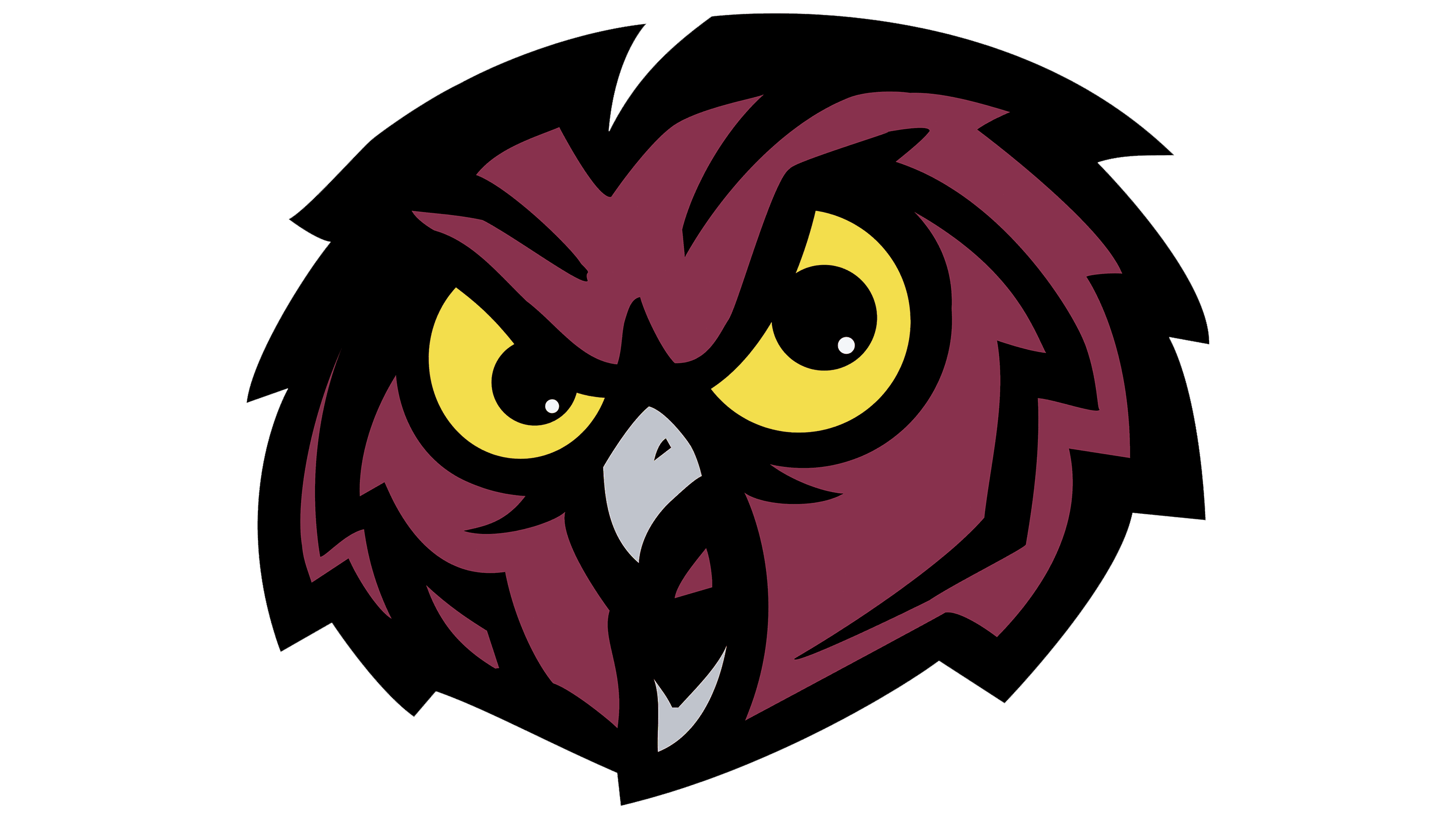
In this version of the logo, the main element is the sports team’s name. It takes up most of the space, and an owl’s head peeks out from above, with only half of it visible. The bird stares fiercely to the right, with shining yellow eyes, and displays a gray hook-shaped beak. The lettering is sharply outlined, as in the previous logo.
2020 – today
![]()
Since all the owl emblems were overloaded with fine detail and didn’t adapt well to modern digital spaces, Temple Owls executives decided to bring back the sporty symbol, adding a “T”. But they swapped the colors, making the main lines cherry and placing them on a blank white background.
The rebranding was done because the old owl symbol had become obsolete and acquired many unofficial variations. This hurt the visual consistency of the Temple Owls. In addition, the 1990s style, with its many small details and five colors, was not well-suited to modern mobile device screens. So the designers turned to the classic “T,” presenting it cleanly and freshly. The open ends of the letter symbolize freedom of thought, and the clear lines inspire a feeling of power.
Font and Colors
The current sports team logo has no lettering unless you count the hand-drawn glyph, which only remotely resembles a “T.” The palette is also very simple. It includes the university’s official colors: cherry (shade PMS 201; HEX #9d2235) and white.