


![]()
Tezza, the photo and video editing app co-founded by Tezza Barton and Cole Herrmann in 2018, has rolled out a fresh new look crafted by creative agency Saint-Urbain. Known for its vintage-inspired editing tools and vibrant creative community, Tezza’s rebrand reflects how far it’s come—from a simple app to a global platform—and sets the stage for what’s next, all while staying true to its artistic roots.
With over 25 million downloads and a growing base of content creators worldwide, the platform has evolved beyond its original purpose. Expanding into new areas called for a cohesive and bold visual identity. The updated logo, typography, and design system mark a new chapter, blending fashion-forward style with sleek minimalism.
![]()
The old logo had an elegant serif font with elongated lines and subtle flourishes, giving it a sophisticated, boutique fashion vibe. It was beautiful but felt delicate for a brand growing as fast and wide as this creative tool. The thin strokes and vintage charm didn’t quite capture the energy of a dynamic, ever-evolving digital platform.
The new logo features a bold sans-serif wordmark with strong geometric shapes. The thick, condensed letters feel solid and confident, with sharp, square angles that nod to the square photo format central to the app. The standout feature? The letter “A,” with its unique vertical cuts, aligns neatly with the horizontal lines in “E” and “Z,” creating a distinct, rhythmic flow.
The brand has swapped its muted beige-on-black palette for a striking black-on-light background combo. This flip boosts clarity and versatility, whether on screens or in print. The monochrome keeps things clean and modern, letting the bold typography shine without distractions.
The new typeface, Untitled Serif, adds a sophisticated touch. Its minimal, understated style contrasts with the bold sans-serif logo, bringing a subtle elegance reminiscent of high-end fashion magazines. The mix of strong and refined elements perfectly captures the platform’s identity: bold, expressive, polished, and timeless.
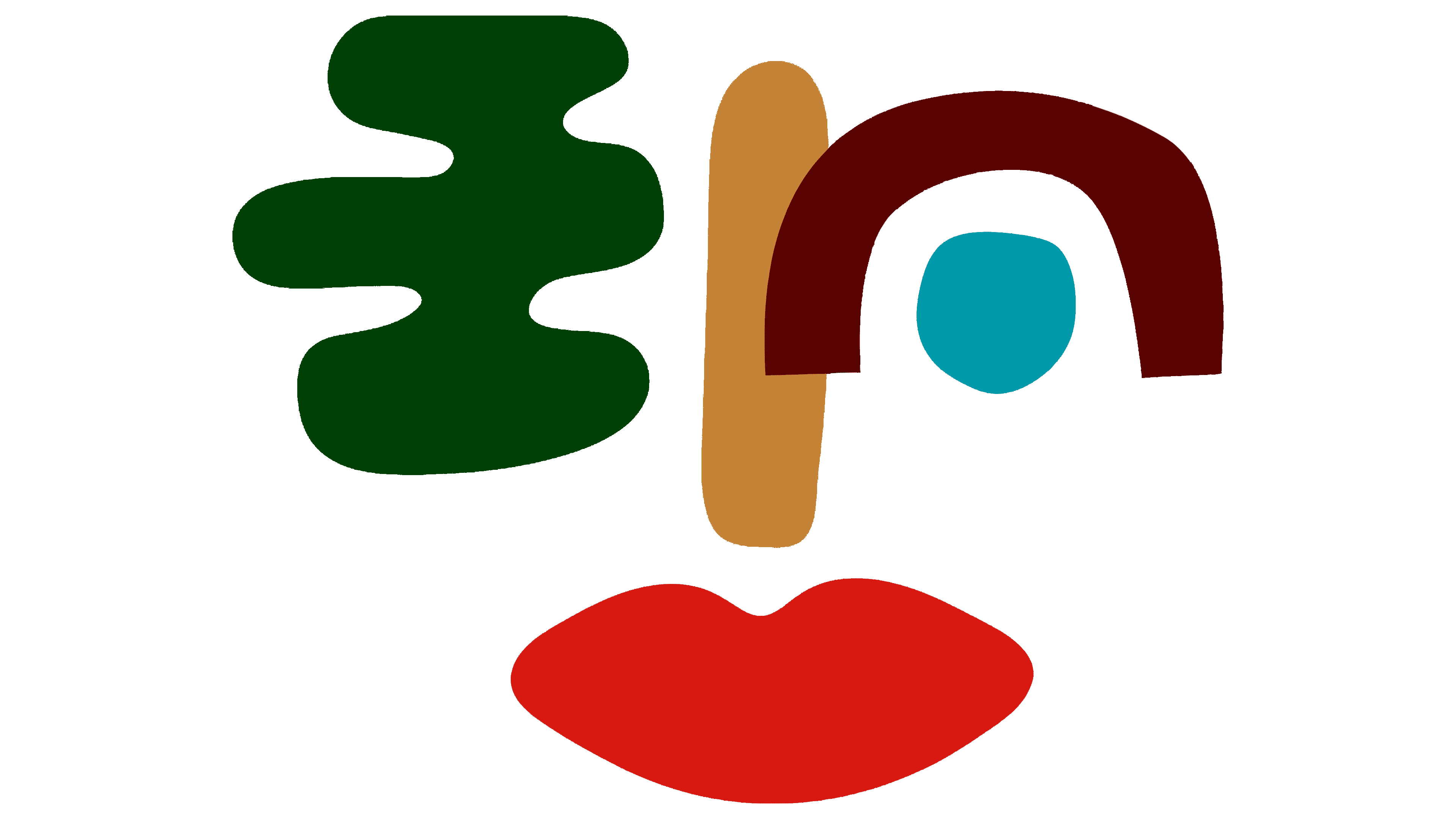
One thing that hasn’t changed is that Zhenya Rynzhuk designed the iconic face emblem. While most of the brand got a makeover, this playful symbol stays, linking to the app’s origins. It adds a human, whimsical feel, reminding us that every photo edit has a person—and a story—behind it.
![]()
Inspired by fashion editorials, the new design system features structured grids, clean lines, and plenty of white space. But it’s not all serious—animated elements like the face logo bring a fun, approachable vibe. The balance of structure and spontaneity mirrors what the editing tool is all about: a professional-grade resource that still feels personal and creative.
The new visual language speaks to modern creativity, blending fashion-inspired aesthetics with practical design. By balancing boldness with warmth and digital sleekness with a human touch, Tezza’s refreshed identity feels ready to grow alongside its ever-evolving creative community.