The Beach Boys logo portrays the image of beautiful young people on a sunny beach. The design features the smooth glide of a surfer riding the waves. The emblem is filled with harmony and conveys the great mood created by the band’s songs.
The Beach Boys: Brand Overview
Originating in 1961 in the sunny town of Hawthorne, California, The Beach Boys have swept through the generations as an iconic American rock band. The ensemble, consisting of the Wilson brothers, Brian, Dennis, and Carl, as well as their cousin Mike Love and friend Al Jardine, have imprinted their melodic compositions on the hearts of countless music fans.
The Beach Boys created their early sound by combining surf rock’s fizzy rhythms with the smooth doo-wop cadences. Their debut single, “Surfin’,” released in 1961, set the tone for their future musical journey. A subsequent contract with Capitol Records paved the way for their blossoming musical path.
The Beach Boys rose to new heights of fame in the mid-1960s with chart-topping hits such as “California Girls,” “Help Me, Rhonda” and “Good Vibrations.” Their signature surf-rock harmonies and irresistible melodies quickly made them one of the era’s most beloved and successful bands.
Despite the joyful rhythm of their music, the members of The Beach Boys experienced internal struggles behind the scenes. Brian Wilson, the creative genius behind many of the band’s timeless songs, struggled with mental illness and abused alcohol. This led to internal strife and intermittently interfered with the creative process.
As the 1970s progressed, internal friction peaked, leading to several band members’ departure. However, the remaining members did not stop there; they released new music and captivated audiences with live performances.
The Beach Boys are considered pioneers of modern music, leaving an indelible mark on the 1960s music scene. Their unique sound, characterized by complex harmonies, innovative instrumentation, and groundbreaking lyrics, continues to shape rock music. From their origins in surf rock to their later experiments, The Beach Boys have proven their enduring importance in the pantheon of American music.
Meaning and History
What is The Beach Boys?
They are an iconic American rock band that originated in Hawthorne, California. Known for their signature harmonies and distinctive sound, they captured the hearts of music lovers across the country with their chart-topping hits in the ’60s. Their surf-inspired melodies and blend of rock and pop pioneered a new musical genre. Their success story spans more than six decades, and their timeless hits are still popular with listeners of all ages.
1962
The first logo of the Beach Boys features the band’s name in large letters. The glyphs have small slanted extensions at the ends, resembling wave crests. This detail gives the logo a unique look, connecting it to the sea and beach theme. The inscription is in dark gold, emphasizing the theme of elite and “golden youth” spending time at the beach in a relaxed atmosphere. This choice of color and style reflects the idea of luxury and carefreeness associated with the lifestyle the band promotes through their songs.
The middle brother, Dennis Wilson, was the only one in the family interested in sports and spent much time at the beach. He proposed the band’s theme. His passion for surfing and love for the sea formed the basis for the band’s name and style.
Initially, the group called themselves The Pendletones. After recording their first song, the label owners changed the band’s name to match the content of their music better. This led to the name The Beach Boys, which quickly became associated with their unique sound and theme. This logo was first used on the cover of their debut album, Surfin’ Safari.
1963
The Beach Boys’ second logo was designed for the Surfin’ U.S.A. compilation. It continues the theme of surfing and beach life, which the band actively promoted through their music. The logo features blue letters that harmonize with the image of California surfer Leslie Williams on the album cover.
The shade of the letters resembles the clear ocean waves illuminated by the sun, associating with a bright and sunny day at the beach. The letters in the logo stretch upward, symbolizing the high waves needed for surfing and highlighting the dynamic energy inherent in this sport.
1963
1963
1964
1964
1964
1964
1965
1965
1965
1966
1967
1967
1968
1969
1970
1971
1973
1976 – 2021
In 1976, the Beach Boys introduced a new style with the eldest brother’s return to producing the band’s music. The updated emblem was first shown on the cover of the album “15 Big Ones.”
Connecting all the letters into a single composition held several symbolic meanings:
- Family reunion: Brian Wilson, the eldest brother, returned to work with the band after rehabilitation. This return marked an important event in the band’s history and symbolized a new phase in their creativity.
- Collaboration: The musicians actively worked on the album, often making additions and changes at night, highlighting their enthusiasm and dedication to creating quality music.
- Connection to the past: “15 Big Ones” included cover versions of popular songs from past years, showing their respect for musical tradition and desire to bring a new sound to well-known hits.
The band’s name in the emblem was transformed to reflect the process of wave riding. The large curls of the first letters and the tail of the “y” resembled wave crests, with the word “The” riding on them. The extended lower glyphs symbolized surfboards, creating an association with the movement and energy of surfing.
The emblem appeared dynamic, with symbols flowing smoothly into each other like waves rolling onto the shore.
1977
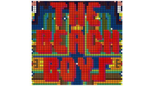
The logo and artwork for the album “The Beach Boys Love You” stand out significantly from the band’s other works. Brian Wilson wrote and produced all the songs on this album, making it almost his creation. He recorded most of the musical parts, highlighting his leading role in the album’s production.
The album’s emblem resembles cross-stitch embroidery, neatly framed. At the center of the emblem is an important message about love, conveying the album’s main theme. This design looks like a gift from the Beach Boys to their fans, creating a warm and personal feel.
“The Beach Boys Love You” became a landmark release for the group as they planned to end their activity after its release.
1978
The emblem for the next album, “M.I.U. Album,” is connected to the Maharishi International University, which the album is named after. This university is known for its programs focused on spiritual practices, enlightenment, and self-development. The album’s theme is expressed through its design, with a light yellow background resembling an endless sandy beach. This shade symbolizes inner harmony, joy, and balance, creating a sense of peace and well-being.
White letters on the background shine like sun rays, enhancing the theme of a bright and positive mood. This radiance emphasizes the idea of enlightenment and inner light, which the band members and their listeners strive for.
A special detail in the logo is the extended leg of the letter “E,” forming a wave crest. This subtle nod to surfing maintains the Beach Boys’ iconic image.
1979
The compilation “L.A. (Light Album)” logo resembles a road sign, evoking a sense of travel and adventure. In the album’s design, this image is a navigator pointing the way to the beach, an essential part of the group’s image. This depiction connects the band with relaxation and invites listeners to embark on a journey of memories, stopping where pleasant moments of vacations and carefree beach days are stored.
Designers chose shades of dark brown instead of a fully black background. This color creates a sense of confidence and strength, symbolizing a solid foundation. The dark brown palette emphasizes the band’s consistency and dedication to their musical direction. The logo looks like a road sign, conveying the message: “When it comes to the Beach Boys, think surf rock.”
1985
After a five-year hiatus due to two unsuccessful albums, the Beach Boys returned with the compilation “The Beach Boys” and an updated logo. The new logo featured large capital letters reflecting beautiful coastal scenes, capturing the essence of the band’s creativity. This design symbolized the band’s return to their roots, emphasizing their consistent surfing and beach culture theme.
The emblem demonstrated that the band retained its true essence despite changes in recording locations, the introduction of digital equipment, and working with a new producer. The logo served as a reminder that the Beach Boys remain the energetic guys singing about surfers and beaches.
1989
The white, widely spaced letters of the “Still Cruisin'” album logo create a sense of calm and tranquility. This emblem lacks sharp movements, haste, or excessive emotions, highlighting the band’s maturity and confidence at this career stage. The Beach Boys reached an important milestone with their induction into the Rock and Roll Hall of Fame. This achievement commemorates the musicians and their contribution to music history.
The logo of the “Still Cruisin'” album crowns this significant victory, radiating a sense of measured peace. The wide spacing between the letters symbolizes the band’s long journey to fame, illustrating the effort and time invested in their work. Each letter reflects the many albums released over the years and all the moments that made them legendary.
2021 – today
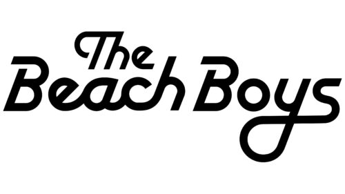
The Beach Boys logo first appeared on the band’s official website in 2021 and began featuring on albums a year later. The band’s name is written in black and divided into two levels: “The” at the top and “Beach Boys” below it. The font is unique, with an inverted “e” and holes in both “B’s.” Most of the letters are connected. The design draws inspiration from an old emblem created by Dean Torrence in 1976.
The special font and holes in the “B” letters evoke a sense of calm and relaxation, mirroring the band’s music. The connected letters mimic waves, bringing to mind the beach and good times. This design effectively represents the band’s essence without needing any additional explanation.
The joined letters create a flow reminiscent of ocean waves, enhancing the beach vibe. The black adds a classic touch, while the unique font details provide a modern twist. The inverted “e” and the distinctive “B” letters make the logo instantly recognizable and memorable.
The overall design captures the spirit of The Beach Boys, combining a relaxed, carefree feel with a sense of nostalgia. The two-level arrangement of the text adds balance and structure, while the unique typography brings character and charm. The logo’s design encapsulates the essence of the band’s music and legacy.


