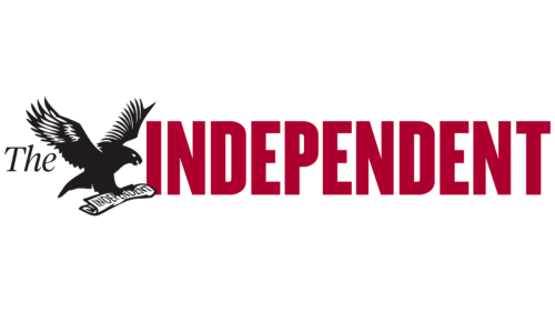
The Independent logo is free and confident. The emblem represents a newspaper that defends its values and impartially conveys information to readers. The sign gives a sense of flight and purposefulness.
The Independent: Brand overview
| Founded: | 7 October 1986 |
| Founder: | Evgeny Lebedev, Sultan Muhammad Abuljadayel, Justin Byam Shaw, Minor shareholders |
| Headquarters: | Kensington, London, United Kingdom |
| Website: | independent.co.uk |
“The Independent” – a national English morning newspaper that existed in print until 2016 and now is only available online. It is owned by Justin Byam Shaw (26%), Sultan Muhammad Abuljadayel (30%), and Alexander Lebedev (41%). Its headquarters are located in Kensington, London.
Meaning and History
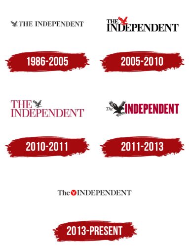
The key elements of visual identity were chosen at the inception of the newspaper and remain constant. The eagle symbol, designed by Matt Willey, is the signature emblem of the publication. Each subsequent rebranding represents the pursuit of aligning with the spirit of the times and the needs of the readers. For this, the owners have turned to modern graphic designers and agencies. A shift in the publication format requiring a more compact logo was another reason for exploring new imagery.
What is The Independent?
An English publication available online in many languages (Spanish, Turkish, Persian, Urdu) and accessible in most countries worldwide. It has 17 international offices. The last print edition was released in 2016 due to declining demand, as the circulation gradually dropped from 400 to 54 thousand copies. Meanwhile, the digital version is read by 58 million users each month.
1986 – 2005
The first logo comprises the title written in uppercase black letters with white highlights. The light color creates a sense of volume intended to convey the publication’s multifaceted nature.
Names for the future newspaper, such as Arena, The Examiner, and The Nation, were considered. The founders aimed to convey an independent spirit, modern journalism, appeal to readers, and emphasize the company’s values. Only “The Independent” could encapsulate all these objectives. Its name radiates freedom and strength. It indicates the publication’s distinct stance on various issues, presenting material independent of politically interested forces.
Along with the name is a small image of an eagle carrying a copy of the newspaper in its talons. The bird is positioned before “The.” The icon was designed by then-young corporate-style graphic designer Matt Willey. The eagle symbolizes:
- A height of flight is accessible to few. The choice indicates that the publication has full access to information and forms its perspective on events as impartially and accurately as possible.
- As a large predatory bird, the eagle is the king of the skies. It embodies a publication dominating its competitors. Just three years after its release, the newspaper’s circulation had already exceeded 400,000 copies.
- The publication has often engaged in debates concerning significant world and political events. Topics such as climate change, the war in Iraq, refugees, and the Brexit referendum have been discussed in the newspaper.
- The broadness of views. From the highest point where eagles soar, the view is broader. “The Independent” offers its pages for people with the most diverse perspectives to express themselves.
The newspaper seems to descend from the heavens from those at the peak, observing the world. The eagle’s pose indicates that the publication is readily accessible as it is delivered straight to the newsstands.
2005 – 2010
In 2003, the newspaper switched its format from broadsheet to tabloid. And in 2005, it turned to a Barcelona-based graphic design agency to refresh the layout. The final version bears a resemblance to the French Libération.
The new compact format implied a logo change. The updated emblem became shorter. The article and the eagle were positioned at the top. The letters of the name are fully black and bolder than before. The approach suggests large circulations in a convenient, small size. The thick glyphs hint at the addition of pages.
The eagle changed its color from black and white to red, indicating fresh news and hot debates on the pages of the publication.
2010 – 2011
The newspaper went bankrupt and was bought out by businessman A.E. Lebedev. The new logo after the ownership change looks very delicate and elegant. Its structure remained the same, but the transformation affected the color and the font. Light red letters indicate a decrease in circulation and global changes that occurred in the tabloid. However, the black eagle, as in the first version, hints at the loyalty of the publication, the continuation of releases, and stability.
2011 – 2013
The new owners helped the tabloid get back on its feet and conducted a more extensive rebranding. The article, which was becoming outdated, was de-emphasized in the newspaper’s name, as most readers don’t use it in internet searches. Therefore, It was placed in a very small size before the eagle.
The choice helped shorten the logo and make it more pleasing to the eye. The approach also showed that the newspaper talks about the main thing without preludes, not wasting readers’ time – easy access, maximum news.
The eagle is soaring before the name. As if it has just received information, printed it, and is now urgently delivering the fresh edition. The letters of the name are large and bold again. The thickness indicates the improvement of the publication’s financial indicators.
2013 – today
The latest emblem looks more restrained due to the eagle placed in a red circle. The icon is perfect for the online version thanks to its laconic and bright design. Still, for the printed edition, it points more to a reduction in the audience, the impossibility of “spreading its wings.”
The red circle also focuses attention on the eagle, its landing spot, to show that the newspaper is looking for the best way to deliver information to readers.
Font and Colors
Red and black are the primary colors of all The Independent emblems. They perfectly suit a political news publication.
- Black – authority, strength of spirit, defending one’s position, impartiality.
- Red – urgency of news, coverage of important events, debate, daily availability on newsstands, implying a high speed of work.
Interestingly, the white color is only actively present in the latest emblem even though in other publications, it usually represents news. Therefore, in the case of The Independent, it points to future large-scale changes, which indeed followed in 2016.
The inscription font, Monotype Engravers Pro Regular, features elegant thin glyphs that point to the beauty of the wording and layout of the newspaper.
The Independent color codes
| Red | Hex color: | #f60000 |
|---|---|---|
| RGB: | 246 0 0 | |
| CMYK: | 0 100 100 4 | |
| Pantone: | PMS 172 C |
| Raisin Black | Hex color: | #35 31 32 |
|---|---|---|
| RGB: | 35 31 32 | |
| CMYK: | 0 11 9 86 | |
| Pantone: | PMS Neutral Black C |
