


![]() The Office Logo PNG
The Office Logo PNG
The austere, minimalist style of “The Office Logo” reflects the working relationships highlighted by the TV series. The emblem symbolizes the lightness of the plot and ordinary everyday life with its ups and downs.
The American television series The Office is divided into nine seasons aired by the National Broadcasting Company between 2005 and 2013. They contain 201 episodes, much more than in the original British show The Office, which aired on BBC Two. The main genres are satire, pseudo-documentary, and comedy. The series’s raised topic is colleagues’ lives in a closed team, their problems, complexes, conflicts, friendships, and working days.
The comedy is filmed as reportage from the office of the fictional company Dunder Mifflin, which sells stationery and paper products. Despite the finished script, the series resembles a reality show because the actors are allowed to improvise. Moreover, they did not know where the camera was or at what angle they were being filmed. Thanks to a creative approach, many actions are unpredictable, and emotions are real.
If the storyline developed only in the confined space of the office in the first episodes, then later, the heroes gradually went beyond the four walls. The audience learned about their families, household chores, and personal lives. However, the shooting style has not changed: each episode resembles an excerpt from a documentary film.
The American version of The Office successfully adapts the British 14-episode show. She has received over 20 awards for her creative storytelling, excellent directing, outstanding acting, and other critically acclaimed achievements. Over time, the popular comedy became a media franchise that included a computer game.
Meaning and History
![]()
The Office copies the format of the British TV series with the same name and logo – a short black inscription on a white background. Originally, the title used a standard black sans-serif font. The developers preferred a completely different design for the American version: letters with “defects” and rounded ends, as if the word had been typed on a typewriter. At the same time, the color remained black, though an alternative would be a red inscription at an angle, split into two lines.
What is The Office?
This is a comedy series in a mockumentary format about the lives of employees in a regular office. It is known for its dry humor, awkward situations, and satire of office culture. The original version was released in the UK in 2001, created by Ricky Gervais and Stephen Merchant, and in 2005, an American adaptation appeared, which became even more popular for its mix of comedy and character development.
2005 – 2013
![]()
The comedy show’s logo is very laconic. The designers did not add graphic elements; they limited themselves to a simple black title on a white background. This has its symbolism: a wordmark resembles a piece of text in a document, which is why it is associated with office work.
All letters are lowercase, which indicates some incompleteness. One gets the impression that the inscription has a beginning and an end somewhere and has been taken out of context. The stylization enhances this effect: the characters look like prints because of their distinctive shapes. The red version is more of an advertisement and looks like a stamp.
![]()
the office tv show logo
Font and Colors

The font used for The Office logo has many counterparts. There are both paid options (Typewriter FS Regular from FontSite Inc. or Typewriter Serial Regular from SoftMaker) and free ones (Linowrite Regular from LennardGlitter, Typewriter Regular from Roger White). They are united by the same letter design: they seem to be written with a typewriter. Characteristic features of the style include disproportion, unevenness, rounded ends, and long serifs on the top “h” and “i.”
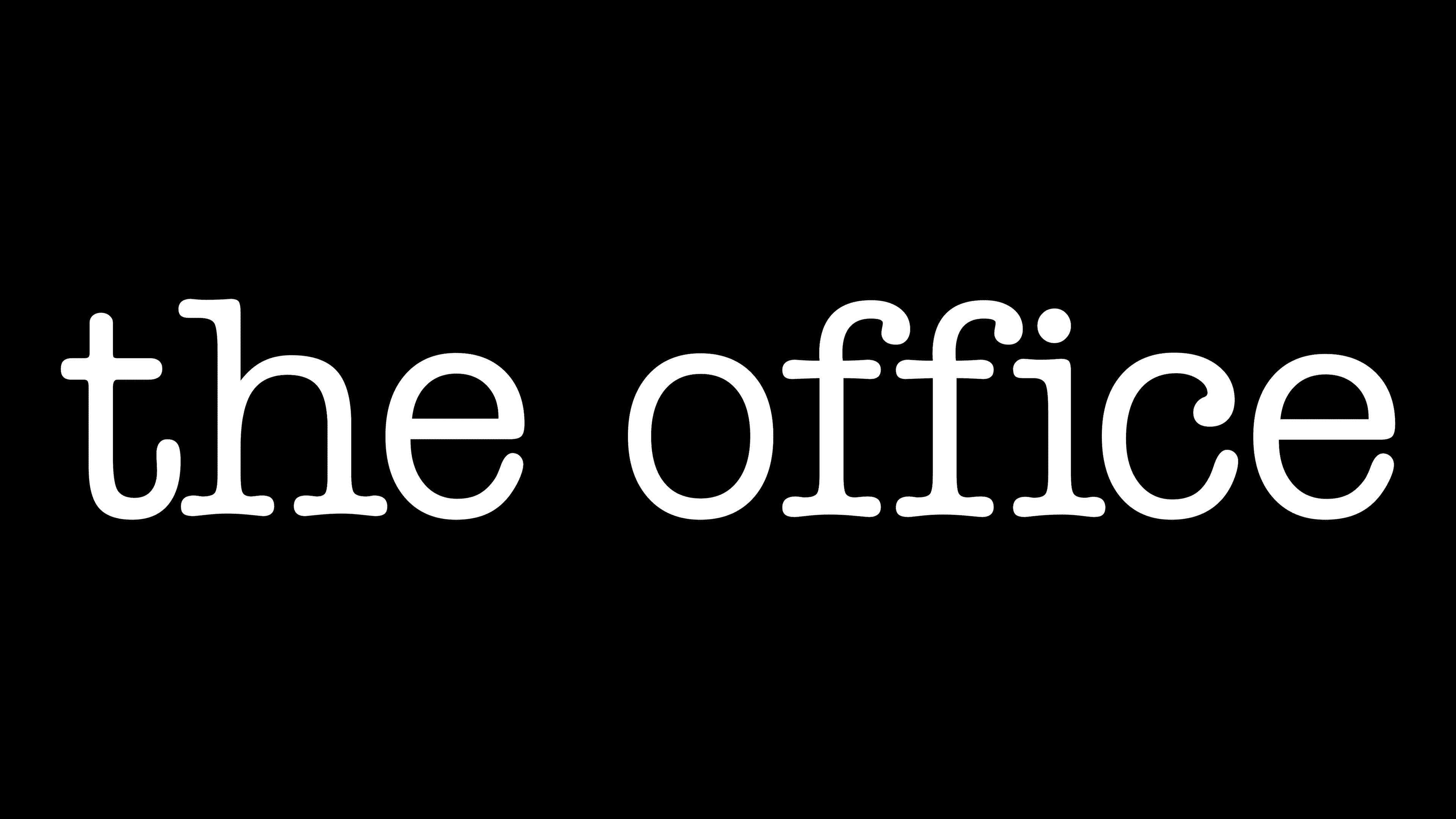
The title of the sitcom is black, and the background is completely white. This combination gives the impression that the inscription was taken from office documents. A minimalist palette links the logo to the TV show it belongs to. A similar trick was used in the British version of The Office. There is also a bright red emblem designed to attract attention.
![]()
the office logo