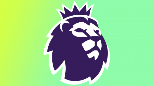
The Premier League, a brand synonymous with English football, has introduced a fresh logo for the 2023/24 season. Though the transformation might appear modest at first glance, it marks a significant step in aligning with contemporary design practices, leading to a bolder and more refined appearance.
The emblematic lion, a symbol that has come to define the Premier League’s persona, remains largely untouched in form. So subtle are the alterations that they may go unnoticed by a cursory observer. However, upon closer inspection, the vibrancy of a new color gradient becomes apparent. The real novelty lies in what’s been subtracted rather than added.
The Premier League’s new branding agency, Nomad Studio, describes the changes as a “radical simplification.” The new design fuses elements of two previous lion images, masterfully crafting an outline that nearly encases the lion without completely doing so. Though this shift might seem marginal, it’s part of a larger design strategy.
By employing this outlining stroke, the lion gains prominence, empowering it to represent the league without needing a wordmark. This strategy echoes the branding techniques of industry giants like Nike and Apple, where the visual symbol carries the full weight of the brand’s identity. As a global football powerhouse, the Premier League possesses the prestige to carry this off, albeit risking some light-hearted comparisons to The Lion King.
While the wordmark is not entirely retired and will still find its place in select contexts, its omission from the primary logo is a defining move. Even the color palette is rejuvenated, merging six earlier solid shades into a trio of gradients. Though this appears contrary to recent tendencies toward design simplification, these energetic colors resonate with prevailing design trends. How well they translate across diverse platforms is yet to be answered.
The Premier League’s new logo for the 2023/24 season might not appear as a groundbreaking shift, but it is an artfully executed metamorphosis. By subtly refining the iconic imagery, the Premier League has seamlessly woven modern design elements into its time-honored legacy. As football enthusiasts and teams gear up for the new season, this revamped logo stands as a beacon of the Premier League’s enduring dominance and resonance in the global sports arena.


