When looking at the group’s logo, electronic sound vibrations are visible. In the genre of musicians, musical variations are available that are not possible in other styles. The Prodigy logo represents the band as constantly growing professionals in their field.
The Prodigy: Brand overview
| Founded: | 1990–present |
| Founder: | Liam Howlett |
| Headquarters: | Braintree, Essex, England |
| Website: | theprodigy.com |
Meaning and History
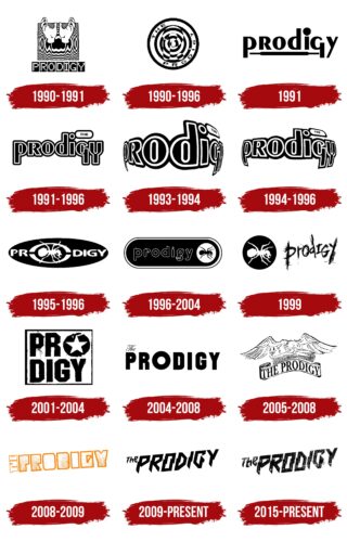
Over the past three decades, the music team has changed many logos. The first was in use for the shortest time – from 1990 to 1991. Moreover, each version of the branding is directly related to the name of the band: The Prodigy means “gifted,” “gifted,” or “wonderful.” The history of its appearance is quite simple. Liam Howlett borrowed the name from his first keyboard synthesizer, the Moog Prodigy.
What is The Prodigy?
The Prodigy is a British band performing electronic, club, and alternative music. Its work also includes punk, techno, breakbeat, and rock. The band was formed in 1990 by Liam Howlett, a keyboardist, producer, and songwriter. The group’s singles ranked in the top 5 best in the United Kingdom.
1990 – 1991
Two versions of the logo that appeared on studio albums of that period belong to this period. The first represents two palms depicted against a square background with wavy black and white lines resembling circles on water or vibrations of sound. Drawn below are black squares, each containing one white letter from the word “Prodigy.”
1990 – 1996
The second emblem also imitates waves diverging from the center in the form of monochrome stripes. It has the shape of a circle with a translucent (or rather, ghostly) “R” in the middle. The group’s name is written on the extreme light line.
1991
The phrase “Prodigy” occupies the entire space of the logo, so there are no other elements on it. The letters are made in printed type and are combined with each other: “R” and “Y” – uppercase, “p”, “o”, “d”, “i”, “g” – lowercase. At the same time, they are the same size. Has double black and white piping.
1991 – 1996
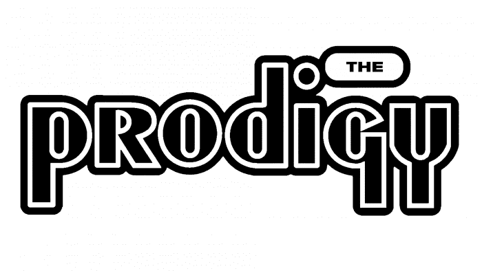
This logo appeared in 1991 and was used on five singles, on the debut album Experience, and several music cassettes. It is black in the standard form; in the individual form (on the covers), it is colored. The emblem contains only the inscription in lowercase letters, except the capital “R.” All characters are wide, with a double border around the edges. Legs “p,” “g,” “y” are balanced and go down the same distance. Moreover, “g” looks like “q.” To the right of the “i” in the white oval is the article “THE.”
1993 – 1994
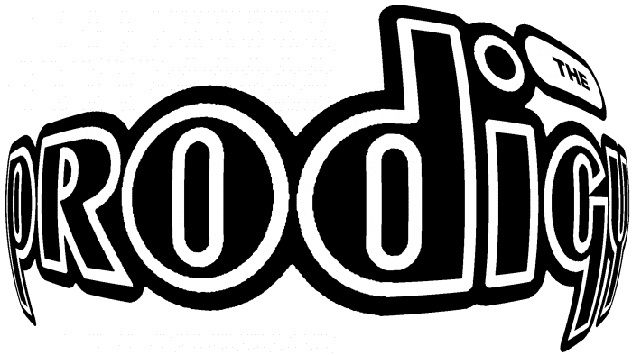
In parallel with the previous version of the logo, there was another one in use. This is the same emblem, but three-dimensional, convex, designed with a curved perspective. The central signs in it are larger than usual (o, d, i), and the side ones, on the contrary, are smaller (p, r, g, y).
1994 – 1996
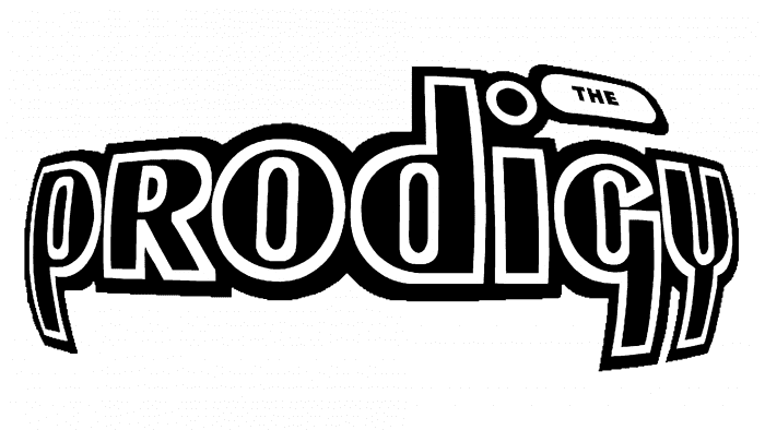
The emblem, chosen by the musicians in 1994, consists of a well-readable inscription because, in the previous version, the letters were uneven in size. In this case, the name is visible despite the stereoscopic effect.
1995 – 1996
During this period, the iconic image of an ant appeared, which the musicians used on other covers. The logo is depicted in an ellipse with a large “O,” which contains the insect.
1996 – 2004
The designers moved the ant to the right, put it at the end of the name, and changed the uppercase letters to the lowercase.
1999
The basis of the logo is an ant. He first appeared on the cover of the album in 1995. Now the group is back to him again. A white insect is placed in an even black circle. To the right of it is the “Prodigy” inscription in the original design. The name of the band seems to be scratched on a hard surface. It consists of small irregular stripes applied randomly. The letters are located in different registers: “p”, “r”, “o”, “d”, “y” – in the lower, “I” and “G” – in the upper.
2001 – 2004
There were affirmative accents in this year’s version: a very large font written by Caps Lock. In addition to the black uppercase characters, the white square contains a light star surrounded by a black torn background.
2004 – 2008
The musical group’s emblem acquired a different style – softer, as evidenced by the article “The,” written in flowery modern italics. The rest of the letters are simple, sans serifs.
2005 – 2008
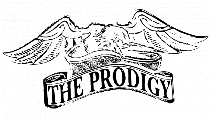
In this version, the classic combination of black and white has disappeared. It was replaced by a pleasant heavenly blue. The name of the group is on a wide curly ribbon – like on a banner. Above the ribbon is an eagle with wings spread to the side.
2008 – 2009
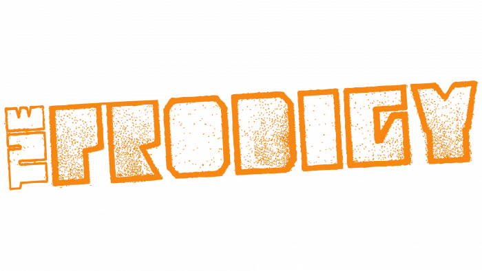
The article “THE” has returned to the emblem again. The musicians turned it sideways and placed it to the left of the name, so visually, it is perceived as another letter. The rest of the characters in the word “Prodigy” are outlined along the contour with a thin sand-colored line. The effect of sand is added to the surface, making it seem to be sprinkled with fine grains of sand. Excessive amounts of white make the letters appear hollow on the inside. At the same time, they are outlined, with a fuzzy drawing – schematic and without specific details.
2009 – today
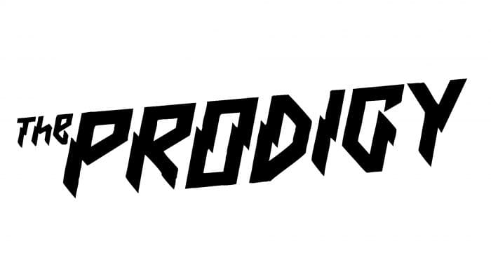
The repertoire of those years again acquired obvious aggression and challenge, which was reflected in the logo. Torn angular sharp letters are painted black.
2015 – today
The modern emblem is a reworking of the previous one. The designers put the word in a straight line, added yellowness, increased the size of the article “The,” and moved it up.
The Prodigy: Interesting Facts
The Prodigy, a British electronic dance music band, started in the early 1990s and quickly became famous. They’re known for mixing different music styles and performing energetic live shows.
- Beginnings: Liam Howlett, initially a DJ, founded The Prodigy in 1990 in Braintree, Essex, after meeting Keith Flint and Leeroy Thornhill. They started by playing at local raves.
- Band Name: They chose “The Prodigy” because the Moog Prodigy synthesizer, one of Howlett’s first instruments, shows their electronic music roots.
- Rise to Fame: Their second album, “Music for the Jilted Generation” (1994), discussed issues like social unrest and introduced a darker sound, making the band famous in the electronic scene.
- Popular Songs: Songs like “Firestarter” and “Breathe” from their 1997 album “The Fat of the Land” made them globally known. Keith Flint’s unique voice and style helped bring electronic music to a wider audience.
- Live Shows: The Prodigy is famous for its lively concerts, and Keith Flint’s energetic performances have become a signature.
- Music Videos: Their innovative music videos, especially for “Firestarter” and “Smack My Bitch Up,” were visually striking but also sparked controversy and discussions about censorship.
- Musical Fusion: They successfully combined various music genres, contributing greatly to their popularity and impact.
- Awards: The Prodigy has won many awards, including two Brit and two MTV Video Music Awards.
- Legacy: Despite Keith Flint’s death in 2019, The Prodigy continues to produce music and perform, proving their lasting influence.
- Influence on Music: The Prodigy has inspired many artists across different music styles, showing their significant role in the evolution of modern music.
The Prodigy’s mix of electronic beats with punk vibes created a groundbreaking sound that has influenced the music industry for years. Their continuous innovation and unique identity have made them electronic dance music pioneers.
Font and Colors
The logo’s current versions consist of two clear inscriptions – “The” and “Prodigy.” At the same time, they have an original design: a beveled cut in the middle adds texture to them. Such futurism echoes the content of the music tracks and demonstrates the character of the performers. In the version of 2015, the letters are not only zigzag but also with an aging effect. Numerous abrasions, damages, scratches are visible on the surface.
In the musicians’ emblems, you cannot find two identical inscriptions – they are so different. And all of them are individual, created specifically for a specific album. Among them, there are point, strict, extended, gothic, contour, hollow, zigzag. Therefore, in this case, one cannot talk about fonts since each letter is, in fact, a graphic sign.
The Prodigy logo color scheme has always been consistent. It is monochrome and is a fatal combination of black and white.
The Prodigy color codes
| Black | Hex color: | #000000 |
|---|---|---|
| RGB: | 0 0 0 | |
| CMYK: | 0 0 0 100 | |
| Pantone: | PMS Process Black C |
