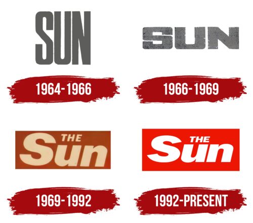
The world-renowned The Sun logo represents the newspaper as a reliable and authoritative news source. The visual symbol reflects the dynamism of information delivery, aiming to attract readers’ attention and stimulate interest in the content.
The Sun: Brand overview
| Founded: | 15 September 1964 |
| Founder: | News UK |
| Headquarters: | London, U.K. |
| Website: | thesun.co.uk |
Meaning and History
Like any other print publication, The Sun has a logo that is placed at the top of the front page in each issue. It is also used in the digital version of the newspaper and on its YouTube channel. The visual symbol contains the brand name, set in bold sans-serif letters. Throughout the history of The Sun, the font has undergone a series of changes: initially, it was vertically elongated, then the designers squashed it, and after 1969, a bold italic began to be used. The bright color of the emblem has become iconic since a red rectangle has served as a basis for the white inscription since 1992.
What is The Sun?
The Sun is a popular daily newspaper from the United Kingdom. It has been around since 1964, and since 1969, it has been published in tabloid format. Its owner is News Corp UK & Ireland Limited. The publication has regional issues for the Republic of Ireland, Northern Ireland, and Scotland. Originally, the newspaper was positioned as politically neutral, but over time it began to support various parties. The core of its views are Euroscepticism, populism, and conservatism.
1964 – 1966
In the mid-1960s, The Sun was a broadsheet newspaper with a large gray logo located on the first page in the upper left corner. It contained the name of the print publication without the article “The.” The inscription was made in bold sans-serif font. The letters were narrow, as were the spaces between them.
1966 – 1969
The word “SUN” remained gray, but its appearance changed. Designers balanced the width and height of the glyphs, giving them a square shape. At the same time, the font became bolder. It was used to enhance the visual impact and attract the attention of readers in a competitive media environment.
1969 – 1992
In 1969, Rupert Murdoch bought the newspaper and relaunched it in tabloid format. The new design was copied from the Daily Mirror, so the logo acquired a rectangular base – just like the emblem of the competitor. On the background of the quadrilateral was the beige-colored phrase “THE Sun.” The article was reduced and occupied the space above the “u.” The letters in the word “Sun” gained smooth roundings, completely unlike the old rectangular font. At the same time, they remained bold and still lacked serifs. The right-leaning inscription underscored the energetic and active character of the publication.
1992 – today
As a result of the redesign, the logo became more balanced: now, the inscription is located exactly in the middle of the rectangle. For this, the designers had to reduce the letters slightly, narrow the spaces between them, and move the article closer to the “u.” The bright red color of the base helps highlight the white name of the newspaper and make it more readable.
Font and Colors
The designers used a modified version of the Franklin Gothic Heavy Italic font for the wordmark. Bold sans-serif letters convey strength and confidence, emphasizing the authority of The Sun as a source of information. A slight slant creates a sense of dynamism, which corresponds to the character of a news newspaper, where events are constantly changing.
The combination of red and white exactly corresponds to the colors of the Daily Mirror’s emblem. It’s a fitting choice for a printed publication, as red symbolizes the importance of the information and attracts attention, while white creates a sense of reliability and neutrality.
The Sun color codes
| Red | Hex color: | #eb1702 |
|---|---|---|
| RGB: | 235 23 2 | |
| CMYK: | 0 90 99 8 | |
| Pantone: | PMS 172 C |
