


The Train Factory in Helsinki has introduced a logo based on railcar maintenance markings. Agency Hasan & Partners transformed a symbol identifying lifting points into a “T.” For a public destination housed in former railway workshops, this technical detail connects its industrial past with its present-day uses.
The Train Factory project launched in 2023 in the historic Konepaja area of Vallila. Its red-brick buildings house restaurants, sports facilities, a theater, film screenings, and galleries. The name recalls railway manufacturing, while the identity was intended to present the various activities as parts of a single complex. By September 2026, the update had extended to wayfinding, the website, and venue materials.
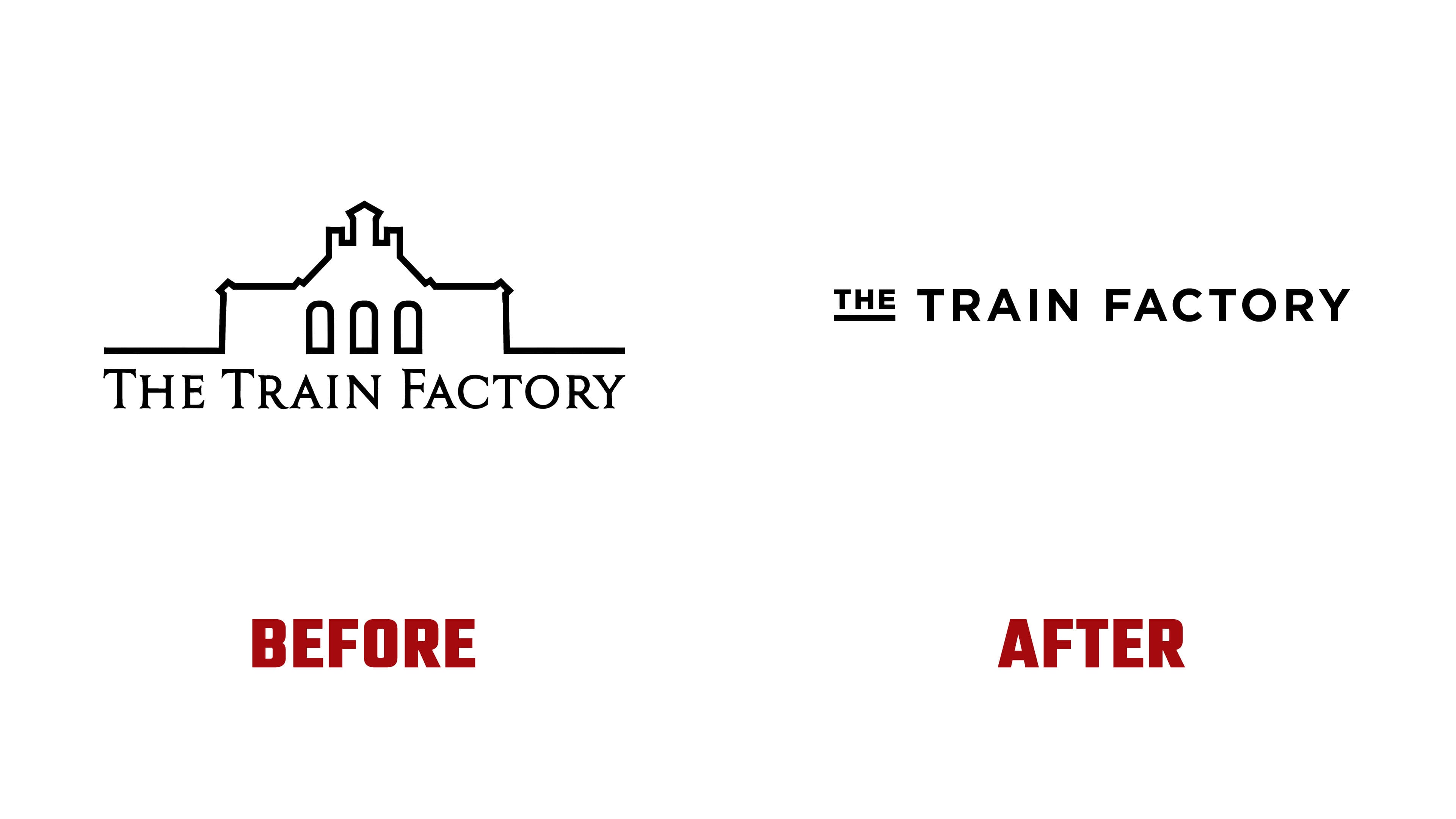
Hasan & Partners drew ideas from the surviving equipment, industrial markings, and architectural details. The previous logo depicted a facade in outline, with angular projections. A serif wordmark echoed the building’s pointed features. In the new version, a railcar-maintenance symbol replaces the architectural illustration.
The emblem consists of a thick horizontal bar with a triangle beneath its center. The triangle’s tip meets the bar, replacing the vertical stem of the “T.” The letter connects to the Train Factory name. At the same time, the designers reinterpreted the marking’s original purpose as support for new initiatives. A symbol that once indicated where to lift a railcar becomes an image of a place that supports culture, recreation, and social connection.
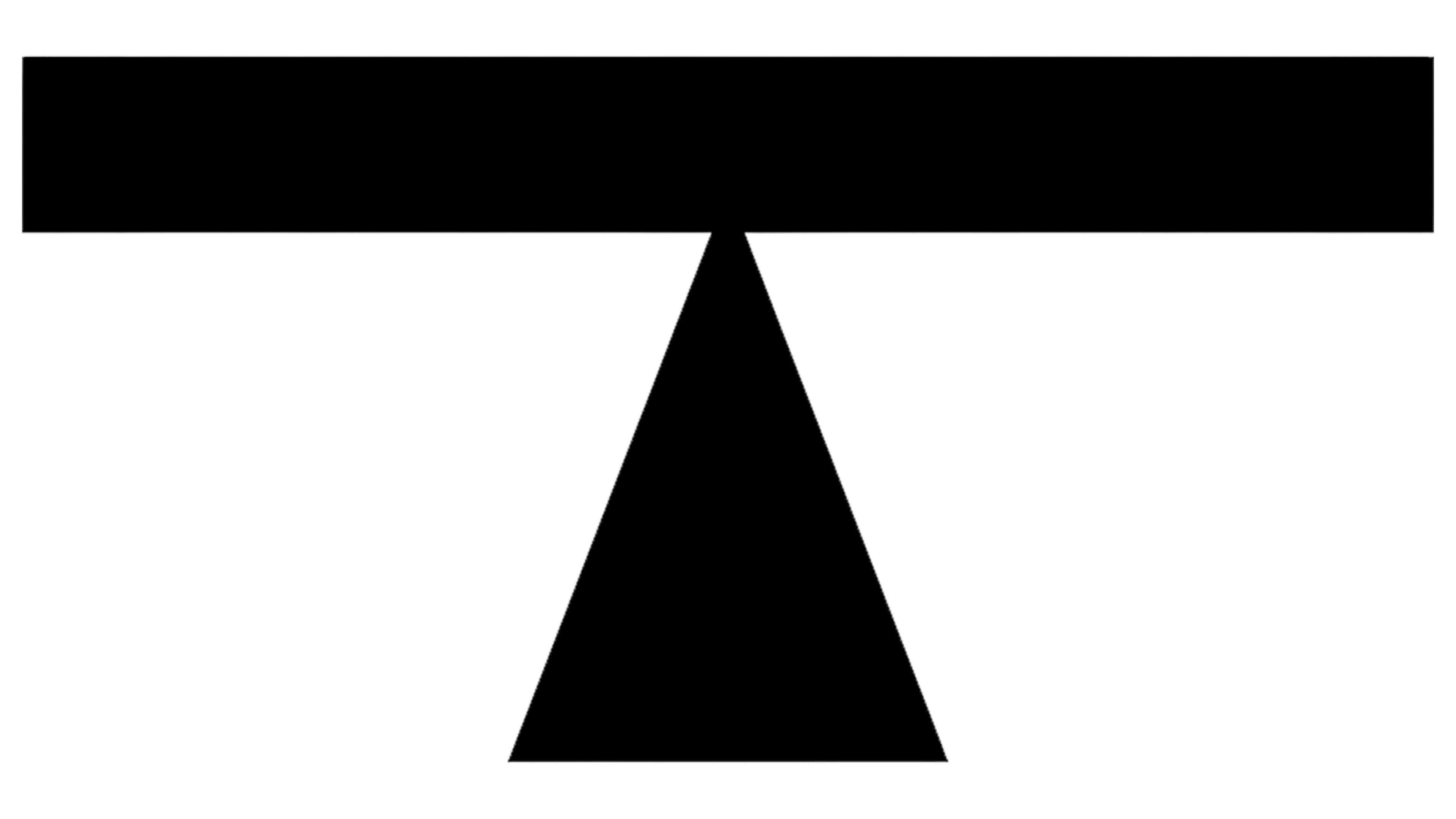
The triangle also references the workshops’ structure. Its profile echoes the roof lanterns. The two geometric forms connect railway maintenance with the architecture of the industrial buildings.
The Train Factory wordmark appears both with the emblem and on its own. It uses widely spaced sans-serif capitals. A small THE sits on the left above a thick horizontal line. Together, they form a block matching the height of the main TRAIN FACTORY line. According to Hasan & Partners, the logo and wayfinding lettering are based on historic Finnish railcar numbering. The black version appears on light backgrounds, while the white version is used on dark surfaces and photographs.
The colors come from the workshop surroundings. Red recalls the brick facades, while yellow and gray-blue reference factory markings and surviving cranes. Brown and beige shades round out the selection. Signs and posters continue the industrial theme and unite the complex’s different venues.
The update includes “Your Next Stop.” The railway phrase invites people to visit a restaurant, attend a workout, or join a cultural event. In digital animation, the letters change like those on station information boards. The new identity appears in interior wayfinding, outdoor displays, social media, and souvenir tote bags.