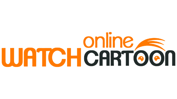
 Thewatchcartoononline Logo PNG
At the entertainment platform, the Thewatchcartoononline logo is dedicated to the viewers who gaze admiringly at the huge catalog of cartoons. The emblem reminds us that this video service offers a wide selection of content of different genres, and everyone will find something interesting there.
Thewatchcartoononline: Brand overview
| Founded: | 2019 |
| Headquarters: | United States of America |
| Website: | wcofun.net |
Meaning and History
The popular video service appeared in 2019, at the same time that its domain name was registered. The site’s web server is located in the United States of America, and the main visitors, according to the results of the analysis, are residents of the United States and Italy. All content featured in the Thewatchcartoonline collection is distributed free of charge. At the same time, the owners of the entertainment platform receive advertising revenue.
The catalog includes cartoons from various animation studios, but it is worth noting that the service does not officially cooperate with anyone: it works illegally and violates copyrights. On the other hand, the site listens to the rights holders and is ready to remove any videos that receive a complaint from open access.
What is Thewatchcartoononline?
Thewatchcartoononline is a popular video service that allows you to watch high-quality cartoons and anime. Users do not need to register or pay a subscription fee because all content is available for free access.
Thewatchcartoononline differs from other online cinemas in the choice of content. Instead of films, series, and programs, in its collection, there are thousands of free cartoons and anime. And this, of course, was reflected in the logo of the video service: the designers stylized some of the letters under the face of a cartoon character. We are talking about double “OO,” inside which are depicted orange pupils in the form of crescents, turned “horns” down. To clarify that these are the eyes, the designers added three lines above the “OO,” connected at one point and imitating hair. They, like the pupils, are also orange.
The logo contains the brand’s full name (only without the initial article “The”); because of this, its structure is rather complicated. In this case, the words are not in order: “online” is at the top and right-aligned, and “WATCH” and “CARTOON” are on the second line. Different designs compensate for very narrow intervals between them. Each part is written in its font and painted in an individual color, thanks to which they are visually separated.
In particular, the word “online” consists of orange lowercase letters. “WATCH” is also orange, but all the glyphs are capitalized and oversized. The word “CARTOON” is white and fully uppercase, although it is not as large in height as the previous one. The inscription is located inside a dark gray, almost black rectangle stretched horizontally.
Two “O” s that look like eyes and three orange lines of hair form a funny face. Perhaps this is how the Thewatchcartoononline video service sees its viewer: curious, with wide eyes. Or is it an attempt to show that only anime and cartoons are presented on the site since the “little man” looks like some animated character.
Font and Colors
The custom set of glyphs used by Thewatchcartoononline logo designers is very diverse. If the lowercase “o,” “n,” “l,” and “i” have a standard form (similar letters are presented in the Novel Sans Office Pro Regular font from Atlas Font Foundry), then the “e” with a diagonal bridge looks very original. The same goes for the capital “W,” “A,” “T,” and “N,” which stand out with an unusual design. In particular, “W” resembles an inverted handwritten “M,” “T” has the left side of the horizontal stroke turned down, and “A” and “N” look like an inverted “U”: one with a crossbar, the second without.
The color scheme combines bright and dark tones. Its base is orange, white, and graphite. This combination is used for contrast to attract the attention of potential visitors.
Thewatchcartoononline color codes
| Safety Orange | Hex color: | #ff7900 |
|---|---|---|
| RGB: | 255 121 0 | |
| CMYK: | 0 53 100 0 | |
| Pantone: | PMS Bright Orange C |
| Charleston Green | Hex color: | #212a29 |
|---|---|---|
| RGB: | 33 42 41 | |
| CMYK: | 21 0 2 84 | |
| Pantone: | PMS Black 3 C |
