


![]() Three Days Grace Logo PNG
Three Days Grace Logo PNG
The Gothic style of the Three Days Grace logo conveys power and inner tension. The straight lines create a sense of calm before an emotional outburst, when silence turns into a scream. The emblem reflects the band’s maturity and the strength of its sound.
The history of Three Days Grace began in 1992 in Norwood, Ontario, when a group of schoolmates formed a band called Groundswell. The lineup included Adam Gontier, Neil Sanderson, Brad Walst, Phil Crowe, and Joe Grant. In 1995, they released their only album, Wave of Popular Feeling, before disbanding.
In 1997, Gontier, Sanderson, and Walst reunited in Toronto as Three Days Grace. The title, proposed by Gontier, reflected a sense of urgency tied to personal change. They met producer Gavin Brown, who helped refine their material. The track “I Hate Everything About You” attracted label interest and led to a deal with Jive Records.
Their debut album was recorded in Boston and finished in Woodstock, New York, and was released in July 2003. The lead single gained heavy radio rotation, and Barry Stock soon joined as lead guitarist. The band spent the next two years touring, including shows with Nickelback.
During this period, Gontier struggled with addiction and entered rehab in Toronto. His experiences shaped the second album One-X, released in June 2006 and produced by Howard Benson. The single “Animal I Have Become” was written during treatment, and the record went platinum.
Subsequent releases included Life Starts Now in 2009 and Transit of Venus in 2012. In 2013, Gontier left due to health issues, and Matt Walst of My Darkest Days took his place. The single “Painkiller” in 2014 became another chart leader.
Later albums followed, including Human in 2015, Outsider in 2018, and Explosions in 2022. By mid-2025, the band had achieved twenty number-one singles on the Billboard Mainstream Rock chart. In October 2024, Gontier returned, and in 2025, the band released Alienation, their first album with two lead vocalists.
Meaning and History
![]()
Initially, the band was called Groundswell, but then changed its name to Three Days Grace in 1997. The debut logo appeared on the cover of their first album. Before this, the band was expanding its repertoire and performing live.
What is Three Days Grace?
It is a Canadian rock band that plays post-grunge and alternative metal. It has been around since 1992 and was originally founded in Norwood as Groundswell. The group received its current name in 1997.
2003 – 2006
![]()
The official emblem appeared alongside the music group’s new name. It was creatively used on the self-titled album, so it quickly became the band’s easily recognizable, legendary label. The phrase “Three Days Grace” is executed in a stylized font with angular uppercase letters. Although written on a single line, the words are unevenly spaced and vary in height. The color is white with a dark outline.
The textual part of the logo is set against a small circle with a black frame and three short vertical lines in the middle. They look like scratches from a predator’s claws or traces left by a person lost in time who does not want to lose count of the days.
2006 – 2018
![]()
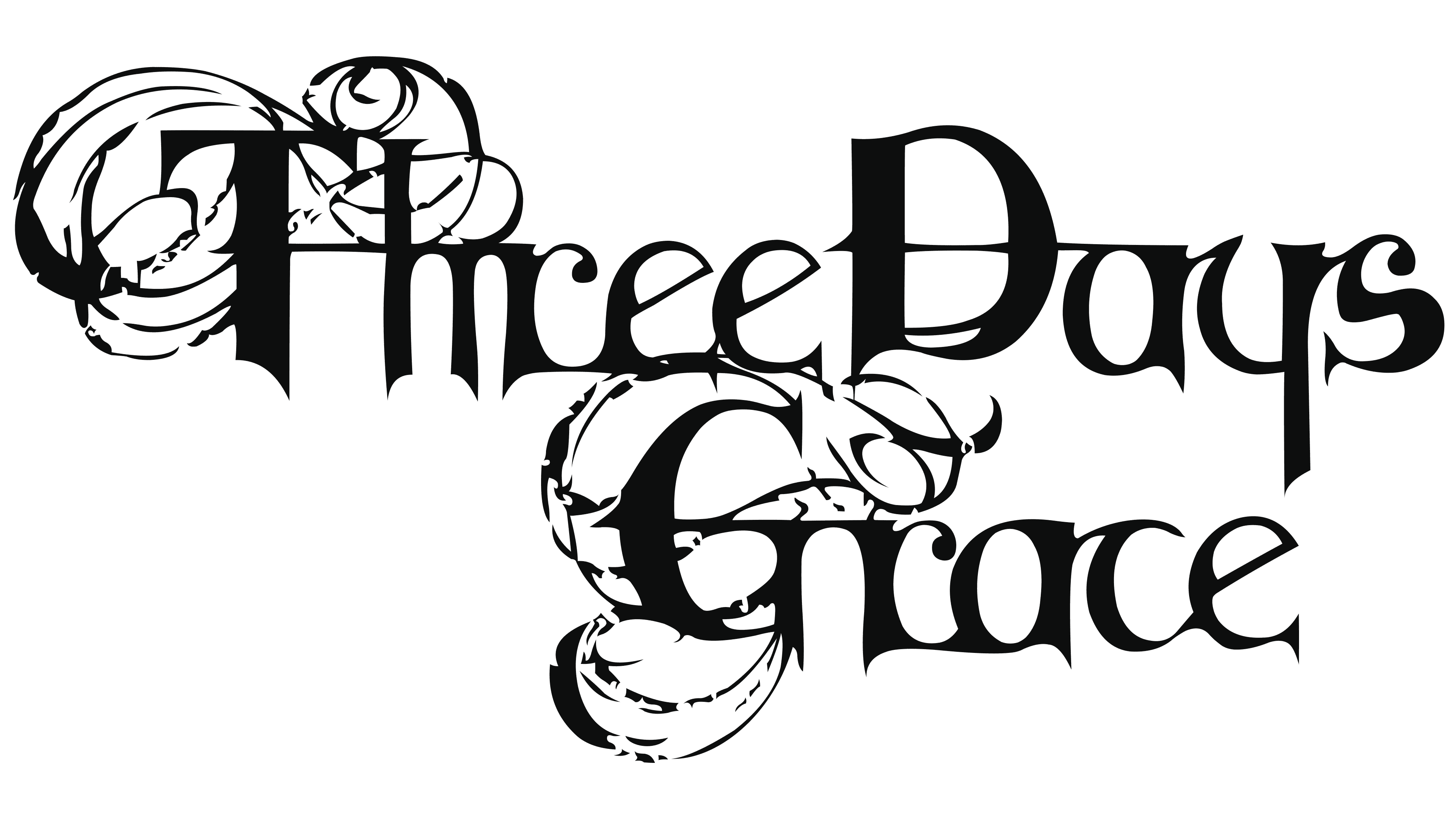
In 2006, with the release of the new album “One-X,” the band changed its star logo. All attention is focused on the inscription, which is set in a Gothic font with thin, intricate strokes. The letters “T,” “D,” and “G” are uppercase, and the rest of the letters are lowercase. They are written in a serif font reminiscent of the commercial Crewekerne Magna Expanded Bold. The bottoms of the characters are pointed, resembling miniature needles or spikes.
The emblem’s style is close to romantic and magical. This relates to the content of the new musical compositions on Adam Gontier’s album. It was very significant for the group’s guitarist that they were written in a rehabilitation center where he was undergoing treatment for drug addiction. The name’s color is white, and the background is black, both of which are very symbolic.
2018 – 2024
![]()
A revised version of the previous logo was released: it looks like the complete opposite of its predecessor. Black and white have switched places; all the letters are dark against a light background. The thin swirls disappeared; only the Gothic font with clear, ornate inscriptions remained.
2024 – today
![]()
Font and Colors
The three serifs used in the original version of the brand name are a nod to the tradition of heavy metal, which originated at the dawn of the search for an individual direction. They appeared at the light hand of Adam Gontier and expressed the idea of time’s transience. The tri-bar is the remaining three days, during which one must radically change one’s entire life.
