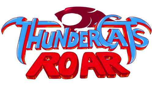
The ThunderCats logo is closely associated with the series and its characters. It reflects the power, energy, and determination typical of this animated universe. The recognizable graphic sign symbolizes the warrior spirit and strength of the cat warriors in their constant fight against evil.
ThunderCats: Brand overview
| Founded: | 1985-1989, 2011-2012(ThunderCats); 2020 (ThunderCats Roar) |
| Founder: | Tobin Wolf |
| Headquarters: | United States |
The original ThunderCats animated series appeared in 1985, at the height of the fashion for sci-fi cartoons. This was a Telepictures Corporation project, worked on by animators from Japan, as well as screenwriters, directors, and voice actors from the USA. In 1989, it became owned by Warner Bros. The new owners canceled the series, and only in 2011 was it rebooted under its familiar name. The creators canceled this show after the first season because parents considered it too violent. The next attempt to revive the story was made in 2020 and was also limited to one season due to poor toy sales. The idea of all three cartoons is the same: anthropomorphic cats are forced to leave their home planet to settle on Third Earth and fight local villains. This plot served as inspiration for comics, a video game, and a movie, which was still in the process of filming in 2023.
Meaning and History
In the 1980s, when ThunderCats was very popular, its souvenir merchandise and figures in the form of main characters were sold everywhere. Children played a video game with cartoon characters and collected stickers in the Panini album. Now the famous logo with the silhouette of a cat’s head in a red circle only evokes nostalgia. But fans of the franchise continue to ask the question: why does it depict a real animal with a stretched-out muzzle while all ThunderCats look like people?
There is no reliable information on this score, although similar images are found in the series itself. For example, some Cats’ Lair was decorated with the head of a growling panther. These are giant structures that resemble sphinxes and serve as an operational base for the main characters. Another reference to the ThunderCats logo is contained in the red magical stone Eye of Thundera, inserted into the hilt of the Sword of Omens. Usually, it looks like an eye with a thin pupil, but sometimes an animal’s black head appears on it – the same as on the brand emblem. By the way, in 2019, the car manufacturer Proton from Malaysia presented a similar visual symbol and caused a flurry of jokes on social networks.
What is ThunderCats?
ThunderCats is a franchise based on the eponymous series about anthropomorphic cats who traveled from space to the planet Third Earth. It aired from 1985 to 1989, was remade in an anime style in 2011, and a new humorous version of the cartoon series, akin to Gravity Falls and Adventure Time, emerged in 2020. ThunderCats characters have appeared in video games and comic books and were sold as an extensive line of toys.
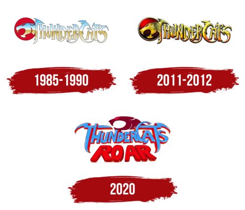
1985 – 1990
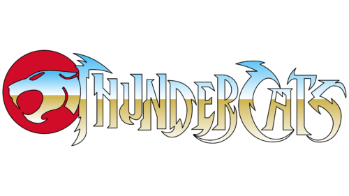
The logo of the original animated series, popular in the 1980s, contains a stylized inscription “THUNDERCATS” in uppercase. All letters are hand-drawn and adorned with sharp notches, emphasizing the energy, strength, and determination of the characters. On the left, there is a red circle – a reference to the magical stone Eye of Thundera. Inside, it is a silhouette of a panther’s head or another predator from the cat family. This element, like the name of the series, is visually divided into two parts: a blue top and a golden bottom. Both colors have a gradient, but the boundaries between them are distinct.
2011 – 2012
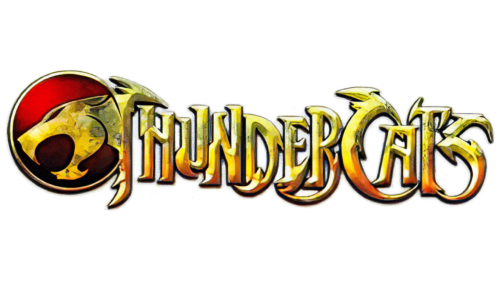
After the reboot of ThunderCats in 2011, the logo was updated. Designers modernized it by making the letters completely golden and outlining them with more noticeable black contours. The animal’s head acquired the same color, and the circle got a golden frame. Due to the use of different shades, shadows, and bright glares, these elements became visually voluminous. The red gem also seems three-dimensional, as it creates a strong contrast between the bright top and the dark bottom.
2020
In 2020, when a new version of the animated series was released, the mad humor of Gravity Falls and Adventure Time was in vogue. Everyone tried to imitate their jokes, and ThunderCats was no exception. This was reflected in its logo, which lost its former aggression. Now the distinctly sharp corners and notches are only present in the two “T” and “C,” while the other letters look standard, although they are hand-drawn. Underneath the light blue inscription “THUNDERCATS” is the red word “ROAR.” It consists of “lying” glyphs with rounded corners. The red circle was removed, and the panther’s head was repainted in marsala color and moved up. At the same time, it acquired atypical features, such as an overly open mouth and a glowing pink eye.
Font and Colors
In the early ThunderCats logos, a unique font with sharp lines of angular shape was used. It was created from scratch through lettering to underline the mystical and martial character of the series. In 2020, the style of the inscription changed, although some letters retained figurative elements. In this case, designers also developed an individual set of glyphs but made it softer.
If earlier the emblems predominated different shades of gold and red, then in 2020, the main color became a combination of red, light blue, and marsala. It is diluted with small inclusions of yellow, white, black, and orange, adding cartoonishness to the logo.
ThunderCats color codes
| Celestial Blue | Hex color: | #49a0f0 |
|---|---|---|
| RGB: | 73 160 240 | |
| CMYK: | 70 33 0 6 | |
| Pantone: | PMS 2925 C |
| Claret | Hex color: | #7e0129 |
|---|---|---|
| RGB: | 126 1 41 | |
| CMYK: | 0 99 67 51 | |
| Pantone: | PMS 7427 C |
| Medium Candy Apple Red | Hex color: | #e5112e |
|---|---|---|
| RGB: | 229 17 46 | |
| CMYK: | 0 93 80 10 | |
| Pantone: | PMS Bright Red C |
