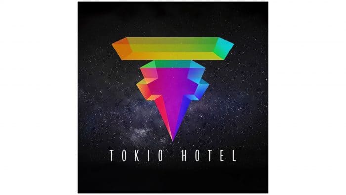
The Tokio Hotel logo embodies the diversity of pop music. It symbolizes the vividness of emotions, the colorfulness of feelings, and fans’ goodwill. Behind its strict geometry lies a refined atmosphere of love and happiness that should be approached with special care.
Tokio Hotel: Brand overview
| Founded: | 2001–present |
| Founder: | Bill Kaulitz, Tom Kaulitz, Georg Listing, Gustav Schäfer |
| Headquarters: | Magdeburg, Germany |
| Website: | tokiohotel.com |
Meaning and History
Formed as a band in 2001, the group used photographs as its emblem. Then, it contemplated a logo that would convey the essence of their creativity and worldview. Therefore, after a redesign, the performers got a real allegorical sign reflecting the concept of their songs. Throughout the history of the pop-rock group, there have been four emblems.
In all logo variants, monochrome predominates, harmonizing with the songs’ content, the group’s creative direction, and its unconventional concept. A separate round sign with an improvised cross made of the letters “T” and “H” is used as a constant marking. This is the abbreviated version of the logo.
What is Tokio Hotel?
Tokio Hotel is a German band that plays music in pop-rock, emo-pop, and pop-punk styles. It was founded in 2001 by four people: Gustav Schäfer, Georg Listing, and twin brothers Tom and Bill Kaulitz. Initially, the band was called Devilish and performed at small concerts. It was renamed in 2001 when it began collaborating with producer Peter Hoffmann.
Devilish 2001 – 2005
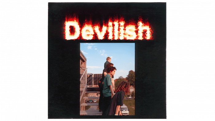
When the musicians were called Devilish, the logo had no graphic elements: only a snapshot with a fragment of the staircase on which (presumably) people stood. A light blue sky occupies the rest. Above the photograph is the group’s name in fiery letters of a juicy color. Both items are in a black rectangle. The contrast of idyllic calm and devilish fervor creates the right mood of unpredictability.
2005 – 2014
Over the years, another version of the logo appeared: a black rectangle with a white inscription. The first letters of the name are uppercase; the rest are lowercase. Below is the brand name – a creative reworking of the ideogram placed in a circle. All elements have gaps, holes, and veins, which look very effective against the black background (the letters themselves are white).
2014 – 2017
The Tokio Hotel logo consists of a word sign, executed in two different styles, and an individual symbol. Tokio is written in a slightly italicized handwritten font with bold lines, reminiscent of brush strokes of hieroglyphs. The letter “T” is elongated: from it to the left extends a straight and slightly shaggy line. A similar pattern is characteristic of the letter “o”: the line extending from it is directed to the right.
The word “Hotel” is written in the Insignia font with an elongated crossbar on the letter “H,” a rectangular serif on the letter “L,” and a semi-phantom letter “E,” which seems to emerge from a parallel reality. Above them loomed a sharp-pointed ideogram, stylized as a combination of “T” and “H.” It resembles a cross but has no religious undertones.
2017 – today
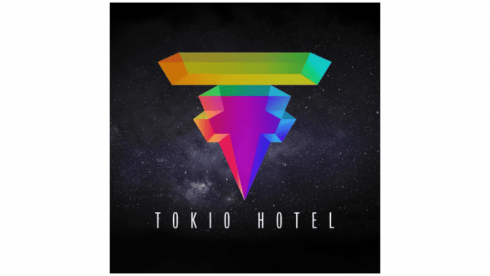
The modern format of the logo is a return to roots and origins. A black vertical rectangle, saturated colors, a light element in the center – all this speaks of this, despite the difference in the drawing. However, the style has been preserved – strict lines, even angles, geometric shapes. But now, the central element has become the personal sign of the music group Tokio Hotel. It looks voluminous thanks to thin, semi-transparent strokes, shadows, and color enhancement. The bottom part is pointed, and the top is wide. Below the bottom is the group’s name, executed in narrow white letters.
Tokio Hotel: Interesting Facts
Tokio Hotel is a band from Germany that became popular with their first album, “Schrei,” in 2005. The band members are Bill Kaulitz, who sings; Tom Kaulitz, who plays the guitar; Gustav Schäfer, who plays the drums; and Georg Listing, who plays the bass guitar. They mix different kinds of music like pop, rock, and electronic. People worldwide, especially teenagers in the late 2000s, liked their music.
- Twin Brothers: Bill and Tom Kaulitz, born September 1, 1989, are twins. Bill is known for how he looks and sings, and Tom is known for his guitar skills.
- How They Started: The band first formed in 2001 with the name “Devilish.” They played small shows until a music producer found them and helped them start their music career.
- Famous Worldwide: Their first album made them famous in Germany and in many countries, such as France, Italy, Russia, and the Americas. They even released their music in English to reach more fans.
- Awards: They’ve won many awards, including the MTV Europe Music Award for Best Interact in 2007 and the World Music Award for Best Selling German Artist in 2008.
- “Monsoon”: Their song “Durch den Monsun” (“Through the Monsoon”) was a big hit. The English version, “Monsoon,” was especially popular in English-speaking countries.
- Fashion: Bill Kaulitz was known for his unique fashion and hairstyles. He became a symbol for talking about gender and fashion in music.
- Taking a Break: The band took a break in 2012 after being very busy for years. They came back in 2014 with new music that had a different sound.
- Books and Movies: They have a book and a movie that tell the story of their band and what it’s like to be famous.
- Tom and Heidi Klum: Tom Kaulitz married Heidi Klum in 2019, which made more people pay attention to the band.
Although Tokio Hotel has changed a lot over the years, it has always kept its fans happy and shown that it can keep up with new trends in music and life.
Font and Colors
The path of identity development is a smooth, forward movement. There’s only one sharp jump – from Devilish to Tokio Hotel. Everything else is a modification of existing elements, with which the developers periodically change the design. The key feature is the personal icon consisting of encrypted symbols. These are “T” and “H,” the first letters of the name. Although their combination resembles a cross, they carry no religious undertone.
The group’s logo is based on the elegant Insignia font with some additions and corrections. The overwhelming part is designer strokes. They transform the inscription into a unique attribute. The logo’s color palette consists of a combination of the entire rainbow spectrum framed by a gradient. The background for it is black. Early versions are monochromatic.
Tokio Hotel color codes
| Mustard Brown | Hex color: | #c97208 |
|---|---|---|
| RGB: | 201 114 8 | |
| CMYK: | 0 43 96 21 | |
| Pantone: | PMS 152 C |
| May Green | Hex color: | #3e9b34 |
|---|---|---|
| RGB: | 62 155 52 | |
| CMYK: | 60 0 66 39 | |
| Pantone: | PMS 354 C |
| Heliotrope Magenta | Hex color: | #a509aa |
|---|---|---|
| RGB: | 165 9 170 | |
| CMYK: | 3 95 0 33 | |
| Pantone: | PMS Purple C |
| Han Purple | Hex color: | #4a1bdf |
|---|---|---|
| RGB: | 69 27 223 | |
| CMYK: | 69 88 0 13 | |
| Pantone: | PMS Violet C |
| Ruby | Hex color: | #e51958 |
|---|---|---|
| RGB: | 229 25 100 | |
| CMYK: | 0 89 56 10 | |
| Pantone: | PMS 192 C |
| Black | Hex color: | #000000 |
|---|---|---|
| RGB: | 0 0 0 | |
| CMYK: | 0 0 0 100 | |
| Pantone: | PMS Process Black C |
| Battery Charged Blue | Hex color: | #2ab7dd |
|---|---|---|
| RGB: | 42 183 221 | |
| CMYK: | 81 17 0 13 | |
| Pantone: | PMS 312 C |
