


![]() Tool Logo PNG
Tool Logo PNG
The sound range, rising and falling, is traced in the Tool logo. Sharp variations characteristic of rock music convey the group’s direction, and elements as if forged from metal complete the impression.
Tool began in Los Angeles in 1989, when Maynard James Keenan met guitarist Adam Jones. Keenan had moved to California after military service and art school in Michigan. At the same time, Jones had studied guitar with Tom Morello and played in Electric Sheep. After hearing Keenan’s demos, Jones pushed to form a band.
Danny Carey joined on drums after Morello introduced him to the group. Carey lived in the same building where Jones and Keenan rehearsed and first stepped in because other drummers failed to show up. Paul D’Amour became a bassist, and by 1990, the lineup was complete as Tool.
The band released the 72826 demo in 1991, then signed with Zoo Entertainment and issued the Opiate EP in March 1992. Tours with Fishbone and Rage Against the Machine followed. Undertow arrived in April 1993, reached No. 50 on the Billboard 200, and later went triple platinum. MTV pulled Adam Jones’s animated “Prison Sex” video in 1994 after limited airplay.
D’Amour left in 1995 and was replaced by Justin Chancellor before Ænima came out in October 1996. The album reached No. 2 in the US, went double platinum within 10 months, and earned Tool its first Grammy in 1998 for “Ænema.” Legal conflict with Volcano Records delayed the next phase, while Keenan formed A Perfect Circle with Billy Howerdel. Lateralus debuted at No. 1 in 2001; 10,000 Days repeated that in 2006; and Fear Inoculum ended a 13-year gap in 2019, as Tool finally released its catalog on streaming platforms.
Meaning and History
![]()
The group appeared in 1990 after its future members met in Los Angeles. While some of them performed on stage, others dreamed of a career in the film industry. Multi-instrumentalist Maynard James Keenan has been rebranding pet stores. Despite completely different ways of earning money, they were all fond of music, which eventually united them.
Initially, the musicians wanted to name their band after lachrymology, a philosophy they invented to better understand the benefits of pain in the human experience. But the group still chose the name Tool, thus comparing themselves with the tool needed to achieve their goals. No less creative rockers approached the design of CD packaging. Guitarist Adam Jones is responsible for most of the design concepts and is an animation artist. Therefore, it is not surprising that all the album covers look different; each has its own logo.
1991 – 1992
![]()
The emblem for the first demo album, 72826, was designed by the famous artist Cam de Leon. Since the artist’s main genre is surrealism, he played on the name “Tool” by drawing a wrench shaped like a phallic symbol. Thus, he expressed the idea that the band members themselves originally put into this world. The inscription “TOOL” takes center stage. The letters are lined up one by one from top to bottom, with a vertical handle. They seem to be engraved on gray metal. The tool is based on a black rectangle.
1992 – 2001
![]()
In 1992, the second EP, Opiate, was released. Cam de Leon also designed the cover. The ambiguous logo was replaced with a standard wordmark bearing the band’s name. It was red, and 2D on the CD packaging, but a 3D version with a black-and-gray gradient is now popular. She appeared in 2000 when the Salival album was released. The top of the inscription is grainy, with a slightly worn effect. The edges of the letters are outlined with a thin granite-colored contour. The font used belongs to the geometric serif category. Vertical strokes “T” and “L” are decorated with wide rectangular serifs.
The emblem on the cover of Ænima (1996) has a similar typeface but with different artwork. The black word is inside the light gray rectangle. It is crossed out by a blurry, dark line that divides the text vertically into two equal parts.
2001 – 2006
![]()
The new graphic symbol of Tool appeared with the release of the music compilation Lateralus in 2001. It looks like the band’s name is stylized as an Arabic inscription. All letters are in lowercase and connected by a common horizontal black stripe. Because the characters are also black, their shape can only be guessed from the protruding edges. The top edges of the “t” and “l” are cut at an angle of approximately 45 degrees. The tops of both “o” are pointed, and the intra-letter gaps are curved and shifted to the lower-left corner. The lettering is surrounded by a white gradient halo that creates a glow and separates the word from a uniformly dark background.
2006 – 2019
![]()
The album 10,000 Days pleased the fans with an updated logo. On its cover, the rock band’s name immediately catches the eye because the designers made the inscription “tool” large and white. The letters remained lowercase, but the font changed. Now it is close to a square-shaped geometric Antiqua. It is distinguished by high contrast: the strokes vary in thickness, creating a sense of dynamism. The first “t” and the last “l” are connected by two horizontal lines that run from above and below. They form a large rectangular frame with rounded corners, except for the serifs on the right side of the “l.” The bottom strip serves as the basis for all the letters.
2019 – today
![]()
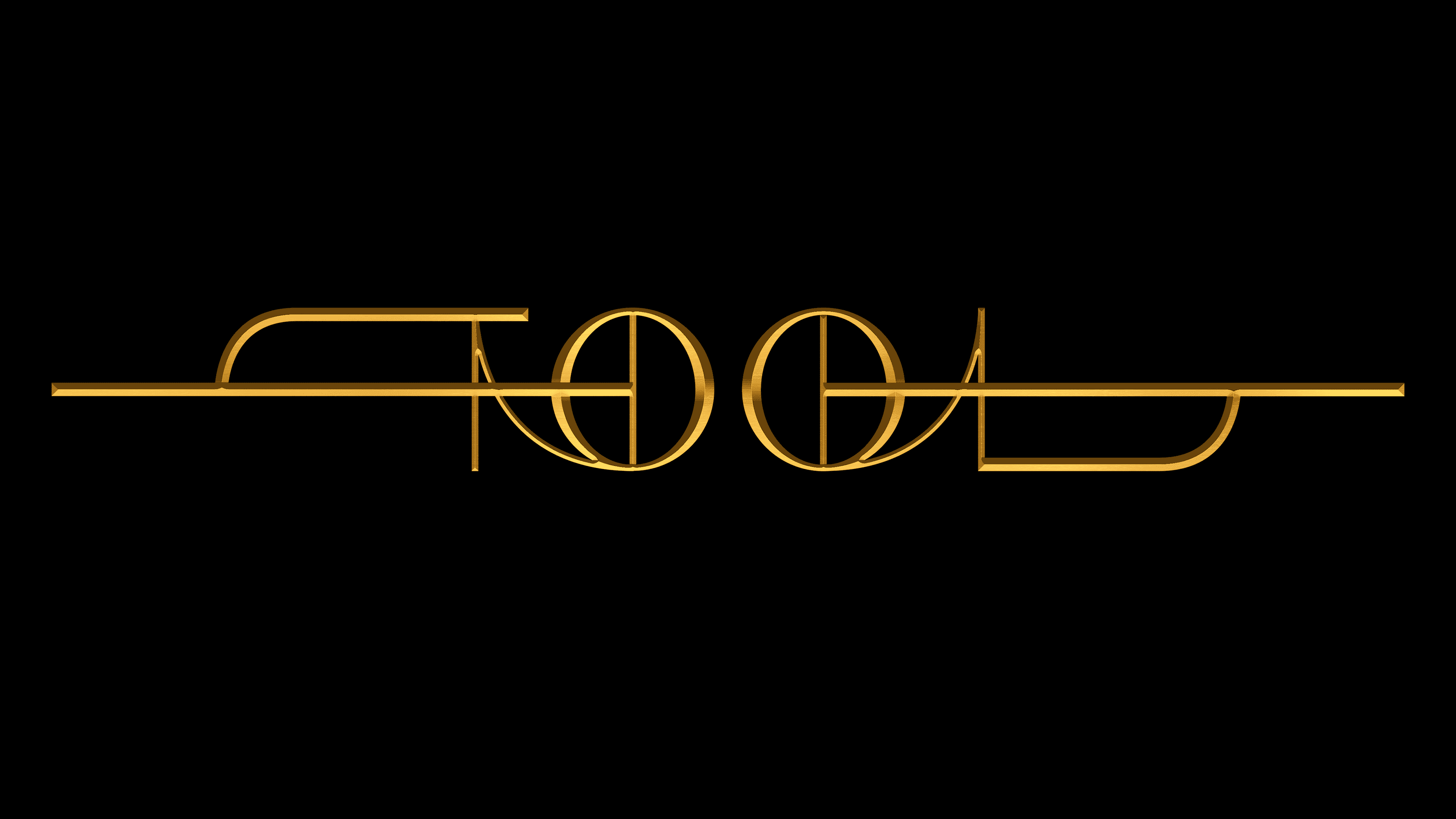
Ahead of their fifth studio album, Fear Inoculum, the band unveiled yet another “Tool” logo, this time an abstract, hard-to-read one. It was revealed in a teaser a month before the release of the music collection, replacing the outdated graphic sign used for the previous 13 years. Thus, the fans saw the emblem before they knew the album’s name and could see its cover.
The graceful symbol, composed of thin golden lines, marked the beginning of a new era in Tool’s history. It was first published on social media on July 21 and immediately attracted attention with its unusual shape. The word is made in a luxurious Egyptian style, and “T” and “L” do not look like letters at all – they look like mirrored curly elements. Symmetry is added because two identical “O” s are located in the middle. Each of them is divided in half by a vertical strip and connected to the adjacent letter: the left one with a “T” and the right one with an “L.”
Font and Colors
The tool’s identity shifts from an ambiguous symbol to an abstract inscription that resembles a work of art. The drastic change in style is probably due to the band’s musical evolution. The modern emblem looks more like a complex ornament than a text. At the same time, each line is in its place, forming a symmetrical, mirrored composition.
The current Tool logo is very abstract. The letters are individually designed and not always identifiable. First of all, this applies to “T” and “L,” which are connected to “O” by smooth semi-arcs and crossed out by long horizontal stripes. Both “O” s correspond to them in appearance: they are two circles, expanding at the edges and bisected by vertical lines.

Previous Tool wordmarks looked different. They became the basis for the non-commercial fonts 10,000 days (inspired by the 2006 album of the same name) and Systema Encéphale (based on the logo featured on the cover of Lateralus in 2001). Close to the typeface, 1992-2001 are Contra Slab ExtraBold and Calypso E ExtraBold, but they differ in several details.
The logos’ color scheme has always been restrained, dominated by shades of black, gray, and white. Thanks to its bright golden gradient, the last symbol stands out, evoking ancient Egyptian luxury and making the inscription feel voluminous. With a 3D effect, the designers imitate a metal surface: the reflections make it seem as if the letters are shining in the light.