The Toshiba logo is confident and bold. The emblem conveys the company’s progressiveness and technological excellence, passionate enthusiasm for the business and commitment to innovations. The symbol reflects the corporation’s scale and influence in the Asian market.
Toshiba: Brand overview
| Founded: | 11 July 1875 |
| Founder: | Tanaka Hisashige, Ichisuke Fujioka |
| Headquarters: | Minato, Tokyo, Japan |
| Website: | global.toshiba |
Incorporated on July 11, 1875, by pioneers Tanaka Hisashige and Ichisuke Fujioka, Toshiba Corporation is a renowned electronics conglomerate based in Japan. The company’s roots are twofold: one from Tanaka Engineering Works, founded in 1882, and the other from Tokyo Denki, initiated in 1890. These two entities merged in 1939 to create what was then known as Tokyo Shibaura Electric Co., Ltd., which later adopted the more recognizable name of Toshiba in 1978.
Over the years, Toshiba has been a trailblazer in diverse sectors. The company has been instrumental in developing and manufacturing power systems, social and industrial infrastructure solutions, electronic elements, and semiconductors. Additionally, it has ventured into hard disk drives, printers, batteries, and lighting technology. There was a time when Toshiba was also a significant player in personal computing, home electronics, household appliances, and medical devices. At its peak, it ranked among the top 10 semiconductor producers globally and was the birthplace of flash memory technology.
However, in the late 2010s, the flash memory division separated from the main corporation and was rebranded as Toshiba Memory, eventually taking on the name Kioxia. Thus, while Toshiba has experienced transformations over the years, its legacy in the tech world remains substantial, reflecting a history of diversification and innovation that spans well over a century.
Meaning and History
The formation of the company emblem is historically linked to the visual identity of the two companies that laid the foundation for Toshiba. The initial symbols, before entering the international market, were simple.
The designs took a circular shape as their basis, connecting the logos to electrical circuits since both companies were involved in electric appliances. In emblems from the late 19th to early 20th centuries, a close relationship with General Electric, which owned shares in both companies, was evident.
After the merger, up to the 1950s, the initial tendency of having inscriptions within a circle remained. In the mid-20th century, there was a shift toward European business models and European design trends for visual symbols. Then, the confident and concise Toshiba inscription first appeared, with which the company’s products are associated today.
What Is Toshiba?
A Japanese company at the forefront of mobile telephony. The founder of a major telecommunications operator, KDDI. Toshiba is a significant player in the electronics and technology market, specializing in computer technologies, energy, semiconductors, and communications. Operating successfully since 1875, the company has net earnings exceeding 1 billion dollars. The corporate headquarters is located in Tokyo.
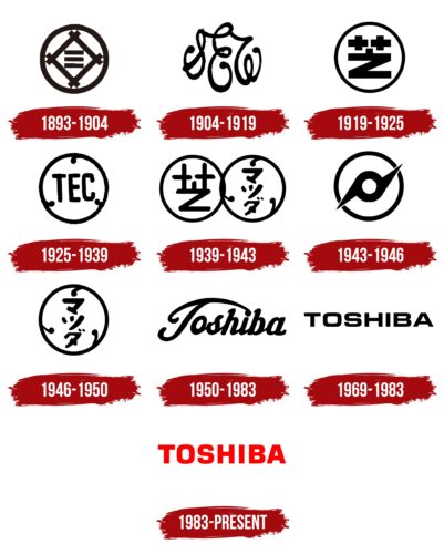
1893 – 1904
The logo is associated with Toshiba’s predecessor, Shibaura Seisakusho. This manufacturer of telegraph equipment was originally founded as Tanaka Seisakusho and later acquired and renamed by Mitsui Bank.
The emblem features a circle, representing harmony, order, and flawless operation. It brings to mind Japan’s flag, which features a circular sun.
Within the circle is a diamond made of intersecting lines. The design resembles an electrical circuit, indicating work with equipment, cables, and phone lines. The crossing lines in the emblem represent the primary function of a switchboard—to connect individual telegraphs. Each line resembles a separate wire leading to a specific device.
At the center of the figure are three parallel solid lines. In the ancient Book of Changes, these lines signified the sky. In the logo, they hinted at air-based communication and secure data transmission.
1904 – 1919
In 1904, the company was renamed Shibaura Engineering Works. The emblem of the period comprises three intricate capital letters: S, E, and W, interconnected.
The abrupt shift from clean, straight lines to flowing curves indicates a creative approach, flexibility, and a willingness to adapt for prosperity and growth.
The collaboration with General Electric, which bought a share of the company to help the Japanese conglomerate stay afloat, influenced the logo choice. The intricate symbols in the logo match General Electric’s emblem’s elegant G and E. Partnership with a large European company was considered highly prestigious, warranting special emphasis on the logo.
1919 – 1925
Toshiba expanded its operations into electronics and changed its logo. The new emblem reintroduces the circular base, within which a symbol resembling a schematic battery representation is a letter Z with two plus signs above it. The design accurately outlines the company’s direction of work.
Clear, confident lines showcase professionalism. A blend of past symbols and contemporary innovations reveals the manufacturer’s experience and ability to learn and build a future based on previous knowledge.
1925 – 1939
The 1925 logo relates to another company at Toshiba’s founding roots—Tokyo Denki or, in English, Tokyo Electric Company. Its founder, Ichisuke Fujioka, was acquainted with Thomas Edison himself. He established a firm to manufacture incandescent bulbs featuring a double coil, Hakunetsu-sha Co, subsequently renamed Tokyo Electric Company.
The company’s emblem featured a circle containing the uppercase letters TEC. Three slender, curlicue lines with dots at the ends were set within the circle. These lines symbolized the filament threads, abstractly depicting their placement inside a light bulb.
The circular shape of the emblem is a nod to electrical circuits, where a light bulb is often represented as a circle.
1939 – 1943
In 1939, Tokyo Electric Company and Shibaura Engineering Works merged to form Tokyo Shibaura Electric Company.
The emblem accurately reflects these events. It features two intertwined circular logos. The first contains the letter Z and two plus signs, while the second displays the Japanese name Tokyo Denki.
Both companies contributed their experience and valuable advancements, as the crisp, confident lines indicate.
1943 – 1946
During the war, the company continued to produce radios, radars, and other military electronics. The emblem still consists of a circle containing a double arrow that resembles gauges, a compass, or a propeller. The choice emphasized:
- Work with electrical equipment.
- Focus on both Western and Eastern customers.
- Ongoing growth and development.
- International expansion.
The firm clear lines indicated that the company knew its direction.
1946 – 1950
After the war, the company operated in Japan. According to new laws, Mitsui Bank could no longer support it, with which it had previously been a conglomerate. The new logo reverted to the circular emblem of Tokyo Electric Company, now featuring hieroglyphs. The choice spoke to a return to its roots.
The main focus in the late 1940s was the production of typewriters. Two thousand units were produced that were typed in Japanese and Chinese characters. This was another reason for reintroducing hieroglyphs into the company’s visual identity.
1950 – 1983
In the 1950s, the company first adopted Toshiba and featured it on the emblem. The new name combines two words, as two hieroglyphs are present in the Japanese text. The first part, “Tou,” means “east,” and the second part, “Shiba,” denotes “cambric,” a light fabric made of fine twisted yarn.
Interestingly, the words were extracted from the names of the two companies whose merger a decade earlier led to the birth of Toshiba. “To” comes from Tokyo Electric, and “Shiba” comes from Shibaura Manufacturing. The cambric analogy hinted at the merging, or “twisting,” that formed the basis of Toshiba’s inception.
The inscription used a capital font. The long, arched upper part of the T covered half of the word as if shielding it.
The design underscores the brand’s confident position as responsible for product quality. It indicates global expansion and distribution of products. Like a rainbow symbol, it promises prosperity and good fortune. Due to the unique “T” design, the logo of the period became known as the “umbrella.”
Toshiba significantly expanded its product range, adding computers, microwaves, and televisions to its catalog. A new English wordmark helped establish the brand’s image and make it memorable for European consumers.
1969 – 1983
At the end of the 1960s, structural reorganizations began within the company. A new director, Toshiwo Doko, was invited to the leadership team. He replaced existing managers and attracted investments by selling shares to Toshiba General Electric.
This reorganization also impacted the company’s identity, creating a new, modern, technologically advanced logo. The black, cast-like uppercase letters of the name introduced the rebranded corporation as an industry leader. Each element highlighted the equal importance of various product groups, collectively making the company strong.
Smooth, rounded corners and a wide, confident typeface made the letters harmonious and easily readable.
1983 – today
In the early 1980s, Saba Shōichi became the director and focused all efforts on the company’s technical development. Shōichi invested in research and automation. The logo was modified during this period to emphasize progress and innovation.
The lettering stretched upward, indicating the growth and scale of the corporation. Bold, substantial glyphs emphasized expansion and the launch of new subsidiaries.
Font and Colors
The red color of the inscription is a symbol of innovation. This color emphasizes advancements in computer technologies, flash memory, and semiconductors. The company has become a global leader in technology production and is actively involved in development projects. According to the company, this shade reflects passion and enthusiasm for the business.
The precise, sharply cut letters resemble the Quare 721 Std Bold font. The inscription conveys the scale and power of the company.
Toshiba color codes
| Red | Hex color: | #ff0000 |
|---|---|---|
| RGB: | 255 0 0 | |
| CMYK: | 0 100 100 0 | |
| Pantone: | PMS 1655 C |
