


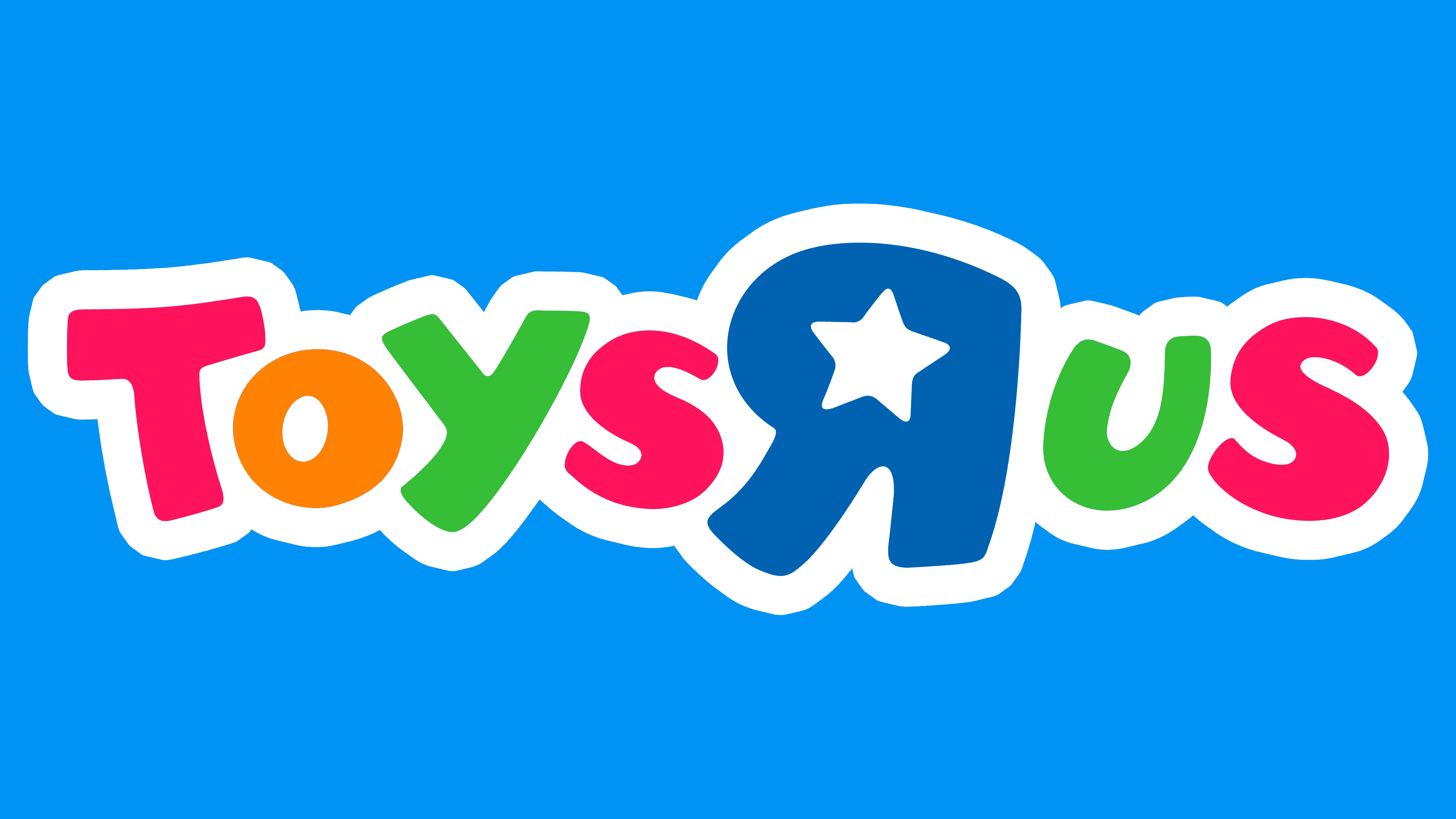
![]() Toys R Us Logo PNG
Toys R Us Logo PNG
The bright and cheerful Toys “R” Us logo perfectly reflects the company’s direction. Movable letters invite you to the world of childhood. The emblem shows that toys and children’s products are available on store shelves for every taste.
Toys R Us began in 1948, when 25-year-old Charles Lazarus returned from the army and opened Children’s Supermart in his father’s bicycle repair shop in Washington. With $5,000 in savings and a bank loan, he focused on the postwar baby boom and sold cribs, strollers, and high chairs.
Lazarus soon realized that toys brought families back more often than furniture did. He added rattles, plush toys, and board games, then opened Baby Furniture and Toy Supermarket in 1952. In 1957, the first Toys R Us store opened in Rockville, Maryland. The shorter name was used because the full version did not fit on the sign.
The chain grew through a warehouse-style format, offering thousands of products at prices 20-50% below competitors’. In 1978, it became Toys R Us, Inc. and went public. By 1983, it had 169 US stores and 12.5% of the American toy market. International expansion began in 1984 with Canada and Singapore, followed by Kids R Us in 1989 and Babies R Us in 1996.
By 1998, Walmart had passed Toys R Us as the largest US toy seller. A 2000 Amazon deal weakened its own online business. In 2005, Bain Capital, KKR, and Vornado bought the company for $6 billion, taking on heavy debt. Toys R Us filed for Chapter 11 in 2017, closed around 735 US stores in 2018, and later returned through Macy’s locations in 2022.
Meaning and History
![]()
This brand was created by the American entrepreneur Charles Lazarus. Her first stores opened in Washington, D.C., with children’s furniture as their main product line. The network’s first name is Children’s Bargaintown. There were many buyers, and demand for the products was high, coinciding with the post-war baby boom in the United States.
A few years later, the brand owner changed its focus: it began to sell only toys. The very first Toys “R” Us store opened in Rockville, Maryland. This happened in 1957. Lazarus also designed the emblem for him, styling it like a child’s lettering: he deliberately rotated the “R” to make it appear as if they were block letters “drawn” by a child. Moreover, the brand changed hands several times and went bankrupt (according to experts) due to a desire to increase traffic. After announcing a 24/7 toy sale, the company was forced to hire additional employees to handle the increased workload.
But during this time, she closed her stores in almost all markets, leaving only a few operating. In 2019, the new owner tried to revive it, but he also failed due to the coronavirus pandemic. More than 400 Toys “R” Us stores are slated to launch in North America shortly (2022), as announced in late summer 2021. At this time, the commercial center exists only in the Internet space and trades worldwide on the Amazon platform.
Over the years, the chain of children’s stores has changed its logo ten times. The first versions underwent drastic changes. Later versions underwent slight adjustments to the same elements, remaining almost unchanged.
1948 – 1957
![]()
The debut logo was simple and in the form of a banner. The sign above the entrance featured bold red letters. It was located above a blue ad line offering great discounts. Children’s Supermart had an uneven height: the central symbols were shorter than the side ones, so the inscription resembled an arch.
1957 – 1967
![]()
In 1957, the legendary transition to the current version took place: the line first appeared, which later became the trademark name. Another key image emerged, a mascot named Geoffrey the Giraffe, who uttered an iconic phrase about toys. An equally significant innovation was the mirrored Rs in all words. The emblem was monochrome and looked like separate fragments collected in one space.
1967 – 1969
![]()
The chain of stores was officially renamed Toys “R” Us. The name was written on a long truck driven by a mascot giraffe. At the same time, the logo appeared colorful: the animal was painted natural orange with black spots, the cabin was painted red, and the van was light beige. But the inscription turned out to be the most colorful: it consisted of purple, blue, green, and yellow bubble-shaped letters.
1969 – 1972
![]()
Only a fragment of a long trailer remained on the emblem, which the designers made black, making the text stand out more. Moreover, the developers have kept the brackets at the inverted “R” and lengthened them slightly to resemble a child’s raised hands in a fit of joy at the sight of numerous toys. This interpretation ideally echoed the brand name. Below, the slogan “The Children’s Bargain Town!” appeared in cursive handwriting.
1972 – 1976
![]()
During this period, unnecessary elements were removed for the first time. The designers retained only the words “Toys’ R ‘Us” on a plain white background. They added smoothness to the letters. At the same time, the characters were slightly straightened compared to the inscriptions in previous versions.
1976 – 1980
![]()
In 1976, the exclamation mark was removed from the emblem, and the letters were colored. “T” and “R” were dyed blue, “O” got dark beige, “Y” and “U” were olive green, and both “S” were burgundy. The bubble shape of the symbols has been retained.
1980 – 1986
![]()
The chain of children’s stores has adopted a very striking logo. Each letter has been painted a different color. The designers made T red, O yellow, Y, and the last S blue, R green, U orange, and S dark pink.
1986 – 1999
![]()
The developers again adopted a different color scheme, slightly altering the pletter palette. This time, the “T” and the last “S” were dark red, the “O” was orange, the “Y” and “U” were green, the center “S” was dark pink, and the “R” was yellow.
1999 – 2007
![]()
In 1999, a graphic sign appeared on the emblem: a dark blue star with five rays. It was aligned with the letter “R” and served as its background.
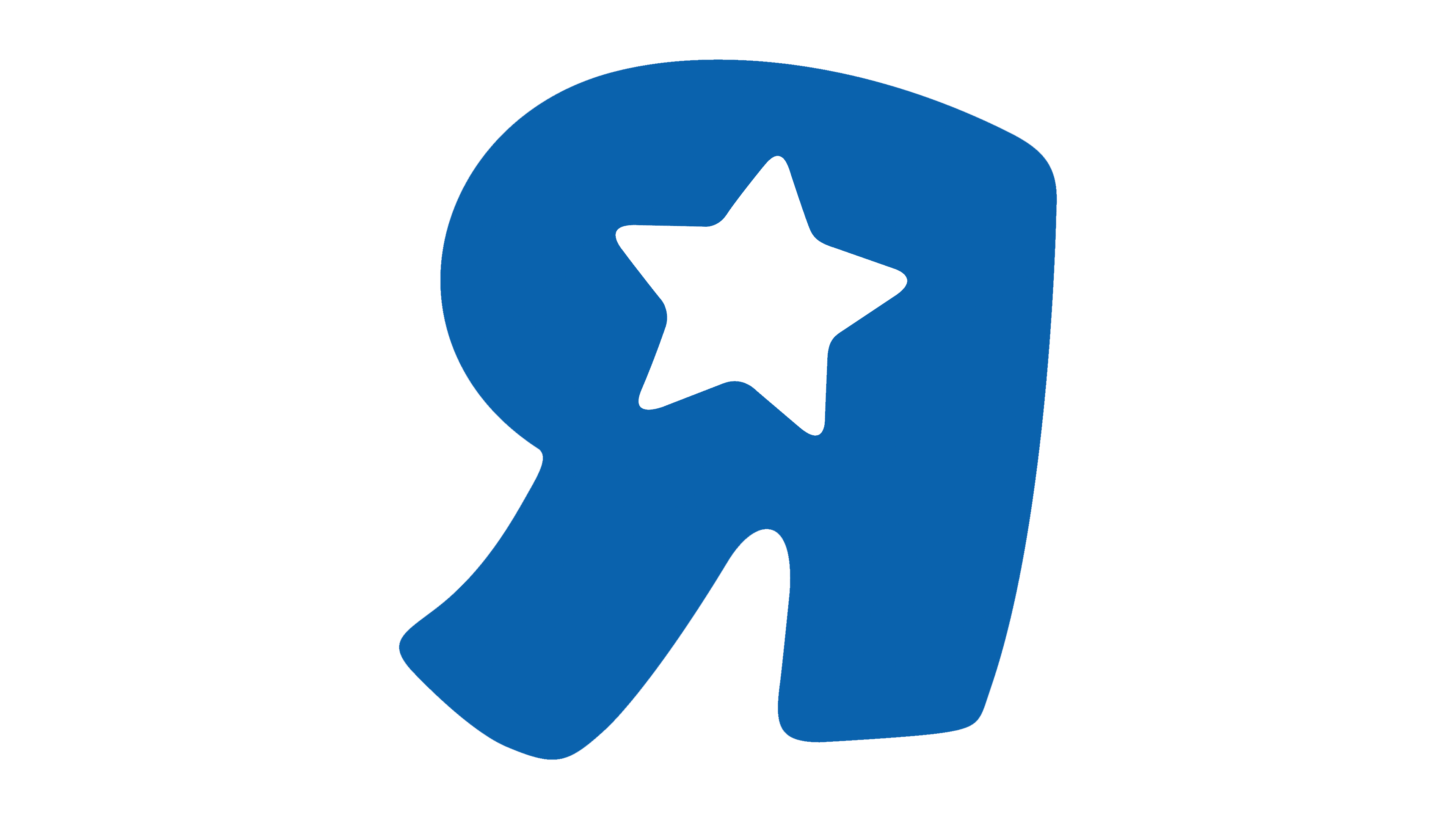
2007 – today
![]()
At the moment, the trademark for the sale of children’s toys uses a modified logo. The designers took the previous version as a basis and transferred the color scheme to the pastel spectrum. In addition, they increased the “R,” making it much larger than the rest. There is now a miniature white star in the center: it is an in-letter lumen. Some symbols have been changed.
Font and Colors
The store logo is dominated by text. This is because he needs a sign with a name that not only attracts attention but also serves other functions. For example, it served as an advertisement, an identification mark, and an information element, and it still performs these roles well. The letters were in uppercase from the very beginning. A graphic image appeared recently in the form of a small star. True, for a long time, the role of the corporate symbol was played by the rotated “R,” reminiscent of the Cyrillic “I.”
The toy and children’s goods store chose a bouncing font for its name. He conveys childish pranks and high spirits. The so-called bubble typeface is smooth, streamlined, and wide as if puffed up. It brings in some elements of play and dynamics.
To maintain the logo’s cheerful atmosphere, the company opted for bright colors. Her color scheme is dominated by red, dark pink, green, yellow, orange, and blue. But early versions are made in a restrained monochrome palette.