![]() Trippie Redd Logo PNG
Trippie Redd Logo PNG
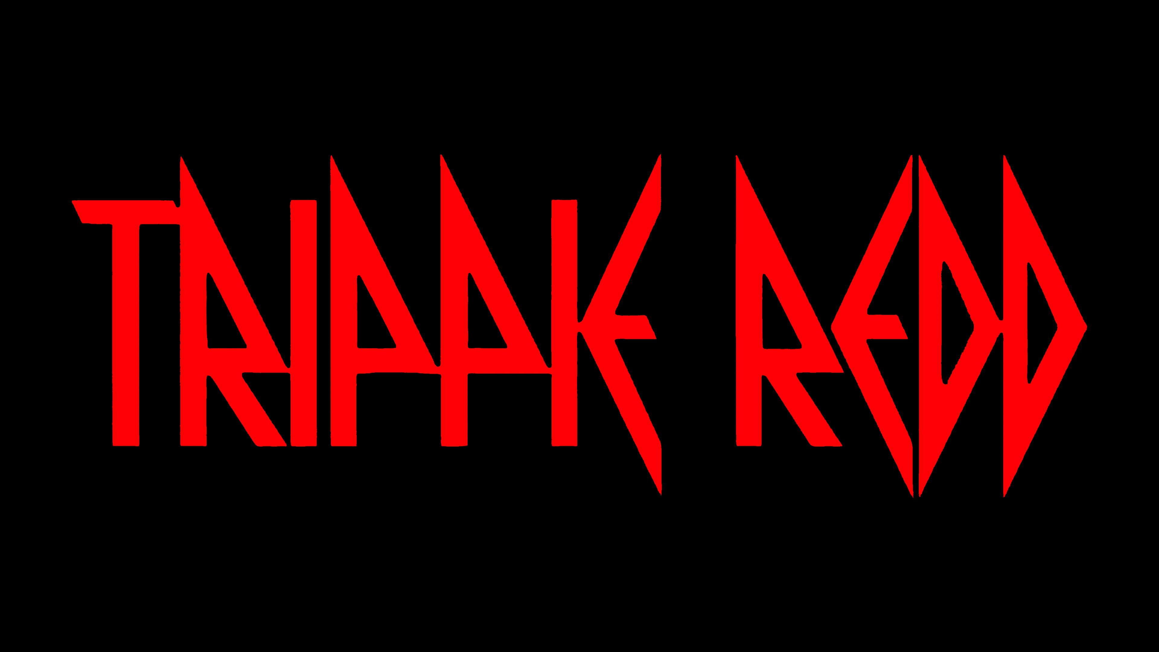
Trippie Redd’s logo has a rocker vibe, even though it belongs to a rapper. The same can be said about his music, which mixes various genres. The artist’s eclecticism is reflected in his emblem, challenging conventional norms.
Meaning and History
![]()
Trippie Redd’s logo is as ambiguous as his art. The American hip-hopper enjoys genre-blending, so his music combines seemingly incompatible styles: melodic rap, heavy metal, energetic rock and roll, and rhythmic R&B. The artist’s emblem is also eclectic, as it doesn’t indicate that it belongs to a rapper. The inscription is in a Greek style yet looks aggressive, resembling a rock symbol. Its red color resonates with the rapper’s stage name. Initially, he wanted to adopt another pseudonym: Trippie Hippie. Since a group with that name already existed, the second word had to be changed.
What is Trippie Redd?
Trippie Redd is the alias of a rapper whose real name is Michael Lamar White IV. He started crafting songs in school, but began his professional career only in 2016. His debut album, Life’s a Trip, was released in 2018. He is known for his eccentric appearance, controversial behavior, and love for mixing different musical genres.
The phrase “TRIPPIE REDD” is written in large letters with a non-standard design. The chosen font lacks curves, featuring straight lines, pointed corners, and sharp cuts. Many elements have a triangular shape; for example, both “D” s and the upper parts of “R” and “P.” As for the “E,” it resembles an arrow pointing to the left. Nearly all glyphs are connected, forming whimsical shapes. Sharp ends of some letters exceed the boundaries of the baseline. This symbolizes that the rapper doesn’t confine himself or his art to strict limits. He is not limited to one musical genre but tries to encompass various styles. The bright red color of the inscription signifies Trippie Redd’s passion for music and his expressive style, manifested in his songs and appearance.
Font and Colors
The stage name “MC” is set in a font resembling Pyrite by Typodermic Fonts. This typeface with angular characters draws inspiration from heavy metal aesthetics. The scarlet shade of red aligns with the chosen design, invoking a sense of danger. This is the color of passion and aggression.