The Tuborg logo shows the preservation of a unique recipe that was used by the creators of the foam centuries ago. The logo spreads information about the product everywhere.
Tuborg: Brand overview
| Founded: | 1873 |
| Founder: | Carlsberg Group |
| Headquarters: | Fredericia, Denmark |
| Website: | tuborg.com |
Tuborg is a 4.5% to 5.6% low-fermented beer brand produced at its eponymous plant in Denmark. It is one of the most famous brewing brands, and its products are distributed in more than 100 countries and produced under license in almost 25 countries in Africa, Asia, and Europe. The company was founded by four industrialists who formed a business alliance: Philip Heyman, Rudolph Puggaard, Gustav Brock, and C. F. Tietgen. Today it is owned by the Carlsberg Group. The head office is in Fredericia, Denmark. The time when the alcohol brand appeared was 1873. The first pilsner was brewed in 1880.
The company’s roots go back to the second half of the 19th century when a brewery appeared in Copenhagen, built by the Danish businessman-financier Carl Frederik Tietgen. He teamed up with three entrepreneurs led by Philip Heyman to launch the beer brand. They introduced a light, low-fermented alcoholic beverage with an unobtrusive hop flavor and called it Tuborg. The name refers to the local Thuesborg, which translates as “Thue’s castle.” It is located in the vicinity of a 17th-century hotel and was the basis for the brewery’s name. And it, in turn, gave the name Tuborgvej of Copenhagen.
The beer was successful and widespread not only because of its taste qualities but also because of the bottles in which it was poured. First of all, Tuborg was the first company in Denmark to offer beer in portioned containers instead of kegs. Secondly, it was easier to deliver the product to all corners of the country and abroad, expanding its distribution area. Three years after the company was founded, it immediately started making its famous Tuborg Green line, and five years later, it launched Tuborg Gold.
In 1894 a historical event happened: 11 breweries from Copenhagen were united into one group called The United Breweries. Its main task was to compete with the Carlsberg brand. However, in 1903 Tuborg agreed with Carlsberg to split the supply and income, dividing the market in half. In 1970 both plants were taken over by Carlsberg A/S. Then the Copenhagen plant was taken over by BBH (Baltic Beverages Holding). But after a few years, the situation changed, and Carlsberg and the Tuborg brand took it over.
Meaning and History
With over 140 years of brewing history under its belt, Tuborg strives to maintain a modern, creative, and youthful image, as it doesn’t want to be associated with a product “for old people.” However, its pocket watch-shaped logo continues to be used today, albeit in a redesigned form. The original version of the logo was created by Philip Wulff Heyman, co-founder of Tuborg Brewery, who understood marketing well. The crown on the label appeared in 1915 when the beer maker was granted the status of a purveyor to the court.
What is Tuborg?
Tuborg is a Danish beer brand and the company name that produces it. It was founded by a group of businessmen led by Philip Heyman, whose descendants were at the head of the company for a long time. The brewery was opened in 1873 on the outskirts of Copenhagen, in Hellerup Harbor. It brewed its first pilsner in 1880 and then introduced several variations to the market. Since 1970 the brand has been part of the Carlsberg Group and exports to more than a hundred countries worldwide.
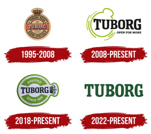
1995 – 2008
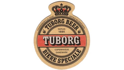
The logo is divided into two zones: graphic and text. The first part is an image of the imperial crown. The attribute of monarchic power is colored in gold and studded with precious stones of round, rhombic and rectangular cuts. On the crossbars are drawn large white pearls. The cloth side is dyed red, and a figure cross crowns the whole with four-fingered rounded ends. The bottom of the crown is black, as are the dividing lines.
Below is the name of the brand Tuborg, made in a grotesque style and painted gray. At the same time, a shadow falls from each letter. This inscription is the largest on the label, so it immediately attracts the attention of beer lovers. Now it is not used on all brands of beer.
2008 – today
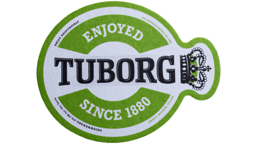
An actual variation of the emblem is used on bottles, cans, and caps. It is a cap: around the element with a ring at the top for tapping the beer. One of the variants has the word “Tuborg” in the center. It is inclined and almost reaches the vertical. The letters are black, with white stripes on the left, extending from the center to the edges. On the right and left sides of the brand name are wide arches that bear inscriptions of informational content: the type of beer, the place of production, and the year of the first pilsner.
The basic version of the modern logo is schematic but also has the shape of a cap with a ring for uncorking. Around it are arc-shaped strokes of different lengths. The name of the beer producer is located horizontally and decorated with large serifs. All elements are colored in lettuce or black and applied to a white background.
2018 – today
The logo features a large “TUBORG” inscription, with thin dark stripes serving as the background. The black letters with gray shadows appear two-dimensional. A green arch-shaped quadrilateral is depicted at the top, and a mirror image, curved in the opposite direction, is shown at the bottom. The first fragment contains the white word “ENJOYED,” and the second – the phrase “SINCE 1880”. A font with rectangular serifs is used for these inscriptions. The traditional Tuborg crown is located to the right of the brand name, a reminder of the rich history of alcoholic beverages. All elements are placed in a white circle with a protrusion, surrounded by a wide green stripe.
2022 – today
The beer manufacturer did not abandon the motif of “pocket watches” but decided to bring an exquisite wordmark to the forefront. The rebranding was planned as early as the end of 2020. At least that’s when Tuborg signed a contract with the British design studio Robot Food, which won the tender to update the corporate identity of the Danish company. Work on the emblem was carried out almost throughout 2021. Designers had to rejuvenate the brand and show that it is not only intended for older generations. Tuborg’s owners were concerned that modern youth make decisions based on the “all or nothing” principle and reject old beer brands as uncool.
The agency tried to attract the target demographic’s attention with a wordmark corresponding to the fashionable principles of minimalism. Typographer Rob Clarke worked on the font of the new logo. He came up with a version that fits comfortably on the curve of the packaging. Now all letters have a smooth shape and serifs with rounded corners. The designers kept the traditional green color but chose a darker shade that is associated with confidence, freshness, and reliability.
Font and Colors
Tuborg prefers to use several logo variants for marking the individual beer lines. They have the name in common, which appears on all the labels. Some of them are also characterized by a crown placed under the text part. It has become the main link between the beer, its founders, and its place of origin.
The beer brand’s key association has passed on from generation to generation has to do with its unchanging Stenskriften for upper case letters and Cheltenham for lower case letters. The color palette, too, is stable: green in several shades and neutral white. The red, gold, and black appear from time to time, depending on the type of beer and the container in which it is placed.
Tuborg color codes
| Bottle Green | Hex color: | #016241 |
|---|---|---|
| RGB: | 1 98 65 | |
| CMYK: | 99 0 34 62 | |
| Pantone: | PMS 3415 C |
