


![]() Turk Telekom Logo PNG
Turk Telekom Logo PNG
The modern communications market is diverse, says the Türk Telekom logo: the choice is the user’s home, mobile phone, Internet, or Wi-Fi. The emblem is a prototype of modern technologies. This shows the company’s commitment to meeting the needs of all customers.
Türk Telekom traces its roots to 1840, when the Ottoman Empire established a postal service in Istanbul. With the arrival of telegraph technology, the system expanded. In 1855, the first telegraph line linked Istanbul with the European part of the empire. Over time, postal, telegraph, and telephone services were consolidated into PTT. For decades, PTT operated as a state monopoly, managing all telecommunications nationwide.
In 1994, GSM mobile services were introduced in Ankara, Istanbul, and Izmir. On April 24, 1995, telecom operations were separated from PTT and formed into Türk Telekom, while postal services remained under PTT. In 1998, the government issued 25-year GSM licenses to Turkcell and Vodafone Turkey, opening the market to competition. In 1999, Türk Telekom launched ADSL and created Aycell to develop its mobile network.
In 2001, the company established TTNET as an internet provider. In 2004, Aycell merged with İş-TİM, backed by İş Bankası and Telecom Italia Mobile, forming a new operator that later became known as Avea.
Privatization was completed on November 14, 2005, when 55% of shares were sold to Oger Telecom. In 2008, 15% of shares were listed on the Istanbul Stock Exchange, raising $1.9 billion. Avea launched 3G services in 2009. In 2016, all brands, including Avea and TTNET, were unified under Türk Telekom. In 2018, financial issues at Saudi Oger led creditors to take control of the stake. In 2022, Turkey’s sovereign wealth fund reacquired a 55% stake, restoring state control.
Meaning and History
![]()
This Turkish operator’s professional career was unsuccessful, as he underwent many trials. One of the biggest was a financial crash. In the summer of 2018, international and local banks took tight control of the telecommunications organization’s activities due to unpaid debts totaling several billion dollars.
To prevent a default, creditors had to develop a special mechanism to resolve the situation, including its acquisition. As a result, more than half of Turk Telekom’s shares are now owned by Levent Yapılandırma Yönetimi A.Ş., and 30 percent by Turkey’s Undersecretariat of Treasury.
Over the years, the company has expanded significantly. Over the years, she acquired competing companies, opened subsidiaries, and was engaged in mergers. Active work with multiple transitional stages could affect the official symbols: the company changed its logo in the most crucial periods.
What is Turk Telekom?
Türk Telekom is the leader in Turkey’s telecommunications market. Established in 1995, it is a state-owned company. Its responsibilities include providing fixed and mobile communication services, digital television, internet services, cloud services, and more.
1995 – 2016
![]()
The Turkish company received its identity after separating from the postal sector and transitioning to telecommunications services. It fully aligns with the thematic direction, as reflected in the symbolism. This also confirms the company’s arrival on the market in a new capacity: as an operator and a provider. The emblem is made as a horizontal rectangle divided into two identical halves. As a result, two equivalent squares were produced.
A graphic part on the left is a dark blue arrow on a light blue background. It reflects the communication of information to multiple clients and the delivery of services at scale. Small squares of white and blue colors are randomly located on and around the signpost. They mean the union of users into one common thread.
On the right is a dark-blue square bearing the company’s name. It is divided into fragments and written in three lines: the top line reads “TÜRK,” the middle line “TELE,” and the bottom line “KOM.” The adjacent arrow points to it.
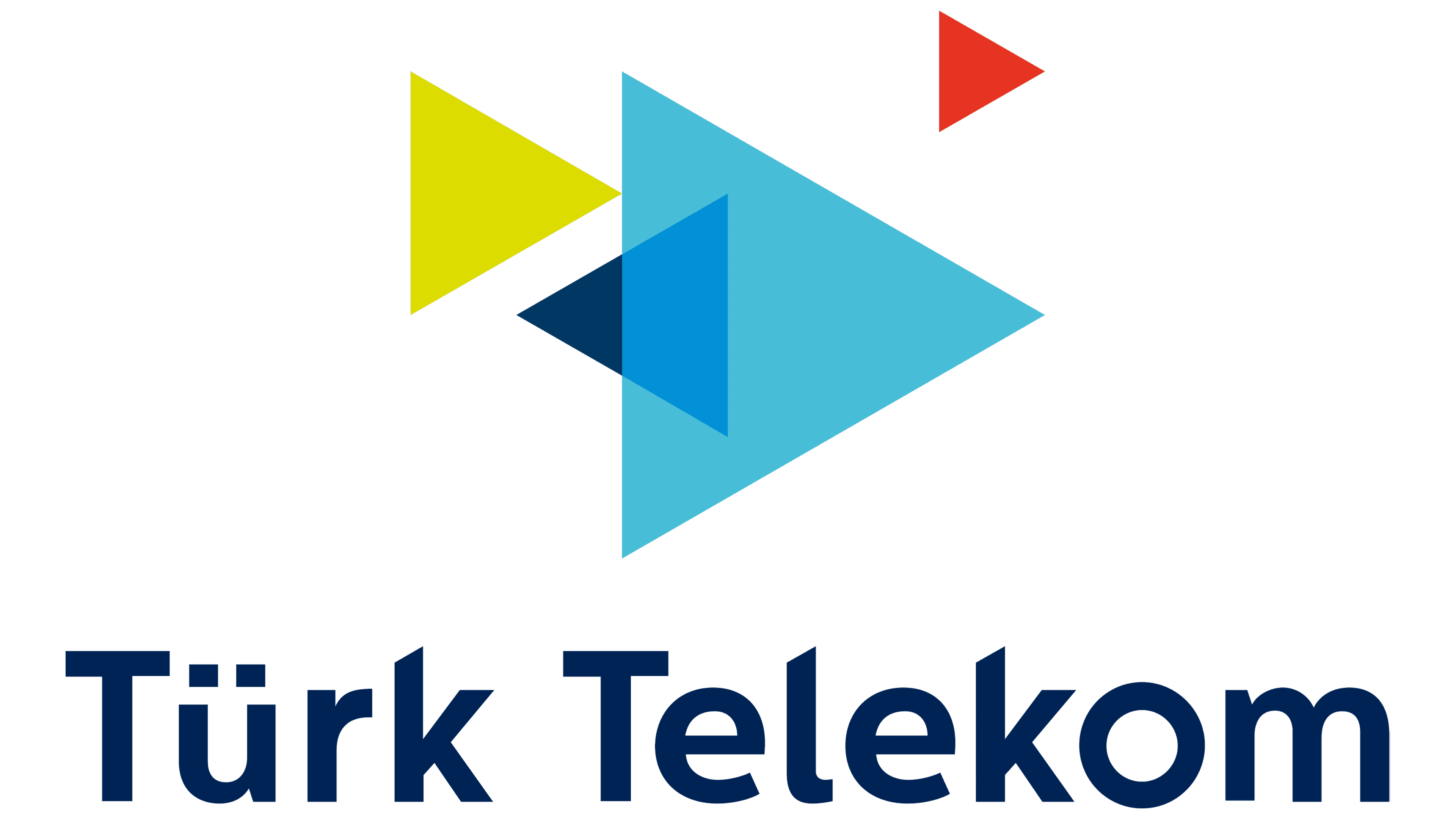
2016 – today
![]()
After a difficult financial stage with the takeover of Levent Yapılandırma Yönetimi A.Ş., Turkey’s telecommunications network adopted a new logo. The designers have modernized the design while retaining the iconic elements. In particular, the title and index. They just creatively reworked them, changing the location and appearance.
Now, the icon does not have a single arrow but several different-sized ones. Moreover, the signs are stylized and allegorically combined with small details: small triangles are depicted on the emblem. Even though they are randomly scattered and painted in different colors, they are all turned the same way, to the right. The phrase “Türk Telekom” is executed in blue letters on a white background on the left side.
If you trace the path of logo modification, you can note several important factors. First and foremost, the identity is fully consistent with the concept and objectives of telecommunications services. Second, the logo’s content is simple and intuitive. The debut and current versions use the same elements: the company’s name, signs, and several minor parts.
However, the current version lacks the geometric figure that previously denoted the frames. Consequently, the operator has exceeded the usual boundaries and constantly expanded its influence. Interbrand, Chermayeff, and Saffron Studios worked on the logo various times. Some focused on graphics, others only on letters.
Font and Colors
The developers chose the Centrale Sans typeface for the branding, which is based on an older version of Gotham. The similarities between them can be traced through the letters “Ü,” “R,” and “K.” Following the canons of harmony, the authors arranged for the triangles and letters to correspond simultaneously. How? They cut off the protruding elements at the same angle as the edges of geometric shapes.
Apart from this, the letters have several other interesting features. The first is “Ü” below the rest of the lowercase characters. The second is that “o” is greater than “e,” although they should be the same shape. The third “r” does not match the rest of the font’s design. The color scheme includes navy blue, cyan, red, and vivid green.