


![]() Twisted Tea Logo PNG
Twisted Tea Logo PNG
The refreshing note of an invigorating summer mix of iced tea and lemon in the beer can is reflected in the emblem’s elements. The Twisted Tea logo represents a drink with a harmonious blend of unusual flavors, setting it apart from the usual foamy varieties.
Twisted Tea came from Boston Beer Company, founded in 1984 by Jim Koch and Rhonda Kallman. Its first product, Samuel Adams Boston Lager, quickly gained attention after winning at the Great American Beer Festival. By the late 1990s, Koch was looking beyond craft beer as Mike’s Hard Lemonade and Smirnoff Ice helped build the “malternative” category.
Boston Beer already brews Tradewinds Tea, so making a hard iced tea that fits its production setup makes sense. In 2000, the drink launched as BoDean’s Twisted Tea, named after two Boston Beer employees, Bo and Dean. The name soon caused trouble after an ad referenced the rock band BoDeans without permission. The band sued, and in 2001, Boston Beer relaunched the product as Twisted Tea.
Early sales started in rural parts of New Hampshire and Maine. The company first expected to reach women and rural shoppers, but the strongest base became working-class men. While Mike’s Hard Lemonade and Smirnoff Ice led the broader flavored malt beverage market, Twisted Tea found space between sweet alcoholic drinks and regular iced tea.
The 2006 “Tea Partay” campaign brought national attention. Growth accelerated later, with retail sales rising 185% from 2016 to 2021. In 2021, the brand sponsored Team Twisted Tea Suzuki, and Boston Beer partnered with Beam Suntory on Twisted Tea Sweet Tea Whiskey. By 2022, it was the top alcoholic tea in the US. In 2023, Twisted Tea Extreme launched at 8% ABV. In 2024, shipments reached 3.15 million barrels, accounting for about 57% of Boston Beer’s total volume.
Meaning and History
![]()
Alcohol from malted barley is 5% strength, as indicated on cans and bottles. At the same time, it is positioned as “strong green tea” – a phrase that complements the brand name in the logo. And this is not just an advertising slogan: the drink is made from tea leaves and real lemon. The malt only emphasizes the piquancy of the taste.
The Boston Beer Company experts proceeded from the fact that the product must fully comply with the instructions on the packaging. So, they found the perfect recipe by balancing the alcohol-to-other-ingredients ratio. Over time, new varieties of Twisted Tea were introduced, including peach, raspberry, and half-and-half. The last option is to imitate the Arnold Palmer soft drink, in which lemonade and tea are mixed in equal parts.
As of today, the brand has several variations of its logo, each used in different contexts. Despite the differences, all versions share a common brand style, with multiple inscriptions and the symbol of a rising sun in every variation.
What is Twisted Tea?
This distinctive alcohol brand combines a malt base with natural tea. The unique recipe blends tea extract with malt, creating a refreshing taste with a harmonious balance of sweetness and a hint of tea bitterness. The lineup includes fruity variations such as lemon, peach, mango, and raspberry, as well as the classic Original with black tea. Each drink contains 5% alcohol and is packaged in signature yellow cans and bottles with the brand’s logo.
1921 – today
![]()
The first malt drink logos were bright and multicomponent. In the center was an image of an oval sun with 18 elongated rays. Because of its shape, the emblem looked more like a burning star or a flash of an explosion. The middle was light yellow, and a darker shade was used for the rays. Two orange stripes were drawn along the edges of each process, creating an effect of depth.
The sun served as the backdrop for the blue word “TWISTED TEA” arched out. The first “T”s were slightly taller than the others. At the same time, both words seemed voluminous because of the light blue lines. Additional inscriptions were next to the name: “The Original” at the top and “Hard Iced Tea” at the bottom. They were framed on the sides with curved stripes. On the packages, the logo was accompanied by product information. On the lower beams, the word “Naturally Sweetened” stood out, and just below it, “5%” inside a small blue sun with the words “Alcohol By Volume.” The last phrase was in the form of an arch, curved in the opposite direction, and was decorated with bold dots along the edges.
2020 – today
![]()
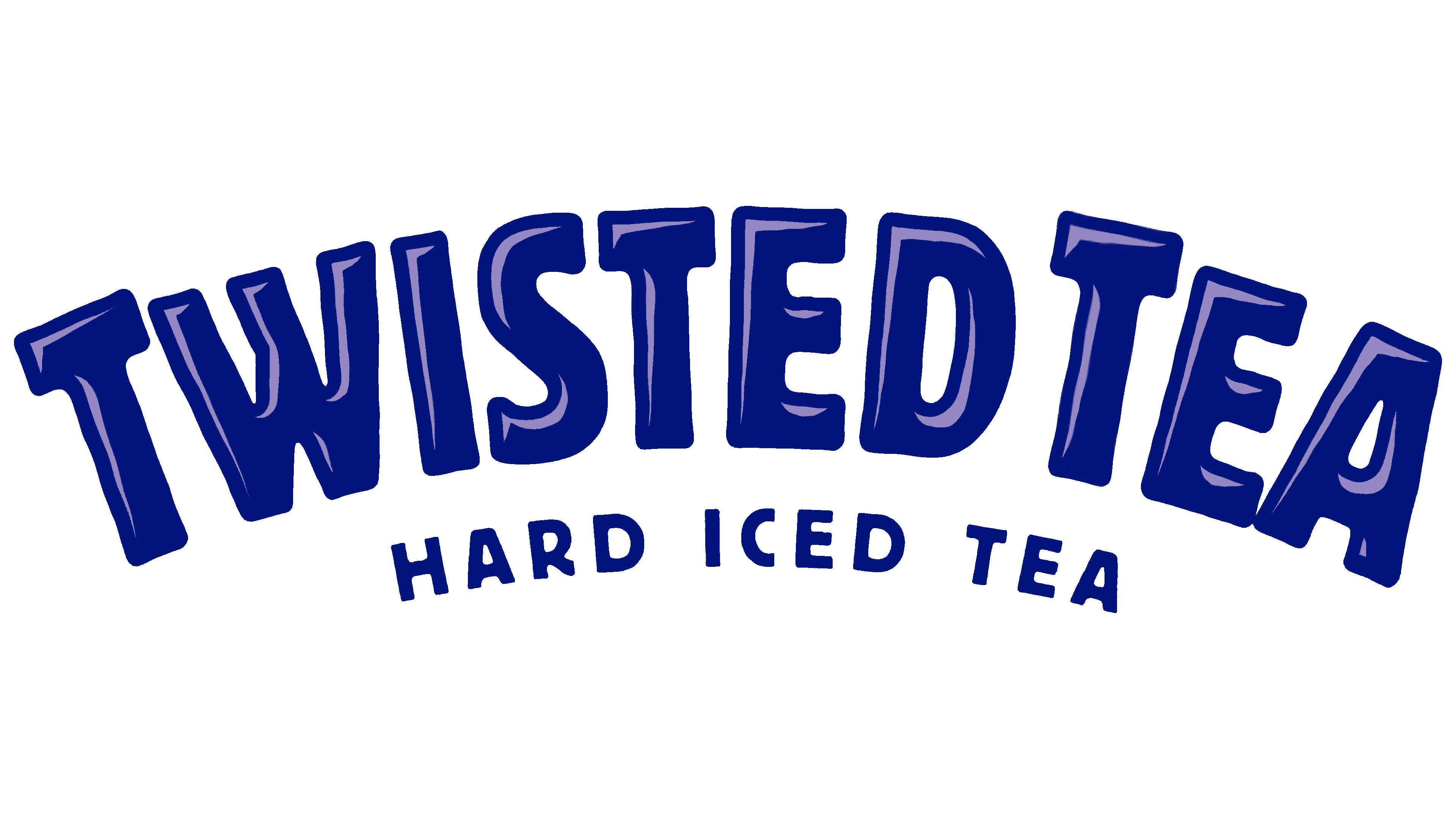
The modern malt drink logo has a more minimalistic look. The designers retained the arched “TWISTED TEA” lettering and kept the overall letter proportions, but made them two-dimensional by removing the extra light-blue shadows. The phrase “HARD ICED TEA” was changed to uppercase and stripped of its framing stripes. All other text is gone, as is the big yellow sun in the background.
Now, the sun’s silhouette is guessed in the negative space created by seven short rays arranged in a semicircle. The graphic element is directly above the inscription, so the sun seems to be rising from the horizon.
2022 – today
![]()
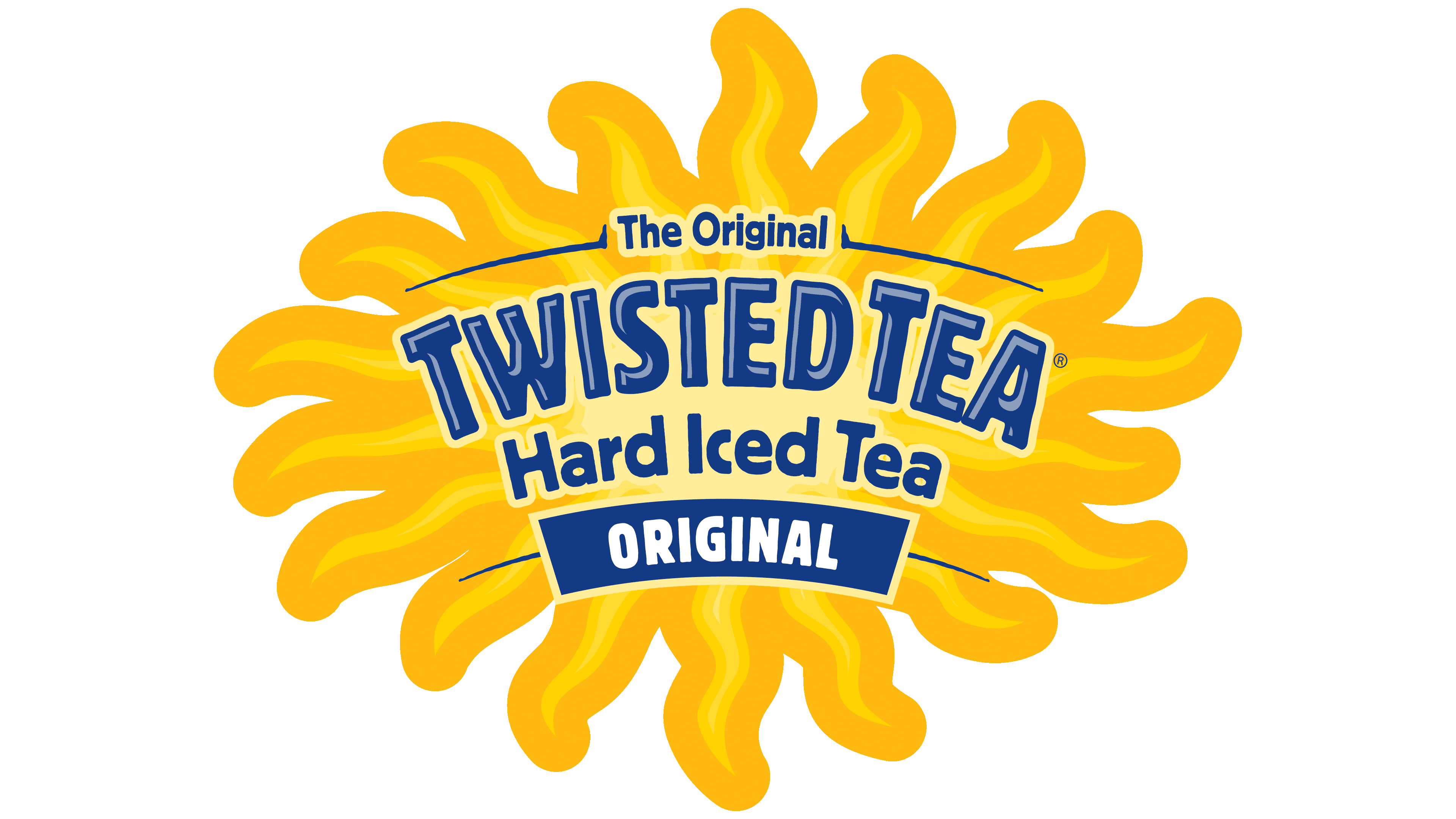
The Twisted Tea logo, updated in 2022, retained the key elements of previous versions while adopting a cleaner, more vibrant look. Designers adjusted the text shape, making all letters the same height and creating a smooth, harmonious curve.
The upper part of the logo features a stylized sun with sharp golden rays, symbolizing warmth, a summer vibe, and the relaxed atmosphere associated with the beverage. Beneath the sun, the phrase “Hard Iced Tea” is displayed, indicating the product category and its alcoholic content.
The brand name “Twisted Tea” is set in a large, bold font in deep blue. The letters have a slight slant and curved form, giving the logo a playful feel and reflecting the idea of “twisted,” a slightly unconventional or unique approach. The chosen colors, yellow and blue, create a strong contrast and evoke associations with sunshine and refreshment.
Font and Colors
The rising sun is a powerful symbol with a positive meaning. This is the personification of dawn, courage, and vitality. In some world religions, it is associated with powerful gods. Although the sun is a source of heat and light, Twisted Tea uses its image to represent a cold drink. Such a contrast only enhances the logo’s impression and makes it memorable.
A bold sans-serif font was chosen for the beer brand logo. It has an individual design, and the letters in the name “Twisted Tea” seem to be drawn with uneven lines and rounded corners. The words “HARD ICED TEA” are several times smaller than the top inscription but have similar designs.
The first version of the emblem used basic colors (blue and yellow) and numerous shades, making the elements appear three-dimensional. The modern version is two-dimensional: it contains plain blue text and yellow rays of the sun.