The Twix logo highlights its unique feature—two cookie bars in one package, emphasizing the brand’s playful and innovative approach to candy. Twix has consistently focused on the dual nature of its product, which pairs a crunchy cookie with caramel and chocolate. This concept is a key part of Twix’s branding and prominently features its ads, suggesting that you can enjoy one bar now and save the other for later or enjoy both at once. The logo captures Twix as a fun, shareable treat that offers double the enjoyment of a typical chocolate bar, setting it apart in the competitive candy market.
Twix: Brand overview
Twix, a chocolate bar loved for its mix of crunchy cookie, caramel, and milk chocolate, was launched in the UK in 1967 under Mars Limited under the name “Raider.” This combination set it on a path to becoming a favorite treat.
Making its way to the US in 1979 with the new name “Twix Cookie Bar,” it introduced its signature feature: two cookie bars in each package. This made Twix not just a snack but a symbol of fun and sharing.
As it grew in popularity through the 1980s and 1990s in the US and worldwide, Twix was known for its playful slogan, “Two for me, none for you,” highlighting the joy of having two bars. During this time, Twix expanded its line with flavors like Twix Peanut Butter and Twix Triple Chocolate, keeping the brand fresh and exciting.
The marketing strategy took a creative turn in the late 1990s and early 2000s with campaigns like “Need a Moment?” in 1997 and the “Get the Glass” web series, showcasing Twix’s unique approach to reaching its audience.
In 2011, the brand introduced Twix Fino, a slimmer version of the classic bar, as a sophisticated snacking choice. Recent ads have kept up the brand’s humor with campaigns like “Left Twix vs Right Twix” and “Outrageously Satisfying,” which playfully poke fun at marketing clichés.
Meaning and History
What is Twix?
Twix is a globally recognized chocolate bar brand owned by Mars, Incorporated. It is famous for its unique design that features two crispy cookies topped with caramel and coated in milk chocolate. Twix offers a variety of flavors and sizes, including the classic version with two cookies and caramel, as well as special limited editions and seasonal flavors.
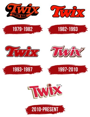
1979 – 1982
From 1979 to 1982, the chocolate bar Raider was renamed Twix in the United States. The new name combines “twin” and “stick,” which describes its key feature: two sticks in each package for twice the enjoyment.
The Twix logo was crafted to make this feature stand out. Its bold, striking style against a black background helped the logo catch attention and make a lasting impression. The black background also enhanced the visibility of the brand name.
In the logo design, special focus was placed on the letter “X.” The extended leg of the “X” draws attention and symbolizes the two chocolate sticks in the package. This design choice helps communicate the product’s dual-stick feature, connecting it with rich flavor and increased enjoyment.
1982 – 1993
Switching the recipe from caramel to peanut butter proved successful, as shown by its market success. This change helped the product gain popularity. A new logo with bold red letters accompanied it. Red is linked to energy and passion, which reflects the product’s dynamic sales and strong consumer interest.
The updated logo minimizes the black background to a thin outline. This shift is significant in the brand’s history as it moves from older recipes to a new market approach. Reducing the dark background symbolizes the brand’s evolution and openness to new ideas, which appeals to consumers.
1993 – 1997
Twix’s logo uses a dark cherry color, known for its depth, to signify its commitment to flavor quality. This color conveys sophistication and aligns to create top-tier confections for refined tastes.
The logo has white and black outlines that enhance its appearance, which indicates the expansion of the Twix product line. New variations include creamy bars, Twix with fondant, and dark and white chocolate versions, marking a key development for the brand. These outlines help to showcase the variety and innovative approach to cookie and chocolate recipes.
The logo’s color palette highlights Twix’s new range of flavors, with different shades and outlines that make it visually appealing and symbolically rich.
White outlines in the logo play an essential role by making it look radiant and appealing. This design choice helps to draw consumer attention, suggesting a new level of taste experience.
1997 – 2010
The Twix logo features red lines representing the sweet filling around each crunchy cookie, visually capturing the unique flavor mix that makes the chocolate bar popular. The brown outline reminds us of the chocolate and caramel that cover the Twix bars, offering a distinctive mix of textures and flavors.
The logo layers symbolize the ingredients and rich flavors of each Twix bar. Sweet caramel, rich chocolate, and crunchy cookies create a culinary delight.
The logo includes slightly wavy lines that mimic the natural edges of the cookie, adding uniqueness to the visual design and emphasizing the authenticity and quality of each bar.
The logo’s bright red hue symbolizes Twix’s global popularity. Red is linked to energy and passion, reflecting the brand’s dynamic nature and ability to inspire strong emotions and enjoyment.
2010 – today
The Twix logo captures the essence of the chocolate bar with a design that looks sweet and biscuit-like. Each letter in the logo mimics cookies coated with white and red icing, making it recognizable and delicious. This visual styling effectively conveys the sweetness and rich flavor of Twix.
The logo aims to be as enticing and delicious-looking as possible, almost inviting consumers to taste this exquisite treat. It stimulates appetite and interest in buying the product, blending aesthetics with marketing.
Special attention is paid to the dot over the letter “i” in the logo, designed to resemble two sticks. This creative element is a clever marketing strategy emphasizing Twix’s unique feature—two sticks per package. It highlights the distinctiveness of the Twix brand and its promise of double enjoyment, setting it apart from other confections in the market.
Font and Colors
The Twix logo features a custom-designed sans-serif font created to give the brand a unique identity. This bold and shaded font adds a three-dimensional effect that makes the logo pop visually. The letters are set at an angle, introducing a dynamic and playful element to the design, while the clean lines of the sans-serif font keep it modern and accessible.
This font is designed to be legible across various sizes and backgrounds, ensuring Twix stands out on store shelves. The boldness and 3D look of the letters convey indulgence and enjoyment, mirroring the experience of eating a Twix bar.
The logo’s letters are vibrant red, which evokes energy and stimulates appetite. A golden shadow hints at the premium, indulgent nature of the caramel-filled bar. The white and chocolate brown background highlights Twix’s creamy and chocolaty aspects, enhancing its appeal and establishing a warm connection with consumers.
The careful spacing between the angled letters ensures the logo remains easy to read and visually appealing. The Twix logo design is recognizable and memorable, communicating the brand’s distinctive features and helping it stand out in the candy market.
FAQ
What does the Twix logo mean?
The Twix logo cleverly uses a ‘pause’ button symbol on the ‘I’ to show that Twix bars are perfect for taking a break. This idea has been a big part of Twix’s advertising for a long time.
The logo also cleverly includes images of chocolate bars, linking the product’s look directly to Twix’s brand identity. This design clarifies that Twix bars are meant to be enjoyed during a break.
The name “Twix” itself is a mix of “twin” and “bix,” which is short for “biscuit.” This name points to the two cookie bars, covered in caramel and chocolate, that come in each pack, making them a great treat for a break. Together, the Twix logo and name effectively show that Twix is all about a pair of biscuit bars perfect for enjoying a moment of pause.
What is the slogan of Twix?
Twix has always found ways to keep its ads fresh and engaging by creating memorable slogans. These slogans are catchy and highlight what makes Twix chocolate bars stand out.
For instance, “Twix and Tea, Happy Together” implies that Twix bars go perfectly with tea, suggesting Twix as the ideal tea-time snack. This idea promotes a comfortable atmosphere, encouraging people to enjoy a Twix with their tea. “Twix, Try Both and Pick a Side” plays on the two-bar package of Twix, making it fun to choose a favorite bar and adding a playful element to snacking on Twix. “Twix, A Break from the Norm” presents the chocolate bar as a small escape from daily life. This slogan paints Twix as a treat that adds a bit of happiness and relaxation to your day.
As mentioned in the Brandon Gaille blog, these slogans showcase various aspects of Twix, from being a perfect companion for tea, offering an enjoyable choice, to being a delightful break.
What brand is Twix bar?
Twix is a well-liked chocolate bar made by Mars, Inc., a big company known for making sweets, pet food, and other kinds of food. Twix is special because it has a crunchy cookie and caramel on top and is covered in milk chocolate. This crunchy, sweet, and creamy mix makes Twix a favorite for people who love chocolate worldwide.
What makes Twix so appealing is its mix of different textures. The cookie provides a crunch, the caramel provides a sweet stickiness, and the chocolate provides a smooth finish. This combination makes Twix stand out among other chocolate bars and appeals to many tastes.
Over the years, Twix has introduced new versions and special editions, trying out new fillings and chocolate types to keep up with what people like. However, the original caramel and cookie recipe is still the most popular, showing how much people continue to enjoy Twix. Mars, Inc., the company that makes Twix, is known for focusing on quality and new ideas.
Why is there a pause symbol on Twix?
The pause symbol on Twix wrappers is a smart way for Mars, Inc., the company making Twix, to communicate a message. They want people to know that eating Twix is a chance to take a little break and enjoy something sweet. Twix isn’t just candy; it’s an invitation to take a breather from our busy lives.
Twix uses this idea in its ads to show that the candy bar is great when you want to relax and treat yourself. The pause symbol looks like the one on electronic devices, which everyone recognizes. It’s a quick way to say, “Stop for a moment.” Eating a Twix is about taking time for yourself, a reminder we all need now and then. The pause symbol nods to the two bars in a Twix pack, suggesting you can enjoy two breaks or share one with someone. This adds to the idea of enjoying a pause with Twix, alone or with a friend.
