


![]() TXT Logo PNG
TXT Logo PNG
The TXT logo shows musicians working together to create the future. The emblem shows that group creativity helps achieve results multiplied many times over. Hence, the first lines of the charts and the mass of fans.
Big Hit Entertainment founder Bang Si-hyuk announced plans for a second boy band under the label in 2017, while BTS was rapidly expanding worldwide. Tomorrow X Together were officially introduced on January 10, 2019, followed by YouTube introduction films for the five members.
On February 7, Big Hit named the debut release The Dream Chapter: Star. TXT debuted on March 4, 2019, with Yeonjun, Soobin, Beomgyu, Taehyun, and HueningKai, aged 16 to 19. Their first showcase took place the next day at Yes24 Live Hall in Seoul.
The debut single “Crown” drew 14.5 million YouTube views in 24 hours. The mini-album topped South Korea’s Gaon Album Chart and Billboard World Albums Chart, while entering the Billboard 200 at No. 140. A week after their debut, TXT won on SBS MTV’s The Show. Their first U.S. showcase tour covered New York, Chicago, Los Angeles, Dallas, Orlando, and Atlanta, with tickets selling out in under 24 hours. Stray Kids and ATEEZ were building audiences in the same period. Still, TXT earned an MTV Video Music Award nomination for Best K-Pop in its debut year.
The Dream Chapter: Magic followed on October 21, 2019, led by “9 and Three Quarters (Run Away).” In 2020, TXT debuted in Japan with Magic Hour. The Chaos Chapter: Freeze arrived in 2021, entered the Billboard 200 at No. 5, and came after Big Hit became Big Hit Music under HYBE. In 2023, TXT headlined Lollapalooza in Chicago and released collaborations with Jonas Brothers and Coi Leray.
Meaning and history
![]()
TXT became Big Hit Entertainment’s first musical group, debuting six years after BTS was founded. Bang Si-hyuk (a South Korean songwriter, producer, and director) has been hatching plans for its formation since 2017. To set the stage in advance, he opened the band’s official channels and posted video releases and extended performances. The band officially launched in January 2019, and over the next 10 days, each member’s video presentation, called an “introductory films,” was posted on YouTube. In March, a teaser presentation of the boy band The Dream Chapter: Star appeared on the same web resource. But before that, the show was broadcast on Mnet TV.
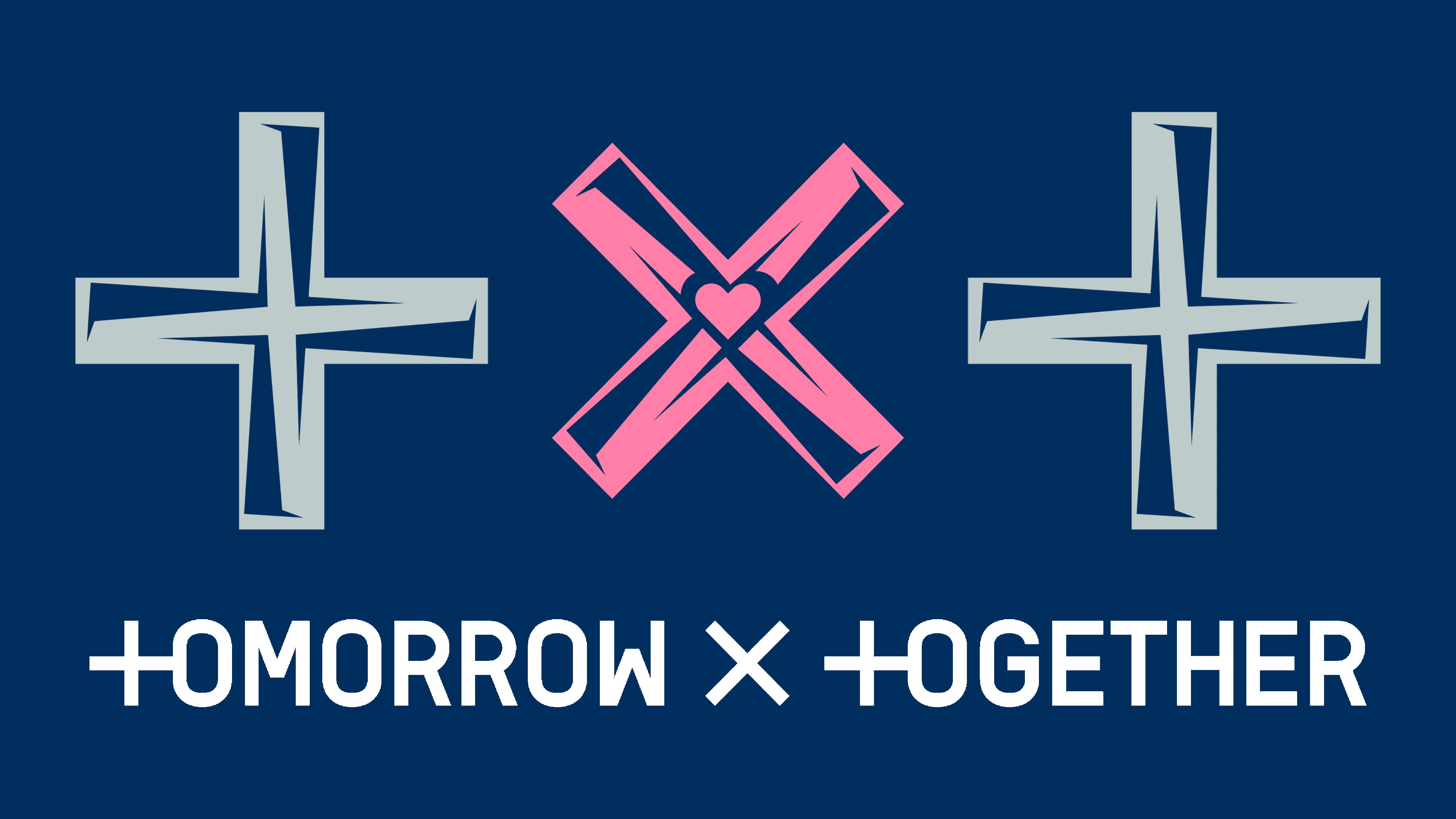
The management approached the choice of the name no less painstakingly. TXT is an acronym for Tomorrow X Together (or Tomorrow by Together). Its concept stands for “five people united by one dream in the hope of building a better tomorrow.” During an interview, young people clarified that they prefer the full name rather than the abbreviated one. Nevertheless, short characters fit perfectly into the laws of the modern scene and look incredibly impressive – “+ X +.” The two-plus signs around the edges represent the letters “T” and “X”, mathematical symbols for multiplication. Another interpretation of the name: “We are all different, but harmoniously form one synergy.” Several logos appeared during the boy group’s first year of activity.
2019 – today
![]()
The debut emblem consists of two parts: graphics and text. Above there are bold black signs, and below their decoding, where the role of the letter “T” is played by the symbol “+.” The band’s name is written in the format “+ omorrow x + ogether.” In its abbreviated form, it looks like “+ x +,” reminiscent of a formula in a mathematical or physical law.
2019
![]()
Before the group’s debut, a variant consisting of elliptical orbits was launched. The intersecting lines of six elongated ovals form a semblance of trajectories of motion of electrons around a nucleus with protons, which is, in fact, an atom from the aggregate of which our world is formed. That is, the linear version of the boy band logo conveys the essence of humanity’s physical existence and the surrounding space, without which it is impossible to live.
2019
![]()
Another variation of the logo graced the album The Dream Chapter: Star. It shows three two-color signs in one row. Each symbol is divided into two sectors by color. One fragment is a yellow pointer shaped like an open triangle, resembling an arrow. The second part is the same element, but blue. Moreover, based on the location, it is the bottom one, since its sharp top is not visible.
2019
![]()
The third emblem of the musicians accompanied the collection The Dream Chapter: Magic. It contains the same symbols from the name but is decorated with brightly sparkling stars. Mysteriousness is added by a black background, on which stylized signs of yellow, green, and blue are placed.
2019
![]()
When joining MOA Membership, a classic, straightforward variation was chosen: a crossed ruler and a yellow pencil at the center form an “x.” Side “+” signs look like classic pluses and are composed of bold lines. The designers tried to keep the proportions and the width the same for all symbols.
2019
![]()
The official lightstick used a minimalistic logo, contoured and formed from only thin lines, outlining the space inside. This time, each symbol is marked with a different color: yellow, green, and blue.
2020
![]()
The Magic Hour emblem has incredibly deep symbolism. The fact is that the abbreviation of the boy band’s name consists of curly hourglass-shaped hands resembling shurikens. Because of this, a philosophical subtext arises: “time is killing” or “time is a killer.” One element is colored pink, the other blue, which classically denotes women and men.
2020
![]()
For The Dream Chapter: Eternity, the logo was chosen as a tightly connected chain. They look like intertwined ellipses and are painted in the colors of the neon spectrum – turquoise and purple. To enhance contrast, a black horizontal rectangle has been added to the emblem.
2020
![]()
The single Drama was accompanied by the traditional abbreviation “+ x +,” rendered as dumbbells or as the Roman numeral I with large serifs. The badges are painted in blue and yellow and are also complemented by a double border.
2020
![]()
The musicians used this version of the emblem to design the album Minisode 1: Blue Hour. To live up to the name, it is depicted as pixels, the fundamental unit of the digital universe. That is why the small square dots, sprayed with symbols, look like distant yet bright stars. The center sign (“x”) comprises identical-sized squares five in each diagonal line.
2021
![]()
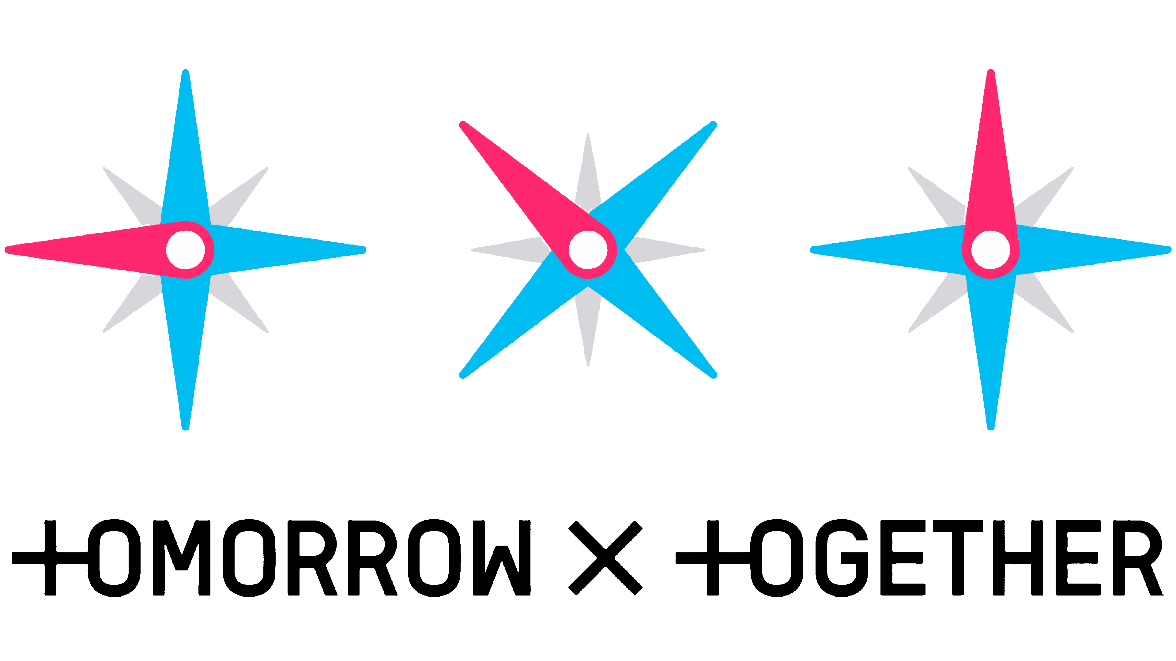
In 2021, the collection Still Dreaming was released. A logo was chosen for it, similar to how the azimuth is designated as a geodetic, physical, and navigational mark. The arrows are narrow and sharp, intersecting at a white point in the center. Three of them are colored blue; one is pink, and four (small) are gray.
Font and Colors
The original boy band emblem exists in several versions, but they all have the same structure despite the variety. Only the decor is different. This approach was chosen deliberately to help the young group gain recognition and a foothold among music lovers. In each of the ten cases (there were so many logos in the fall of 2021), the personal icon consists of the x sign, symbolizing multiplication, and two plus signs on the right and left.
The text is present only in the very first emblem. It is executed in a grotesque font with thin lines. All letters are in uppercase. The words “+ omorrow x + ogether” are typed in smooth and even symbols. They stand for Tomorrow X Together.
The color scheme is varied, comprising turquoise, yellow, blue, black, gray, green, pink, and purple. If you look closely at all the logo variants, you will notice that the most used are yellow, green, and blue.