The UAZ logo appears awkward and out of place in a professional context. Although it represents an automotive company, it includes elements associated with the watch industry. As a result, the emblem fails to convey the brand’s essence and does not provide a significant marketing impact.
UAZ: Brand overview
In the turmoil of World War II, as the Soviet Union undertook the mammoth task of shifting its industries further eastward in 1941, the genesis of UAZ took place. The manufacturer’s journey in the automotive world began with the creation of the UAZ-469 utility jeep in 1948. Famed for its durability and resilience, this 4×4 quickly became a favorite in Soviet military ranks.
The succeeding decade saw the company broaden its horizons by venturing into the realm of light trucks and buses. Key models from this era, such as the UAZ-452 van and the UAZ-451 bus, started to play significant roles in commercial sectors. By the time the 1970s rolled in, the manufacturer unveiled a new avatar of its beloved 469—the UAZ-452 four-wheel-drive series, which swiftly took the mantle as the brand’s iconic offering.
However, the 1990s brought challenges as the Soviet Union disintegrated. Navigating the tricky waters from being state-owned to a privatized entity was no mean feat, and the company grappled with its fair share of economic difficulties. Salvation came in the new millennium when Sollers, a notable Russian automotive company, incorporated the brand under its wing. This rejuvenated the manufacturer, propelling it to diversify its offerings for both civilian and defense sectors.
Today, the company remains respected in the automotive sector, churning out revered 4×4 models such as the Patriot and Pickup. While these vehicles are adored in Russia, their demand also spills into various emerging markets abroad. Although the brand’s manufacturing techniques have retained their traditional essence, efforts have been undertaken to adapt their vehicles to contemporary emission and safety benchmarks. The brand’s legacy, rooted in its Soviet-era origins, bolsters its image as a creator of steadfast and robust off-roading machines.
Meaning and History
What is UAZ?
This is a Russian automaker known for creating reliable, off-road vehicles. The UAZ-469, a rugged 4×4 SUV heavily used by the Russian military and gained popularity among civilian fans for its reliability and ability to overcome difficult terrain, is the company’s most iconic model. In addition, the company produces several other vehicles designed to operate in difficult Russian conditions, such as buses, vans, and light commercial trucks. The company is known for its simple, useful designs, prioritizing durability and ease of use over ostentatious details.
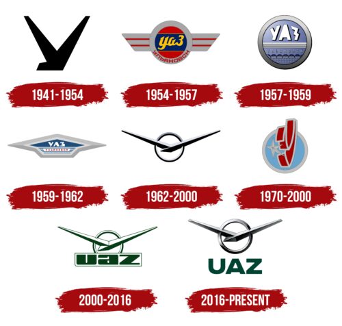
1941 – 1954
The emotional impression of the UAZ emblem is negative: the disproportionate element in the form of a black trident hardly resembles the logo of an automotive industry representative. The creators intended it to be shaped like the Cyrillic letter “У.” Still, the result is an awkward design valued only among the local population and recognized within the context of the Russian automotive industry. It has no prospects for international market entry as it is neither visually nor technically adapted for it.
The emblem hints at the letter “V,” signifying victory, but a strange protrusion on the left side mars it. This makes the logo unattractive, and the black color worsens the situation, which adds an inappropriate sense of mourning, as there is no color balance. The trident has both upper ends cut off. This logo conveys no information, visualizes no concept, and reflects none of the company’s aspirations. Its only clear meaning is the representation of the city of Ulyanovsk, where the factory is located.
1954 – 1957
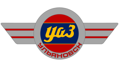
To embellish and diversify the UAZ logo, designers proposed a colorful version with a completely different shape. The background features a trapezoid resembling spread wings, painted in a dirty gray color and complemented by two parallel red stripes. Overlaid on the trapezoid is a circle divided into three parts, which include:
- Two red semicircles (top and bottom)
- One wide blue stripe (in the middle)
At the center is the company name in a yellow handwritten font. The style is confusing since the abbreviations should be in uppercase letters logically. However, in this case, only the last glyph is uppercase, while the first two are lowercase. The reasoning behind this design choice is unclear, as in the Cyrillic phrase “Ульяновский Автомобильный Завод” all words have equal significance, making it unnecessary to highlight any one of them.
The circle is encased in a gray ring matching the background color “wings.” At the bottom, there is a red inscription “Ульяновск” in Russian. This is the name of the city (in Cyrillic script) where the automobile plant is located, having moved there at the beginning of the war.
1957 – 1959
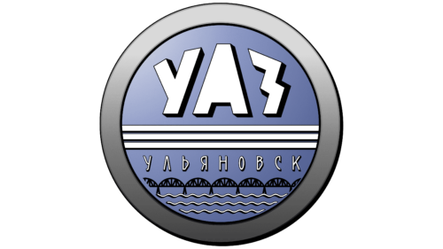
The UAZ logo has changed so drastically that it is now unrecognizable. Firstly, the lack of internal openings in the “A” makes the text difficult to read. This letter now appears as a monolithic structure resembling a tower or a multi-story building of a futuristic design. The neighboring “Z” (in Cyrillic) looks like a lightning bolt on signs that mark electric poles with the warning “Danger – High Voltage.” The “U” (also Cyrillic) appears truncated due to the shortened left stroke.
The font is extra-bold, blocky, white, with black shadows on the right, adding volume to the text. Its style resembles a typeface for children’s shows or cartoons, making the emblem not taken seriously. This impression is reinforced by including a delicate railroad bridge, an odd choice for an automotive brand logo, likely symbolizing the city where the plant is located.
The lower part features waves (presumably representing a river) spanning three rows, as if they are of great importance and relate to the automotive industry. This likely references the plant’s location, impractical from a marketing standpoint, and proper visual identity application. The water has no thematic, informative, meaningful, or advertising significance.
Three horizontal white stripes run through the center. Their purpose is unclear, as they distract from the brand name, do not resemble speed lines, and do not form any thematically significant image. The background is a light purple circle with a dark gray frame. The ring tightly encircles the inner part, separated by a narrow black line.
1959 – 1962
The circle symbolizing a wheel has been transformed into a broad arrow, which signifies nothing in the automotive industry context. It could relate to traffic rules or delivery services but not vehicle manufacturing. This image carries no conceptual weight and fails to express a professional idea. The new emblem resembles a broad upward-pointing arrow, a mushroom, or a low building with a large roof.
At the center, on a dark blue background, are curved Cyrillic letters “УАЗ.” The geometric, extra-bold glyphs have minimal internal spacing, making the text difficult to read. Below, on a blue and white striped background, is the name of the city where the company operates. The word “Ульяновск” is written in red characters with wide spacing, occupying the entire white trapezoid. The font is grotesque, small, narrow, and in uppercase.
The central structure, consisting of various backgrounds, fonts, and styles, is enclosed in a light gray frame around the perimeter. Following this is another dark gray stripe, forming an overall border. Visually divided into two parts (the top shaded lighter than the bottom), it appears as if accidentally joined, lacking any conceptual significance. The side corners of the logo protrude significantly, creating a bulky and awkward appearance.
1962 – 2000
Another redesign failed to clarify the emblem and only worsened the image’s incongruity. This time, the UAZ logo resembles a wall clock. It looks exactly like one:
- A large circle in the center
- Two hands connected in the middle
Shadows are present on the lower side of all elements. These shadows make the sign somewhat attractive by focusing on geometric shapes. The improvised “clock hands” are mirrored, precisely matching each other’s position, angle, and thickness. At the same time, there is a slight difference: the right element is longer than the left due to the elongation at their connection point.
Diagonal stripes cut through the circle and extend far beyond its boundaries. The circle is empty inside, with only neutral white space. The color palette is also sparse, featuring just two colors—gray and black. These colors create a gloomy mood and do not promote the product, which, by default, sold quickly in the former USSR due to the unavailability of other brands’ SUVs. This explains the dull visual identity, as the vehicle was purchased regardless of marketing appeal due to a lack of alternatives.
In this case, gray symbolizes practicality, strictness, and versatility. Black also corresponds to these characteristics, as there was no room for grace and elegance with Soviet UAZ vehicles: they were always covered in dirt and dust as they were driven off-road.
1970 – 2000
For a period, another UAZ emblem was used in parallel—colorful and attractive but with poorly readable text. The first letter of the factory’s name and the city where it is located is so well hidden that it is barely recognizable within the double red ribbon placed in the center. This ribbon is curved to form the Cyrillic letter “У.”
However, due to its complex shape, the desired glyph did not materialize—it looks like an open duck beak trying to catch a star. This association with a beak also arose due to the red color, although the designers attempted to complement the ribbon with a gray border around the perimeter. The five-pointed star is also gray but has an odd structure: curved with unevenly long rays, making it appear deformed.
The red element is so tall that it extends beyond the background circle. The circle itself is divided into two zones:
- Central (light blue)
- Border (light gray frame)
The color scheme is odd, as the red does not match the light blue and visually creates a disbalance, despite the designers’ efforts to emphasize the “elephant trunk,” or the Cyrillic letter “У.” From a branding perspective, this concept failed, repelling rather than attracting attention. The result is a disproportionate logo with a strange color combination, an unattractive glyph, and a lopsided star.
2000 – 2016
Once again, the “wall clock” era has returned. The logo with two long diagonal stripes connected in the center indeed looks like a clock with hands showing 10:10, 2:50, or 10:10 PM. It resembles a broken clock mechanism, negatively impacting the image of a car manufacturer that should be flawless and safe for drivers.
The lines taper at the ends and are much wider at the base. The top surface of the stripes is painted white as if illuminated by the sun, while the bottom is darkened, as if in shadow.
The stripes are connected by a small ring visually divided into three segments. The lower two are formed by the text overlapping the circle. The text is simple, featuring an abbreviation in a Latin font. Thus, the abbreviation “UAZ,” derived from the phrase “Ulyanovsky Avtomobilny Zavod,” seems illogical and absurd, as an English abbreviation demands an English name, not a Russian one artificially styled to fit another language.
The text is set in an extra-bold font. The case is unclear, as “U” and “Z” could be either lowercase or uppercase, while “a” is definitively lowercase. The abbreviation is enclosed in a thin frame, forming a rectangle. The base color of the logo is dark green, symbolizing vegetation, growth, and nature. This does not align with the automotive theme and adds no novelty to the Russian company’s concept.
2016 – today
Despite the intention to modernize its visual identity, the company retained the wall clock shape entirely. Although it aimed to present a flying bird to the public, it failed: the whimsical stylization is not perceived as a bird. Only geometric shapes are visible—a circle and sharp, bulky, straight lines of varying widths.
The main element of the UAZ emblem is a composite structure derived from a ring intersected by two diagonal stripes pointing in different directions. The two stripes are connected in the center by their wide ends: the left side is uniform, while the right side has a massive protrusion resembling a trapezoid divided into two equal triangles by color.
The logo’s monochromatic color palette: the chrome elements shine under bright light. This effect is achieved through shades of gray—from steel to anthracite. The presence of shadows and semi-shadows adds depth to the emblem. Below, the company name is written in bold, grotesque type in a minimalist style with uniformly wide strokes.
The geometric letters are smooth and even painted dark olive, which is irrelevant to the automotive industry. However, this color is used for the tarps and cabs of Russian vehicles, serving as a protective camouflage color. The reason for this transportation to hide and from whom remains unclear since it is used widely throughout the country.
