


![]() Uber Eats Logo PNG
Uber Eats Logo PNG
The service logo demonstrates two sides of the work. The Uber Eats logo represents a fast, light transportation service and a selection of fresh, healthy food. The sign highlights a wide selection of dishes for every taste.
Uber Eats grew out of Uber, founded in 2009 by Travis Kalanick and Garrett Camp. By 2014, the company had a global driver network, which raised a practical question about using that infrastructure beyond passenger transport.
In August 2014, Uber launched UberFRESH in Santa Monica. The pilot focused on a narrow menu from a few restaurants with delivery in about ten minutes. Demand proved viable, prompting expansion plans.
In 2015, the service became Uber Eats and shifted to a broader marketplace model. Users could order from multiple restaurants in cities like New York, Chicago, and Los Angeles through the main Uber app.
In 2016, Uber Eats split from the Uber app and entered markets such as Australia, Canada, and the United Kingdom. The brand later standardized as Uber Eats. By 2017, it operated in over 50 cities, competing with DoorDash and Grubhub.
In 2017, Kalanick resigned as CEO amid internal scandals, and Dara Khosrowshahi took over, steering the company toward an IPO. In 2018, Uber Eats added scheduled orders and partnered with McDonald’s.
In 2019, Uber went public on the New York Stock Exchange. Uber Eats generated about $1 billion in annual revenue, around 13 percent of total revenue. The same year, it sold its Indian unit to Zomato and surpassed Grubhub in US revenue.
In 2020, Uber acquired Postmates for $2.65 billion. In 2021, it bought Drizly, which it later shut down in 2023. By 2023–2024, Uber Eats expanded partnerships with Starbucks and integrated grocery delivery via Instacart.
Meaning and History
![]()
The parent company founded the same name in 2009, but a few years later (in 2014), it relaunched it under a different name. Therefore, it was originally called UberFRESH and was located in Santa Monica, California. The service got its current name in 2015. Until now, he has changed several emblems for culinary and food topics.
The firm is now in decline due to the coronavirus pandemic. The fact is that many restaurants have introduced takeout food to their menus, independently organizing their deliveries. Therefore, the company has already announced a 20 percent reduction in its staff. It is possible that another rebranding, with a change to the emblem’s design, is on the way.
What is Uber Eats?
Uber Eats is an online platform that lets customers order food for delivery; it was launched in 2014 and is owned by Uber. Taxi drivers and couriers, using cars, bicycles, and scooters, handle the delivery of orders. The service quickly gained popularity and is now available in 45 countries. The founders of the service are Garrett Camp and Travis Kalanick.
2014 – 2015
![]()
Before the rebranding to Uber Eats, the food delivery service was called UberFRESH. Its logo contained the corresponding inscription in black, with the first four letters lowercase and the rest uppercase. The designers’ font was distinguished by clear forms, smooth, rounded lines of approximately equal thickness, and the absence of serifs at the ends.
2015 – 2016
![]()
Renamed Uber Eats, the online platform gained independence, an app, and its website. With their help, customers can place orders. A unique logo featuring a three-pronged fork within a circle on a white background enhances recognition of the service. The image consists of a single unbroken thin line that forms both the cutlery and the improvised round “plate.” At the bottom, in two lines, is the service’s name, with each word in its own color.
2016 – 2017
![]()
The logo’s shape is preserved. Only her palette and letters have changed: green has replaced blue, and thin characters have become bold.
2017 – 2018
![]()
In this version of the logo, nothing from the previous versions has survived; the changes were dramatic. The developers removed the branded round icon and focused on the food delivery company’s name. They enlarged the word “eats” and made it lowercase. Whereas the inscription “Uber” compared with it remained small and invisible: it took only two characters, “ea.” Green has become saturated.
2018 – 2020
![]()
The designers arranged the phrase “Uber Eats” in a single row, leaving the first word dark green and the second light green.
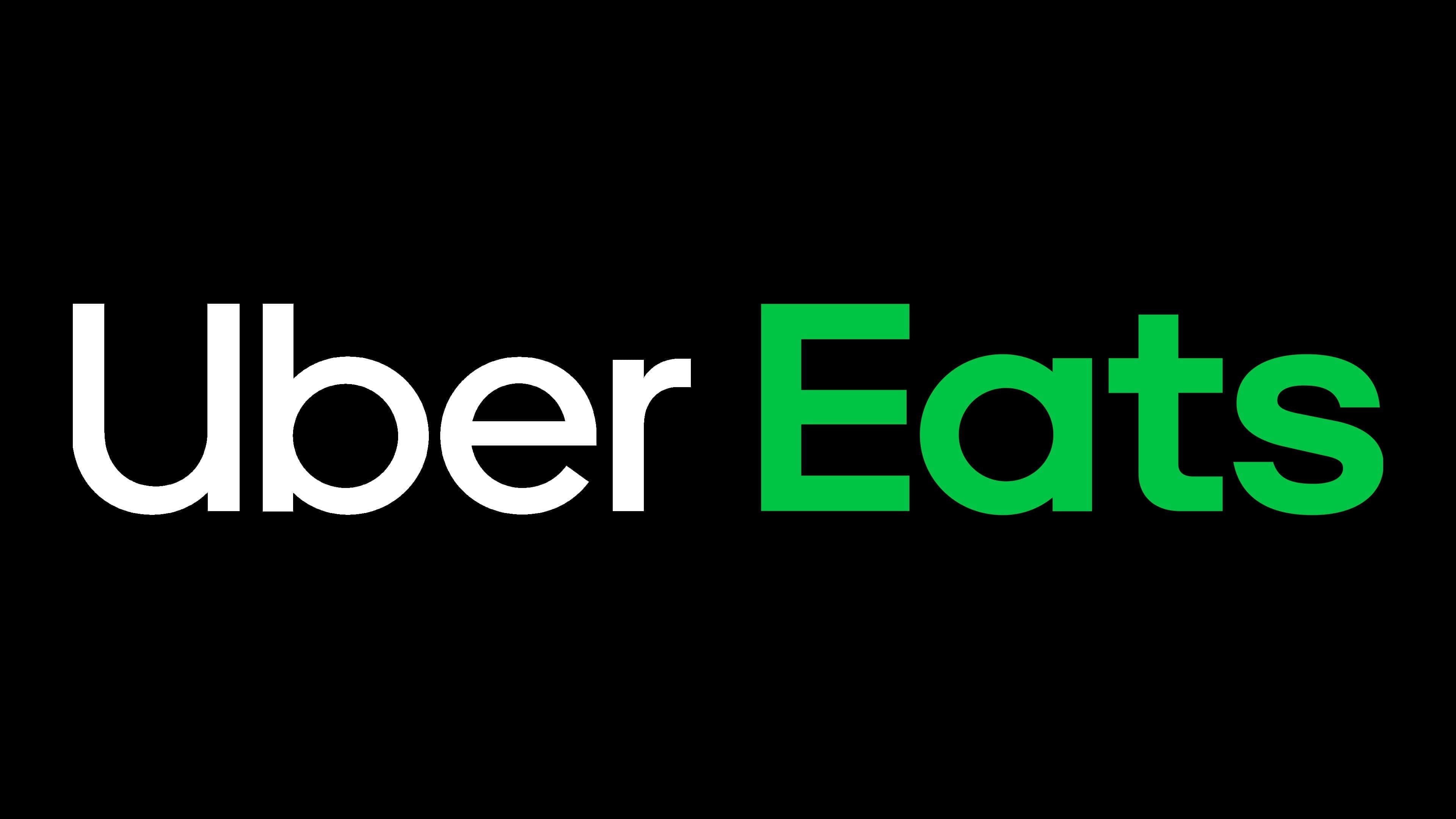
2020 – today
![]()
To attract potential consumers’ attention, the company’s management changed the color of the “Eats” lettering to green-aquamarine. The rest of the elements were unchanged.
Font and Colors

Central to all options is the name “Uber Eats.” It was secondary until the end of 2017; after that, it was the main and only one. Designers mainly changed the shapes, shades, and arrangement of the words it included.
The logo features Uber Love’s custom sans-serif typeface co-written by Jeremy Mickel of MCKL and Wolff Olins. The emblem uses two signature greens: Dark Jungle Green (#162328) and Medium Sea Green (#3FC060).