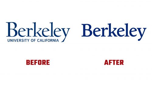
UC Berkeley has introduced a new visual identity to clarify its brand and strengthen community ties. This change addresses confusion, as many people, locally and nationally, do not realize that “Berkeley” and “Cal” refer to the same institution. The Identity Task Force recommended these updates to communicate the university’s comprehensive excellence better.
The updated identity includes both the Berkeley and Cal names. While the athletics identity will remain as Cal Berkeley, the new visual identity connects the two names, creating a unified brand. The process involved feedback from alumni, faculty, staff, and students.
The Cal logo remains unchanged, preserving its history and tradition. The Berkeley logo has been updated for better legibility, usability in digital environments, and compatibility with the Cal logo. The new design is based on the University of California Old Style typeface created by Frederic Goudy. Known as Berkeley Old Style and Californian, this typeface has been refined to enhance digital performance by reducing the contrast between the thickest and thinnest parts of the characters.
The updated logo maintains the visual equity of the existing one while working well with the Cal logo. The seal remains unchanged, but guidelines for using the seal, bear, and other brand assets have been updated to support the university’s legacy and community building.
The traditional “Berkeley Blue” and “California Gold” will be used consistently across all academic and athletic contexts. Berkeley Blue has been brightened to match California Gold’s saturation, creating a harmonious color palette. An updated secondary color palette complements the primary colors.
The updated visual identity includes two new typefaces: Inter and Source Serif. These typefaces, available for free through Google Fonts, enhance visual connection. Inter, a sans-serif typeface, offers a modern look, while Source Serif adds elegance and tradition.
New graphic elements have been introduced, inspired by existing brand elements. These include an optimized seal version, which can now be used in additional ways, such as a supergraphic. Other components are drawn from the seal and the Cal logo, creating a cohesive visual system.
This updated visual identity ensures the brand is clear and cohesive and reflects its prestigious status. It addresses the confusion and strengthens the connection between different parts of the university community. By maintaining historical elements while updating others for modern use, the institution honors its legacy while looking forward to the future.


