The UEFA logo symbolizes major sports with its unstoppable dynamics and vibrant energy that fills hearts with enthusiasm and invigorates the body. At the same time, it is a strict emblem, aiming to show the importance of sports in human life.
Uefa: Brand overview
The Union of European Football Associations (UEFA) was founded in Basel, Switzerland on June 15, 1954. At the French Football Federation’s invitation, representatives of thirty-one European football associations came together to form the organization. UEFA was founded to foster and fortify the solidarity of the European football community.
Danish national Ebbe Schwartz was the organization’s first president and head until 1962. He laid the groundwork for its organizational structure and guiding ideals.
The European Champions Cup, currently known as the Champions League, was the union’s inaugural major competition in 1955. With the greatest teams from the continent participating, this event swiftly became Europe’s most important club competition.
The first European Championship, formerly the European Nations Cup, was held in 1960 in France. The Soviet Union national team won the competition, which helped establish one of the most well-known football competitions in the world.
The Cup Winners’ Cup, founded in 1961, existed until 1999. This competition enhanced the European club’s competition structure.
The European Champions Cup and Cup Winners’ Cup champions (and eventually the Champions League and Europa League winners) square off annually in the Super Cup, established in 1971.
After its debut in 1972, the UEFA Cup (now known as the Europa League) became Europe’s third-biggest club competition.
Football in Europe saw many changes during the 1980s. After the 1985 Heysel Stadium disaster, the organization strengthened stadium safety regulations. As a result, English clubs were temporarily prohibited from competing in European events.
When it was reformed into the Champions League in 1992, the European Champions Cup saw a major increase in match count and tournament money.
The Bosman verdict, adopted in 1995, fundamentally altered the European football transfer system and reinforced the union’s authority to regulate the sport.
In 2000, the association achieved a new milestone in organizing major competitions when it staged the European Championships in Belgium and the Netherlands for the first time.
Michel Platini was chosen to lead the organization in 2007. New financial laws, such as Financial Fair Play, were introduced under his direction.
2009, the Europa League superseded the UEFA Cup, bringing an expanded tournament format and elevated status.
The European Championship became even more spectacular in 2016 when the format was extended to 24 teams.
With the introduction of the Nations League in 2018, more competitive games replaced most friendlies.
The Europa Conference League was the third club competition unveiled in 2019. Its first season began in 2021 to give clubs from lower-tier nations greater opportunities to play in Europe.
The worldwide pandemic caused the European Championship to be rescheduled for 2021, ushering in a new year. This was a choice never made by the union before.
A unique experiment in major event organization, the postponed European Championship in 2021 was organized in a novel format, with matches occurring in 11 European cities.
In 2021, the organization encountered a noteworthy obstacle when attempting to establish the European Super League. Due to the vehement opposition, most teams withdrew from the idea.
The Financial Fair Play standards were replaced by “sustainability regulations” in 2022 to give teams more financial stability.
The union persisted in advancing women’s football. In 2022, a record-breaking crowd attended England’s most successful Women’s European Championship.
The league announced modifications to the Champions League format in 2023; these will be implemented starting with the 2024–2025 season. The new format will include more teams and matches.
In addition, the organization stepped up its battle against racism and prejudice by enforcing harsher sanctions and running awareness-raising initiatives.
The union persisted in introducing technological advancements, such as increasing the usage of VAR in different competitions.
In recent years, the organization has also sought to improve fan involvement, particularly on digital media, and increase the openness of its operations.
Throughout its existence, the union has continuously adjusted to the shifting conditions in the football world by implementing new technology (like the VAR system), enhancing game regulations, and combating unfavorable football phenomena like racism and match-fixing.
By hosting important competitions, establishing standards, and encouraging the ideals of sportsmanship and fair play, the organization continues to play a significant role in the growth of football in Europe and worldwide.
Meaning and History
What is UEFA?
This is one of the most important sports organizations in the world — the Union of European Football Associations, which oversees football in Europe. The organization organizes competitions for its 55 member countries, including the European Championship, the Europa League, and the Champions League. The union plays a key role in professional football by implementing financial fair play rules and promoting the use of video assistant referees (VAR). The top clubs and national teams use the organization’s tournaments to showcase their skills and create stories of rivalry and success that attract millions of fans. Besides top-level football, the organization actively supports women’s football, grassroots association development, and anti-discrimination campaigns in sports.
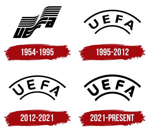
1954 – 1995
The UEFA logo of this period remarkably intertwines dynamics and grace. Sports, in essence, are a blend of limitless human potential—both physical and spiritual—requiring inner focus to shine outwardly with skills. This emblem embodies that energy, bursting like a wave, like a light flag fluttering in the free wind.
The visual identity of the world’s most renowned sports association truly resembles a flag because it features two parallel, wavy lines. They effectively convey movement—a key principle for athletes. The symbol is horizontally divided into two zones:
- Alternating black and white stripes (on top);
- The stylized name of the organization (on the bottom).
There are five black lines. Due to their narrow, upward-curving ends, they resemble classic skis. This applies only to the strokes on the left because the stripes on the right have the narrow side pointed downward. This created a light wave effect as the flag rippled in the breeze. The wide black bands also resemble speed lines, traditionally used in sports logos to convey dynamics.
In the lower zone is the abbreviation formed from the phrase “Union of European Football Associations.” The word “UEFA” is heavily stretched to ensure a smooth transition from the lower to the upper zone, concealing any height difference. Designers achieved this by emphasizing the similarity between “E” and “F.” These letters are so identical that they seamlessly flow into each other, maintaining all horizontal stripes. This continuity creates the visual effect of a flag waving in the wind.
Interestingly, the glyphs in the inscription are mostly uppercase—except for one. If you look closely, you’ll notice a lowercase “a” modestly positioned at the end of the word. It looks like a vertical rectangle. This choice was driven by the need for the text to fit perfectly into the flag’s format, and since the uppercase “A” has large internal openings, it didn’t match the artistic concept. Therefore, the lowercase “a” was selected. This way, the unique, bold sans-serif text is easily transformed into a flag.
1995 – 2012
This was when the arc emerged, marking a new era in the history of the UEFA logo. Thanks to its rigid shape, it became filled with strength, durability, and stability, which is crucial for athletes on their path to victory. The determined character of the visual identity is expressed in two arched lines, with the name of the international organization positioned between them. The upper line is longer than the lower one, giving the emblem the appearance of a fragment of something round—a seal, a ball, or a globe.
Placing the text within a solid framework significantly shifted the logo’s concept: it began to convey the determination, focus, and steadfastness of those within the sports association. The logo is depicted in a flat 2D style. This approach best suits the organization’s inner nature, as this identity requires clarity, strictness, and specificity. Ambiguity is excluded.
Naturally, the new design choice also brought a different font—a more harmonious, rigid, and principled one. It is Arial from the neo-grotesque sans-serif class. In this case, it’s bold and wide, making the letters appear compressed at the top and bottom. However, this is only an impression: in reality, the letters are light and airy due to their large internal openings. The glyphs are also spaced far apart, which positively affects text readability.
The curved flat inscription gained ample space, stretching freely along the arches. This gave the UEFA emblem a modern and professional look, as the glyphs are positioned like football players in front of the goal during a penalty. This composition proved so successful that it remained almost unchanged.
2012 – 2021
After the redesign, the UEFA logo transformed: it became sharper and more stylish, although this is less noticeable in a smaller format. Changes indeed took place, and they are genuinely significant. This is evident when looking closely at the lettering. The updates have positively impacted the visual identity of the globally recognized organization because the icon is now clear to everyone. However, the composition and concept remained unchanged, as they were already a perfect match.
The most noticeable changes occurred in the font of the arched inscription: it was transformed and became unique. It now features:
- Smooth curves
- Rounded corners
- Tall glyphs
- Diagonal cuts
- An open contour
The last item in this list refers to the letter “A,” where the horizontal bar no longer reaches the opposite side. It is cut almost halfway and does not touch the adjacent stroke. The new font style is well-received, containing far fewer sharp angles—lines are mostly smooth and soft. Exceptions are only in a few areas: the slanted cut and the inner peak of the “A,” as well as a couple of straight angles in the “E” and “F.”
The font changes, of course, affected the placement of the inscription. Previously, it was centered and far from the edges; now, the tall glyphs are almost aligned with the arches. The letters have become more refined and appear elegant, framed by two curved lines. Compared to the previous UEFA logo, the new version has a more modern look and stands out with increased dynamism due to the effective combination of straight and rounded angles. The asymmetrical elements in the “A” and “E” also add to its energy.
The black-and-white palette reflects the football association’s seriousness, high standards for teams, sincerity, openness, honesty, and the pursuit of truth. The monochrome scheme grants the organization flexibility, as designers often color the emblem differently.
2021 – today
At first glance, it may seem that the UEFA logo from this period hasn’t received any updates and does not differ from the previous one. However, that is only at first sight, as the logo’s composition, color scheme, and structure truly remained untouched. Yet, there are differences. They may be subtle, but they exist.
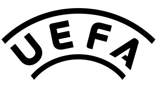
The first noticeable change is the font’s weight. In this case, the letter strokes are much thicker than before—they can be described as extra-bold. This has positively affected the logo’s scalability, which retains clarity at any size, whether enlarged or reduced. Thanks to this graphic technique, the inscription appears sharp on all screens, regardless of size.
With its thick glyphs, the bold text also conveys an atmosphere of determined ambition, strength, reliability, and even an unyielding spirit. It embodies a strong desire for victory, a demand for strict adherence to rules, and fair refereeing. The soft curves reflect a readiness to welcome new talented participants and a drive to expand horizons, reminiscent of the natural shape of a round ball.
The UEFA logo symbolizes absolute dedication to football. Its shape resembles a ball or globe fragment, emphasizing the sport’s global reach. Football is understood worldwide, played globally, and brings together athletes and fans, making the emblem iconic and all-encompassing.


