


![]() United Way Logo PNG
United Way Logo PNG
The international network of organizations that collect donations must be credible. Therefore, the United Way logo symbolizes care, tenderness, kindness, and safety. Through allegorical and abstract imagery, the designers conveyed a desire to help those in need.
United Way began in Denver on October 16, 1887, when Frances Wisebart Jacobs, Pastor Myron Reed, Monsignor William O’Ryan, Dean Hartley Hartin Martin, and Rabbi William Friedman met during a period of rapid urban growth. Poverty and disease were overwhelming separate churches and aid groups, so Jacobs proposed one joint fundraising campaign for several local agencies.
The Charity Organization Society raised $21,700 in 1887 for 22 health and social-service organizations. In 1913, Cleveland created the first Community Chest, a centralized fund for allocating donations among partner agencies. The model spread across the United States, and in 1918, regional federations formed the American Association for Community Organizations. By 1948, more than 1,000 such groups existed nationwide.
After World War II, Community Chest evolved into United Fund, using payroll deductions through employers. In 1963, the United Way name was adopted in the United States. In 1970, it became United Way of America and moved its headquarters from New York to Alexandria, Virginia. Under William Aramony, who led the organization from 1970, annual receipts grew from $787 million to $3.1 billion, helped by a long partnership with the NFL.
In 1992, The Washington Post reported on Aramony’s spending, including salary, benefits, and apartments paid for by the organization. He resigned and, in 1995, was convicted of fraud, conspiracy, and tax evasion. The scandal damaged trust, while America’s Charities gained ground in corporate giving. In 2002, United Way Worldwide was created in Alexandria. By 2021, its network included more than 1,800 local organizations in over 40 countries, with an annual income of over $5.1 billion.
Meaning and History
![]()
The United Way got its current name in 1970. In 1972, they created their original logo with a man standing on his palm. It was used for the next 32 years until it was changed. Despite the redesign, the basic graphic elements remain.
What is United Way?
United Way is a brand used by nonprofit organizations to organize themselves into one large network. United Way Worldwide manages it. It oversees the collection of donations and distributes them to all affiliates. Participating agencies pay a membership fee of 1 percent of the total funds raised.
1922 – 1952
![]()
The concept of Community Chest became popular after 1913, when the first fund was established in the United States to coordinate the collection of donations for 22 nonprofit agencies. More and more organizations in different cities joined this movement, so Community Chest needed a recognizable visual identity. In 1922, a logo featuring a goose feather, which had previously been used as a writing instrument, appeared. It was white, without details. There were black outlines along the edge.
In the upper-left corner was the word “Give,” in bold letters with large serifs. Under the pen was the phrase “THROUGH YOUR,” aligned on the right edge and written in fine, sans-serif type. At the very bottom was the name of the Community Chest. It was divided into two lines and centered. The glyphs that made up the inscription had a disproportionate shape: the designers chose a bold, grotesque, elongated vertical typeface. Its closest counterpart among modern typefaces is the Dharma Gothic C Heavy Dharma Type.
1952 – 1972
![]()
In 1949, the first United Fund was created in the United States. It managed to raise a record amount of funds, so the campaign began to spread actively among charities. Many Community Chest affiliates included the word “United” in their names, so the movement decided to change its name to United Community Funds and Councils of America.
Around the same time, a logo featuring a large “U” with six thin black lines began to be used. Its integrity was broken by the same black word, “UNITED.” The big, bold letters were in a white rectangle. The font resembled something between XXII DONT-MESS-WITH-VIKINGS HARDCORE by Doubletwo Studios and Akkordeon Nine by Emtype Foundry.
1972 – 2004
![]()
The logo changed after the charitable network was renamed United Way. The original symbol for the new brand was created by Saul Bass, the famous American designer who designed posters for Alfred Hitchcock thrillers and Stanley Kubrick feature films. He depicted a helping hand supporting a little man shaped like a “Y” with a pointy head. The figure was under an arch of four strips of different widths. The peculiar rainbow on the left side was connected to the wrist, and on the right it touched the four fingers without merging with them.
The lower half of the hand was dark blue. A little higher up, that color took on a purple hue. A gradient was used for the rainbow, going from purple to red, then to orange, and then to yellow. And the little man was completely red. At the bottom was a black “United Way” inscription, whose typography was created by Saul Bass. He took the bold, grotesque, and added personality to the glyphs.
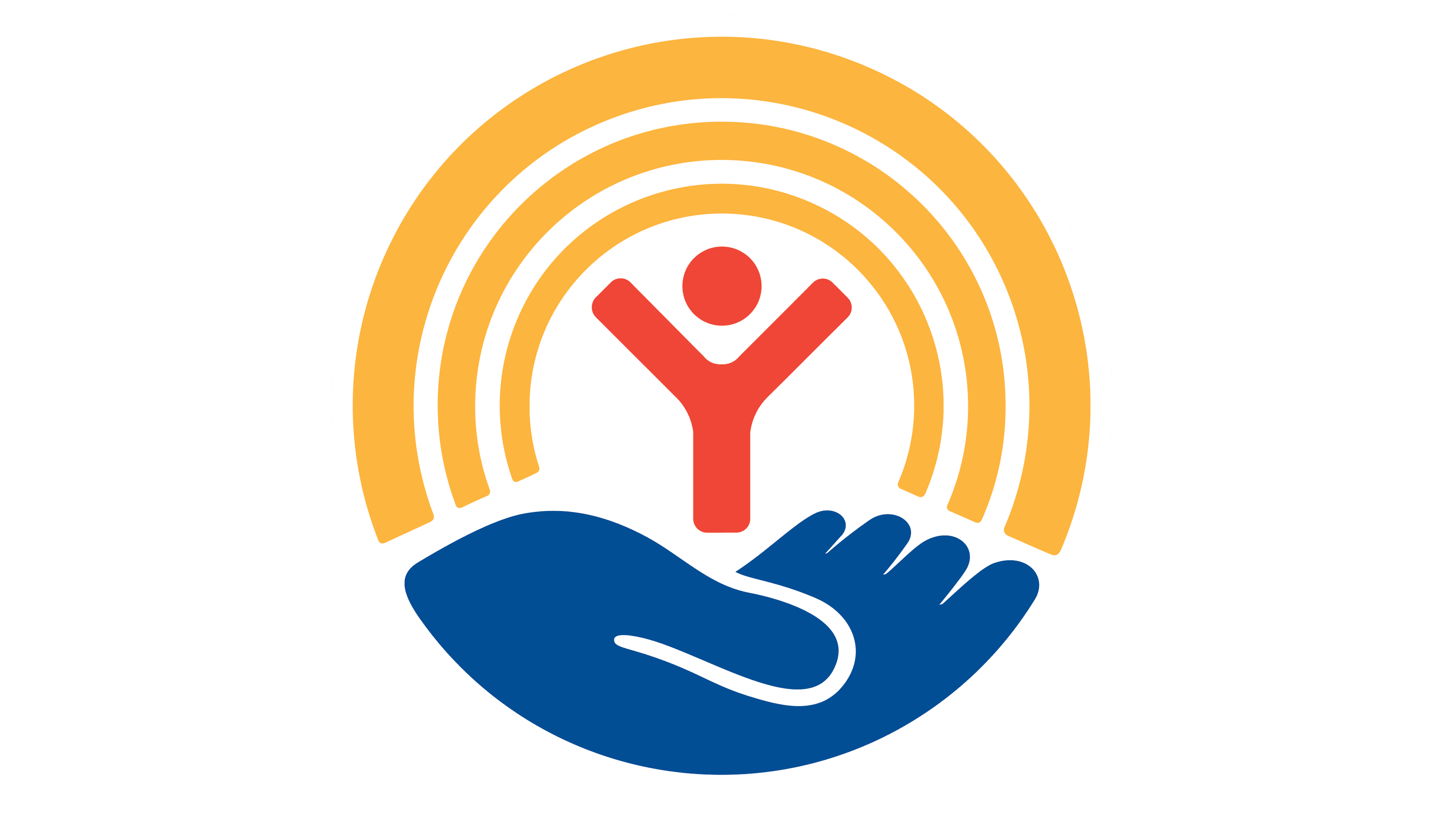
2004 – today
![]()
The new logo the designers developed in 2004 is a direct continuation of the old concept. It inherited the so-called “helping hand,” but the elements’ color and shape are now completely different. Unlike the previous version, there is no gradient here. Only the palm, without the wrist, remains of the hand, and its lines have become smoother and softer. This part of the emblem is entirely blue. For the little man, it is not as bright a red as before, but a warm one with an orange tint. The torso and arms, depicted as the capital letter “Y,” no longer have rounded ends.
The number of stripes in the rainbow has been reduced to three, which are now monochrome – light orange. The palm supporting the man is in a white circle. The latter, in turn, is depicted inside a light blue square. A dark blue rectangle of the same height adjoins it on the left. It asymmetrically displays the white name United Way: the two words are aligned on the right. This shift creates the effect of movement and looks modern. For the lettering, a bold font with massive serifs is used, developed from Avenir.
Font and Colors
Each element of the United Way logo has a special meaning. For example, the rainbow represents hope. The hand cradling a person symbolizes support, as the international network constantly helps those in need. But there’s another hidden metaphor here – balance. The figurine balances on the palm, much like charities balance the capabilities of different segments of society to fight social inequalities. These associations are intensified by the triumphant pose of the little man, who is rejoicing, his hands raised above his head and spread apart as if to express rapture.
A unique set of glyphs was developed for the word mark, which has been used since 2004. It is based on the standard Avenir font. The designers changed the letters to match the emblem’s round shape. In doing so, the capital “W” and the lowercase “a” merge at the top point. This is how the designers decided to reflect the concept of unity. A similar typeface is ITC Officina Serif Medium by Erik Spiekermann.
The United Way logo’s color scheme is highly diverse, despite the lack of a gradient. It contains two shades of blue (dark #005191 and light #539ED0), red (#FF443B), yellow (#FFB351), and white (#FFFFFF).