


 Universidad Del Valle de Mexico Logo PNG
The Universidad Del Valle de México logo is a classic design that harmoniously combines elements of innovative branding and modern graphics. It is a visual symbol and an informative, presentational mark that easily identifies the university. It is bright and attractive yet retains its unique originality, symbolizing knowledge, inspiration, and a focus on business. The design emphasizes precision, creating a subtle but palpable connection to mathematics and accounting.
Since its founding, the university has clearly outlined two key areas: business and accounting. This focus is reflected in its branding, which has evolved while staying true to its roots. Today, Universidad Del Valle de México has over 35 campuses nationwide, and its teaching staff, which initially included only 20 specialists, has grown significantly. The first student enrollment was just 200, reflecting the university’s modest but confident steps toward success.
The logo that emerged during the university’s development differed significantly from the current one, yet each element held meaning. Today, the university is deservedly considered one of the most renowned in Mexico, and its branding remains completely original, reflecting its rich history and high educational standards.
The history of Universidad del Valle de México began in 1960, when Mexican educators and entrepreneurs founded a small institution in Mexico City to answer the country’s demand for trained professionals. Its first programs focused on engineering and business, areas linked to Mexico’s expanding economy during the 1960s.
In the 1970s, UVM broadened its academic offerings to include the social sciences, law, and medicine. The opening of the San Luis Potosí campus in 1976 marked the beginning of its expansion beyond Mexico City. During the 1980s, the university modernized libraries, computer laboratories, and classroom technology. In the 1990s, new campuses in Guadalajara, Monterrey, and other major cities helped it become one of Mexico’s largest private universities.
A major change came in 2000, when UVM joined Laureate International Universities, gaining wider international links and exchange opportunities. Online programs followed in 2004 for students with work schedules or limited access to classroom study. Research activity grew in 2010, driven by new institutes and laboratories. By its 55th anniversary in 2015, UVM had more than 30 campuses and offered bachelor’s, master’s, and doctoral programs.
From 2018 to 2024, UVM revised curricula, expanded internships, supported student entrepreneurship, and signed agreements with U.S. and European colleges. Digital transformation accelerated in 2020, followed by new programs in digital marketing, cybersecurity, and artificial intelligence in 2021. In 2022, business programs received international accreditation, while research in materials and biotechnology grew. In 2023, campuses were renovated, and in 2024, UVM 2030 was launched for its 64th anniversary.
Meaning and History
What is Universidad Del Valle de Mexico?
It is a private higher education institution with several campuses throughout Mexico. It offers graduate and undergraduate programs in social sciences, business, engineering, health, arts, and other subjects. The institution is known for its advanced facilities and real-world approach to learning, focusing on preparing students to succeed in a globalized society. It maintains close relationships with business partners, providing students with access to internships and practical work experience. The institution is a member of the Laureate network of foreign universities, and its curriculum may include a global perspective and participation in foreign exchange programs.
Before 2013

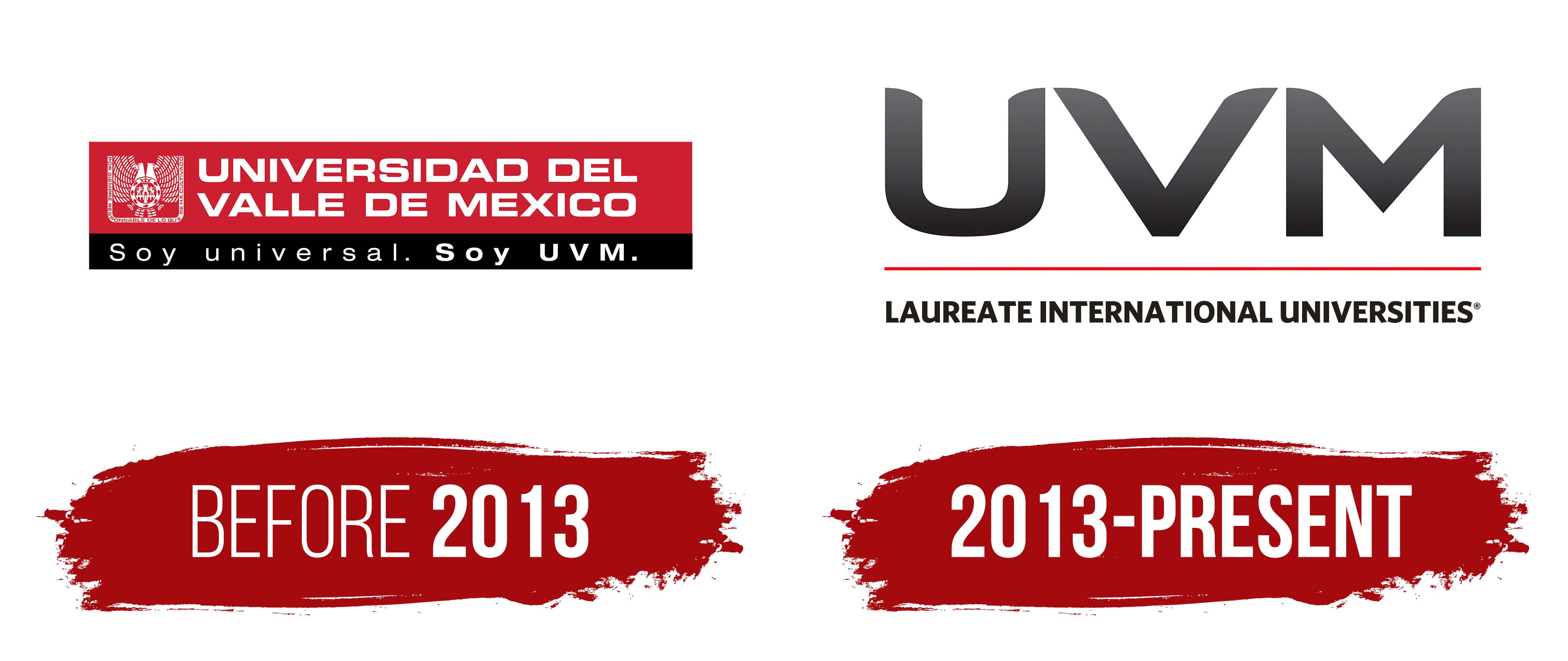
The first logo was remarkably wordy and memorable. It drew attention with its bright tricolor scheme, where black and red harmoniously intertwined, creating a visually captivating contrast with the white letters. This unique combination of colors made the emblem distinctive and easily recognizable. Each area of the logo was delineated, allowing it to convey specific information, like parts of a puzzle, uniting the three key features of the identity.
The graphic emblem, engraved to the right of the text, attracted special attention. Its detail allowed one to see not just an image but powerful symbolism. A double-headed eagle with outstretched wings symbolized freedom and strength, while its powerful beak represented knowledge, ready to break through. The union of the eagle with two lions highlighted success in education and confidence in overcoming challenges.
The university’s name was written in white capital letters arranged in two rows. The logo font was carefully selected, combining perfectly straight lines with soft curves, which gave the text harmony and balance. The width of the letters and equal spacing between them added clarity and order to the overall perception.
An additional element was the two dots used as punctuation in the logo. This was a deliberate technique aimed at focusing the viewer’s attention on the emblem’s key aspects. Of course, the abbreviation UVM, written in large letters, completed the image, emphasizing the university’s importance and prestige.
2013 – today
In 2013, the logo’s color palette was changed, and traditional elements, the two-headed bird, lions, and shield, were abandoned. The new logo focused on the text, emphasizing the perfection of each letter and the simplicity of the background.
At first glance, the new logo’s color scheme seems simple, but this simplicity conceals a carefully considered choice of shades. The gray color on a white background creates an elegant combination, enhanced by a gradient and shine, giving the letters depth and significance. The abbreviation is rendered in uppercase letters, which becomes the central element of the composition. Straight angles and neatly rounded edges of some elements create a balance between precision and sophistication. The visual impact is amplified by a red line separating the two words. This thin line is a visual magnet, drawing attention to key details.
The black color used for the uppercase letters in the phrase “Laureate International Universities” emphasizes the institution’s high status. This inscription serves as a reminder that the Universidad Del Valle de México continues its dynamic development and ranks fourth among the country’s best educational institutions.