


 Macquarie University Logo PNG
The Macquarie University logo combines current trends from different eras, symbolizing strength, faith, and reliability in a unified configuration. The color scheme and introduced graphic elements create a harmonious, memorable image, distinguished by mathematical precision in proportions and a balanced height. The three background colors, used across different planes, blend perfectly, emphasizing the design’s unity and thoughtfulness.
Special attention is drawn to the font used for the university’s name. It is presented on two levels, with the words scaled differently and the second word carefully centered relative to the first. The font skillfully combines boldness and elegance, giving the text expressiveness and significance.
The depiction of the lighthouse on a two-dimensional background enhances the logo’s overall meaning, adding informational depth. This element, previously used in earlier university logos, continues the tradition, but in the new design, it plays an even more important role, strengthening Macquarie University’s identity and visual integrity.
Macquarie University began in 1964, when the New South Wales government created Sydney’s third university in response to population growth and rising postwar demand for higher education. The university was named after Lachlan Macquarie, the fifth governor of New South Wales. Construction started on a 126-hectare campus in North Ryde, near growing industrial districts.
The university officially opened on August 6, 1964, and admitted its first students in 1967. Its first faculties covered arts, science, and economics. Professor Alexander George Mitchell served as the first vice-chancellor until 1975. He helped shape the university’s early academic culture, including an interdisciplinary model that let students study across different fields.
Macquarie added Australia’s first Faculty of Earth Sciences in 1969. During the 1970s, it expanded with the Australian Graduate School of Management in 1972, the School of Law in 1974, and a university hospital in 1978. New research centers followed in the 1980s, while actuarial studies began in 1990, answering demand for financial risk specialists.
The 2000s brought campus modernization and a new library, and in 2010, a $250 million hospital complex. Later milestones included the Earth Sciences center in 2011, the Global Leadership Program in 2012, 50th anniversary events in 2014, Dr. Chau Chak Wing Medical School in 2015, the university incubator in 2016, a new arts building in 2018, a new study structure in 2019, Applied Finance and an updated MBA in 2021, robotics and AI work in 2022, and quantum computing research in 2023.
Meaning and History
What is Macquarie University?
This university is a public research institution in the Macquarie Park area of Sydney, Australia. It offers a wide range of undergraduate and postgraduate courses in arts, business, science, engineering, and health sciences, among other areas. The university is renowned for its cutting-edge approach to teaching, with a strong focus on interdisciplinary courses and practical placements, and is set on a modern, park-like campus, including Australia’s first and only private hospital on a university campus, Macquarie University Hospital. The university is well known for its research output and has a strong reputation in commerce, linguistics, and environmental sciences.
1964 – 2009
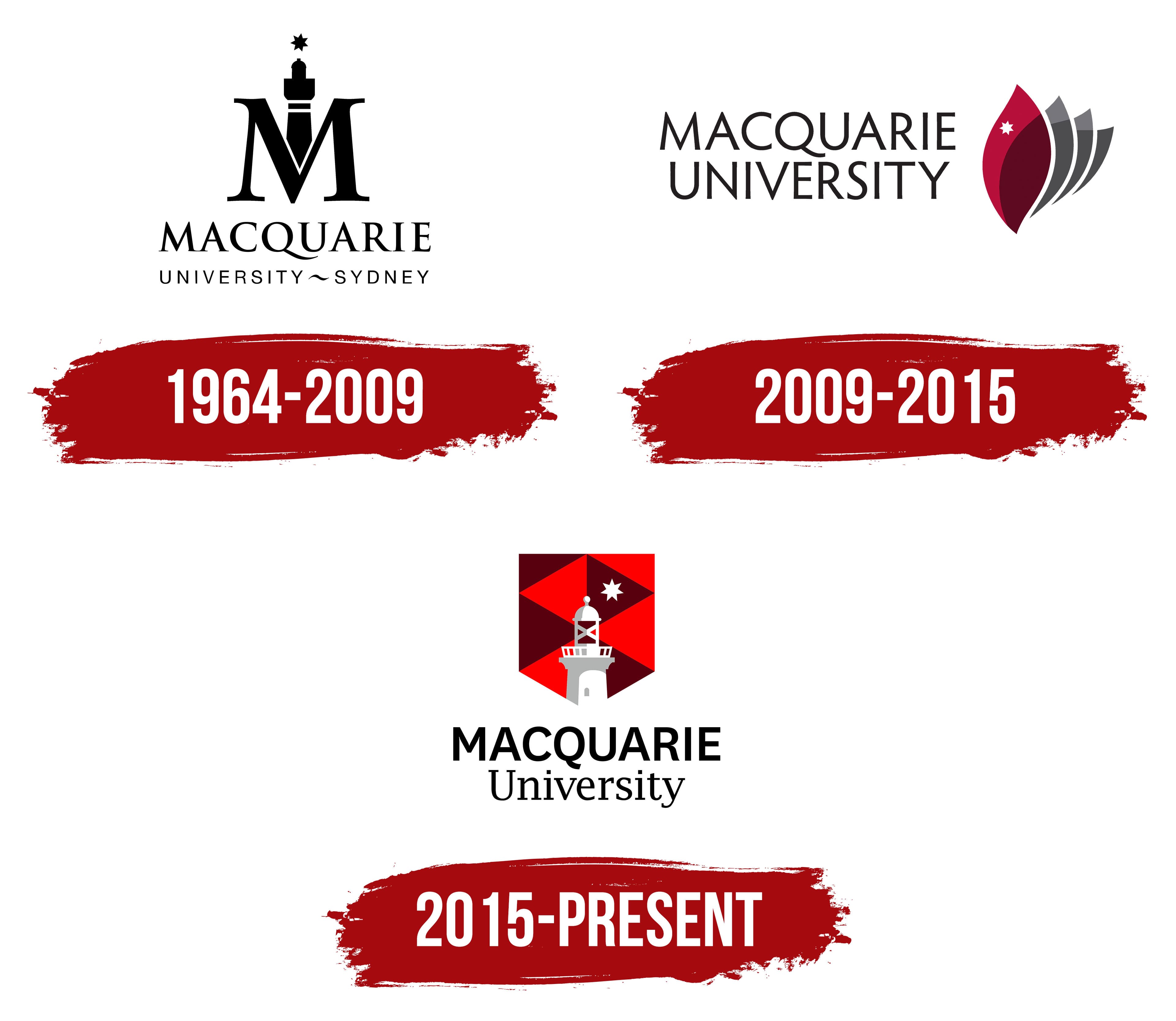
The university’s first logo was introduced in 1964 when Macquarie University debuted. This emblem attracted attention with its unique aesthetics and deep symbolism. The logo was conventionally divided into three levels, which gave it a special mystical appeal. It could be perceived from top to bottom or in reverse, giving it a layered and meaningful appearance.
At the top of the logo, a rising star was depicted on a white background, uniting all the levels. The star’s black color contrasted with the white background, creating the illusion of light breaking through darkness, symbolizing the path to knowledge. This graphic element played with the imagination, evoking associations with light at night and illuminating the way forward.
Below the star was the letter “M,” behind which a lighthouse seemed to be hidden, the central element of the logo. The lighthouse shared its significance with the letter “M,” emphasizing their equal importance. This combination of symbols made the university’s logo visually appealing and rich in meaning.
Space was reserved at the bottom of the logo for the university’s name. At that time, including an institution’s full or abbreviated name in logos was mandatory, and Macquarie University was no exception. The words “University” and “Sydney” were placed on the same line, connected by a graphic sign “~,” which gave the logo a particular elegance and completeness.
2009 – 2015
In 2009, the original Macquarie University logo underwent significant changes, resulting in a new look. Many previous elements were replaced with new images filled with symbolism and sacred meaning. This redesign allowed the university to present itself in a new light while maintaining its core identity.
The name “Macquarie University” remained on the logo, but its visual execution was updated. It is now written in two lines, using a new font emphasizing the institution’s prestige and reliability. The graphic separations from previous logo versions disappeared, and now both words appear uniform and harmonious. The only change is a slight offset of the second word relative to the first. The black color of the letters emphasizes the logo’s strictness and elegance.
To the right of the university’s name is a graphic element: a maroon petal with three gray shadows that add depth and volume. This element became the symbol of the new logo. On the maroon petal is a barely noticeable white star that seems to have transitioned from the previous logo, preserving continuity and a connection to history.
2015 – today
The star has always remained a constant element of Macquarie University’s identity, appearing on the logo throughout its existence. The latest logo transformation combines familiar and new elements, creating a harmonious and recognizable visual design. The logo once again includes the key symbols:s the lighthouse, the star, and the elegant university name, written in two lines.
In the new logo, more colors are used, and a shield has been introduced, with its inner space divided into equal triangles. These triangles alternate between red and maroon shades, giving the logo dynamism and depth. The overall background of the logo remains solid white, creating a sharp contrast with the rich colors of the shield, highlighting the uniqueness and significance of each element.
The Seal
The university seal plays a significant role. Macquarie University paid special attention to its creation to ensure it is presentable and accurately reflects its key activities. The seal is highly informative and easily memorable, thanks to its carefully thought-out elements.
The seal’s main background is green, creating a sense of freshness and stability. Against this background, a white lighthouse stands on a pedestal, symbolizing the light of knowledge and guidance. The star, which consistently appears on logos from different periods, is presented in a gold shade with a shimmer, adding elegance and emphasizing the university’s status. This element, positioned at the top of the seal, gives it a sense of completeness and importance, making it a symbol that reflects tradition and the pursuit of high standards.