


![]()
The University of Warwick, one of the UK’s leading research universities, has unveiled a new visual identity. The update includes the logo, crest, slogan, and visual system, reflecting the university’s current stage of development.
The previous mark, created more than ten years ago, was built around a large letter W in a purple palette. It was recognizable but perceived as too abstract and worked poorly in digital channels. The new style addresses this: the name University of Warwick is now presented in large typography using uppercase letters.
![]()
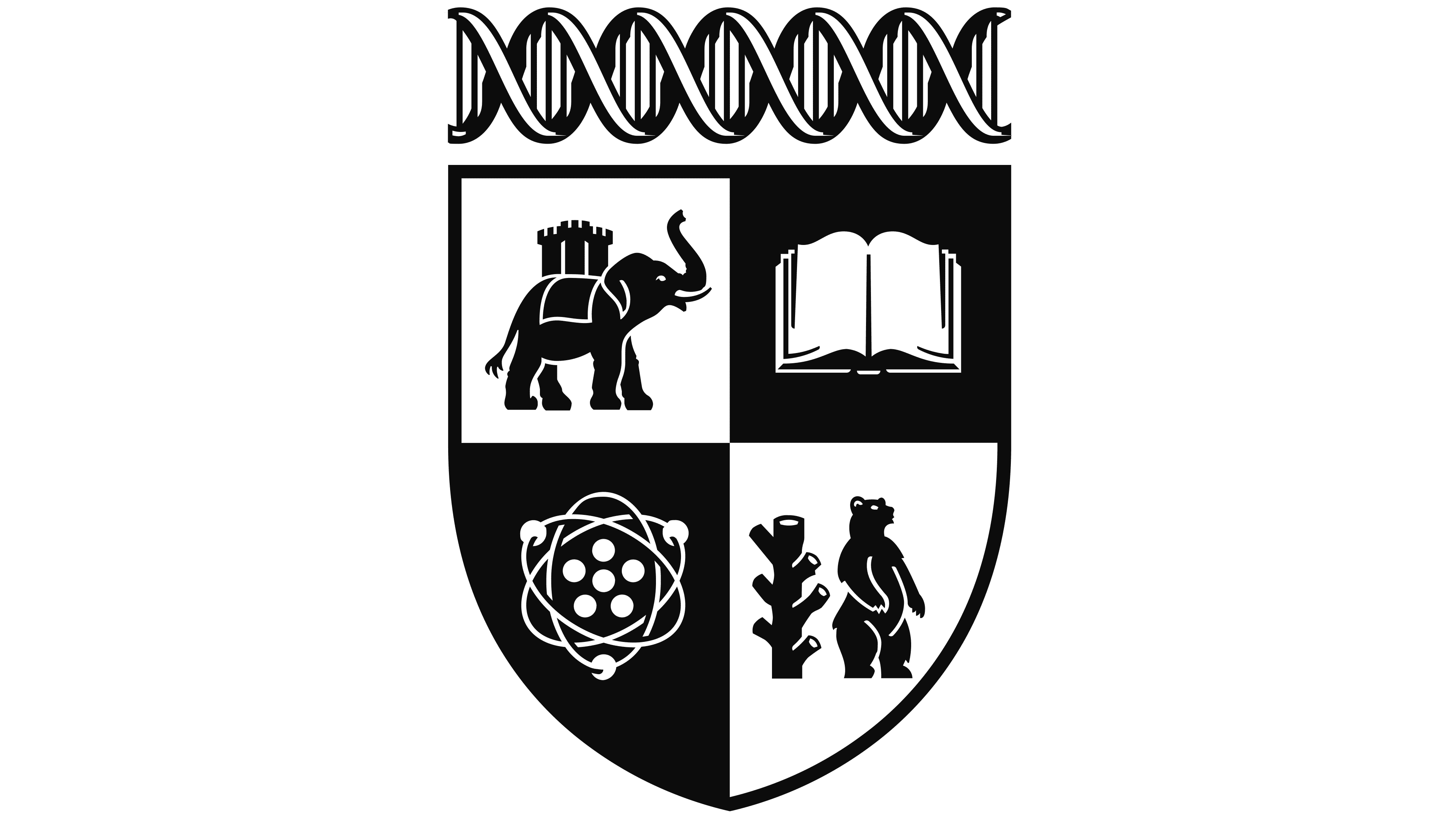
At the same time, the university’s historic crest was redesigned. Illustrator Tobias Hall, who has previously worked with Cadbury and Jim Beam, created a new version in the style of a stylized engraving. The crest has retained the traditional symbols of the 1960s but has been given a modern design that combines continuity with a minimalist approach.
The development of the slogan and brand concept was based on research involving over 10,000 members of the university community, including students, alumni, and staff. The surveys showed that Warwick is perceived as a university with an entrepreneurial culture and an innovative approach to science and education. These qualities formed the foundation of the new communication.
The color system is built on a black-and-white palette. It allows the style to be integrated into any materials, from print publications to digital services. The flexibility of the palette makes the brand a universal tool for the university’s various departments.
An important role in the update was played by the visual photo library created by photographer Megan Eagles. The images capture campus life without staging: students, faculty, and researchers are depicted in their work and everyday settings, creating an authentic representation of the university.
According to Ajay Teli, Director of Marketing and Communications, the goal was to create an image that would be simple, powerful, and digital. The new style reflects the university’s ambitions to strengthen its position among the world’s leaders in education and research.
![]()
The implementation of the updated identity will occur gradually over three years. The new logo and crest will replace the old symbols in all communications, on student and staff uniforms, in campus spaces, and in digital environments.
The rebrand has become a starting point for a new chapter in the University of Warwick’s history. It combines tradition and modernity, emphasizing the university’s key qualities: boldness, innovation, and the ability to offer unconventional solutions to global challenges.