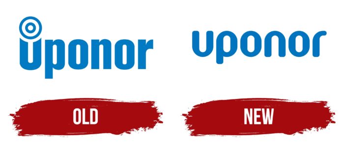
The Uponor logo is light, airy, clean, and weightless. The designers purposely made it that way to show the efficiency of the cooling, heating, and water supply systems that the company produces. They used a minimalistic style because it best conveys a comfortable atmosphere.
Uponor: Brand overview
| Founded: | 1918 |
| Founder: | Aukusti Asko-Avonius |
| Headquarters: | Vantaa, Finland |
Uponor is one of the market leaders in climate control and plumbing. The company is of Scandinavian origin and produces high-quality equipment that meets all requirements. The products are especially in demand among professional building service companies and construction corporations.
The commercial scope of the company is very large. The main facilities are in Finland (Vantaa), and branches are located in America and Europe. Products of one of the largest manufacturers are easily recognized by stylish design. The logo is a model of minimalism and consists of just a single inscription in a stylish blue color.
Meaning and History
Uponor provides residential and commercial buildings with the best technology that focuses on sustainability and high-quality service. The company uses innovative technology and reliable materials in its manufacturing process. The Uponor specialists also work hard to develop the brand, so every year, the brand introduces more advanced plumbing systems and functional equipment for cooling and heating to the market.
The manufacturer’s specialization was the basis for the development of the brand identity concept. A distinctive feature of the Scandinavian countries is the choice favor of laconic and simple design. In Finland (where the delusion is based), this trend is also supported, so an uncomplicated font and monochrome color scheme were chosen for the Uponor logo. It is based on the company name only, which shows the significance of the released designs and the professionalism in the chosen field.
Old
The Scandinavian company has provided consumers with innovative infrastructure solutions for over 100 years. At the time of its foundation (1918) was also developed a corporate identity. The name of the company was taken as the basis of the logo. A stylish blue color was chosen for the design, which evoked associations with trust, stability, and reliability.
In addition, the shade symbolized the manufacturer’s responsible attitude to the manufacturing process of machinery. It was particularly important for a brand that worked in such an industry to establish a friendly and trusting relationship with the customer. After all, the solutions he was offering were bought for long-term use.
Customers choose such products quite carefully, so it is important to pay attention to every detail, down to the badge on the product. To maximize the possibilities and the essence of Uponor and to show its value to customers, the designers added an elegant icon above the first letter of the name. It was reminiscent of a target used in a shooting gallery.
The element that stood out for Uponor’s ability to provide solutions that were perfectly suited to a specific request. The word mark consisted of clearly marked letters with soft cuts and roundings. Medium-sized lines ensured that the logo was recognizable and expressive.
New
Further on, Uponor was steadily gaining the attention of more and more customers and was gradually gaining the leading position. The company’s development was also reflected in the logo. The old badge was replaced by a more stylish version, which did not contain anything unnecessary. The color remained the same, indicating the brand’s steady development invariable course.
The changes touched upon the font and graphic elements. The latter completely disappeared from the new logo, while the font became even smoother. Such a design refreshed the emblem and made it more modern. The new design was successful, authoritative, and innovative.
Font and Colors
The current Uponor logo, like the first version, is minimalist. It is based on just one inscription, which is, in fact, the emblem. It is in the original sans serif font. The letters look like the Mic32 New Rounded Bold style with thick lines and smooth angles. It’s an unusual font that adds to the badge’s solidity.
Given the brand’s long history and its list of high-quality designs, this kind of design is perfect for the company. In addition, the softness of the font is associated with the comfort that Uponor strives to provide to each of its customers. The brand value system is also evident in the perfectly matched colors. The letters of the name are in a light blue shade.
The neutral white base color was chosen as the background. Blue is the color of water and sky. It signifies tranquility, reliability, and inner strength. In this context, it reflects the high quality of the product, its reliability, and stability. White is a universal background, which emphasizes the expressiveness of other shades but also symbolizes simplicity and transparency. It means that the company values its reputation and tries to offer customers only the best.
Uponor color codes
| French Blue | Hex color: | #0074be |
|---|---|---|
| RGB: | 0 116 190 | |
| CMYK: | 100 39 0 26 | |
| Pantone: | PMS 3005 C |


