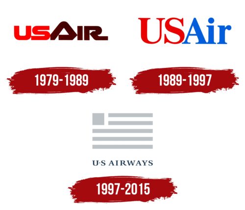
The US Airways logo is like a light shadow on the ground from a passing airliner. The plane is reflected in the form of the American flag. This image immediately makes it clear which country the company represents.
US Airways: Brand overview
US Airways, a prominent American airline, had a significant operational span from 1939 to 2015. It boasted an expansive domestic and international flight network, with primary hubs in Charlotte, Philadelphia, Phoenix, and Washington, D.C.
In 2013, US Airways joined forces with American Airlines. By 2015, this amalgamation led to the dissolution of the US Airways brand. Originally established as All American Aviation in 1939, the airline underwent multiple name transformations over its lengthy history.
The airline’s extensive fleet comprised aircraft from Airbus, Boeing, and other regional jet manufacturers, including models such as the Airbus A320 family jets, Boeing 737s, and Embraer E-jets.
US Airways was part of the Star Alliance from 1997 until 2004, when it left to facilitate a merger with America West Airlines. At its zenith, US Airways secured its position as the 5th largest airline globally, holding a significant market share in the United States.
The airline operated over 3,000 flights daily, serving over 200 destinations in the U.S., Canada, the Caribbean, Latin America, and Europe.
However, financial difficulties and a series of mergers led the airline to declare bankruptcy twice, in 2002 and again in 2004. After a comprehensive integration process with American Airlines, the US Airways brand ceased to exist in 2015.
Meaning and History
What is US Airways?
It is a major American airline headquartered in Tempe, Arizona. It operates a network of domestic and international flights connecting destinations in North America, Europe, the Caribbean, and Latin America. The airline provides a variety of service classes, including economy, first, and business classes on international routes. The airline serves millions of passengers annually. It merged with American Airlines, and its operations were integrated into the American Airlines brand, resulting in the dropping of the US Airways name.
1979 – 1989
US Airways, known as USAir from 1979 to 1989, has undergone a significant evolution and transformation of its brand, starting its history as All American Aviation, then renaming to Allegheny Airlines, and finally adopting the name it wanted to be recognized by. This transition was particularly significant after 1979, when government control over the company was removed, allowing it to free itself from regulatory constraints and more freely shape its brand.
As part of the rebranding, a new logo was introduced, which stood out with its expansive style and red-brown color palette. These colors lent the logo vibrancy and recognizability while reflecting the brand’s solidity and reliability.
The logo’s central letter “A” was styled as a delta symbol, a visual indication of an airplane on an attitude indicator, and a symbol of flight orientation. This logo symbolizes stability and balance, metaphorically reflecting the company’s aim to maintain steadiness and dependability in its flights. The ability of the indicator to show the airplane’s position in space—whether it is flying straight or has banked—is reflected in the logo design: the delta, positioned precisely in the center, represents the company’s correct and steady course.
Additionally, the letters on either side of the delta are formed to visually resemble wings, emphasizing USAir’s aviation focus and dynamism.
1989 – 1997
Ten years after its previous rebranding, the company changed its logo to reflect its ambitions and connection to the aviation industry. The new logo design incorporated colors more closely associated with the sky and flight, emphasizing the company’s main activity area. The choice of color palette reflected the company’s national identity, connecting it with the United States through red and blue shades, which are traditional for the American flag.
The new logo stretched the letters vertically, visually symbolizing the company’s aspirations and achievements in the aviation sector. This design emphasized the dynamics of development and constant forward movement, reminding the company of its unwavering pursuit of new heights in providing aviation services.
A particularly expressive decision was to make the letter “A” common in the words “USA” and “Air,” which made the emblem more compact and memorable.
1997 – 2015
The final brand symbol of US Airways, introduced after ending its partnership with British Airways, marked a distinct departure from previous versions. The company chose an image of a desaturated U.S. flag for its logo, a unique and unconventional move in branding. Rendered in shades of gray and almost transparent tones, the flag created an effect akin to a reflection or a faint shadow of the real flag. This design was imbued with deep meaning and a subtle interplay of visual perceptions.
Using such a symbol in the logo design could effectively evoke feelings of patriotism and pride in the country, yet it did so in a way that was neither excessive nor vulgar. This approach avoided exploiting the national symbol commercially while maintaining a connection with national identity.
Choosing neutral shades for the flag helped create an image of stability and reliability, a key aspect of the aviation industry. These colors emphasized the seriousness and professionalism of the brand, which is particularly important for an airline striving to strengthen trust among its clients.
The company name was rendered in dark blue, further enhancing associations with professionalism and reliability. Dark blue traditionally conveys authority and expertise, ideally suiting the image of US Airways as a leading airline carrier.
This rebranding reflected the company’s strategic direction changes after the partnership with British Airways ended. It allowed US Airways to redefine itself in the market, highlighting its uniqueness and commitment to high standards of service and safety.
