![]() USSF Div 2 Pro League Logo PNG
USSF Div 2 Pro League Logo PNG
The USSF Div 2 Pro League logo reflects a stage of American soccer where teams compete for a place at the highest level. It conveys the atmosphere of competitions built on the desire to prove one’s capability and readiness to advance.
The USSF Division 2 Professional League emerged in 2010 from a conflict between two American soccer leagues, the USL First Division and the NASL. The dispute began with the sale of USL to NuRock, sparking protests from clubs.
The US Soccer Federation (USSF) intervened, forming a temporary one-season league of 12 teams, divided into two conferences based on their previous affiliations with the USL and NASL.
The Puerto Rico Islanders won both the regular season and playoffs, defeating the Carolina RailHawks in the final. Some league clubs also participated in international competitions, notably the Islanders, who played in the CONCACAF Champions League.
After the season, the league dissolved. Several clubs joined NASL, which gained second-division status, while others opted for the newly formed USL Pro (later known as USL Championship).
Montreal Impact, Vancouver Whitecaps, and Portland Timbers soon joined MLS, America’s top soccer league. NASL ceased operations following legal disputes, leaving the USL Championship as the country’s sole second division.
Meaning and History
![]()
What is USSF Div 2 Pro League?
It was a second-division professional soccer league in the US that existed for only one season. The league was established as a temporary solution due to disagreements among clubs regarding management and match organization. It set strict infrastructure standards, but after its first season, teams moved to other soccer competitions.
2010
![]()
The USSF Division 2 Pro League logo appeared after the merger of the United Soccer League and the North American Soccer League. Created for a single season, it reflected the new soccer structure’s official status and emphasized its connection to the national federation.
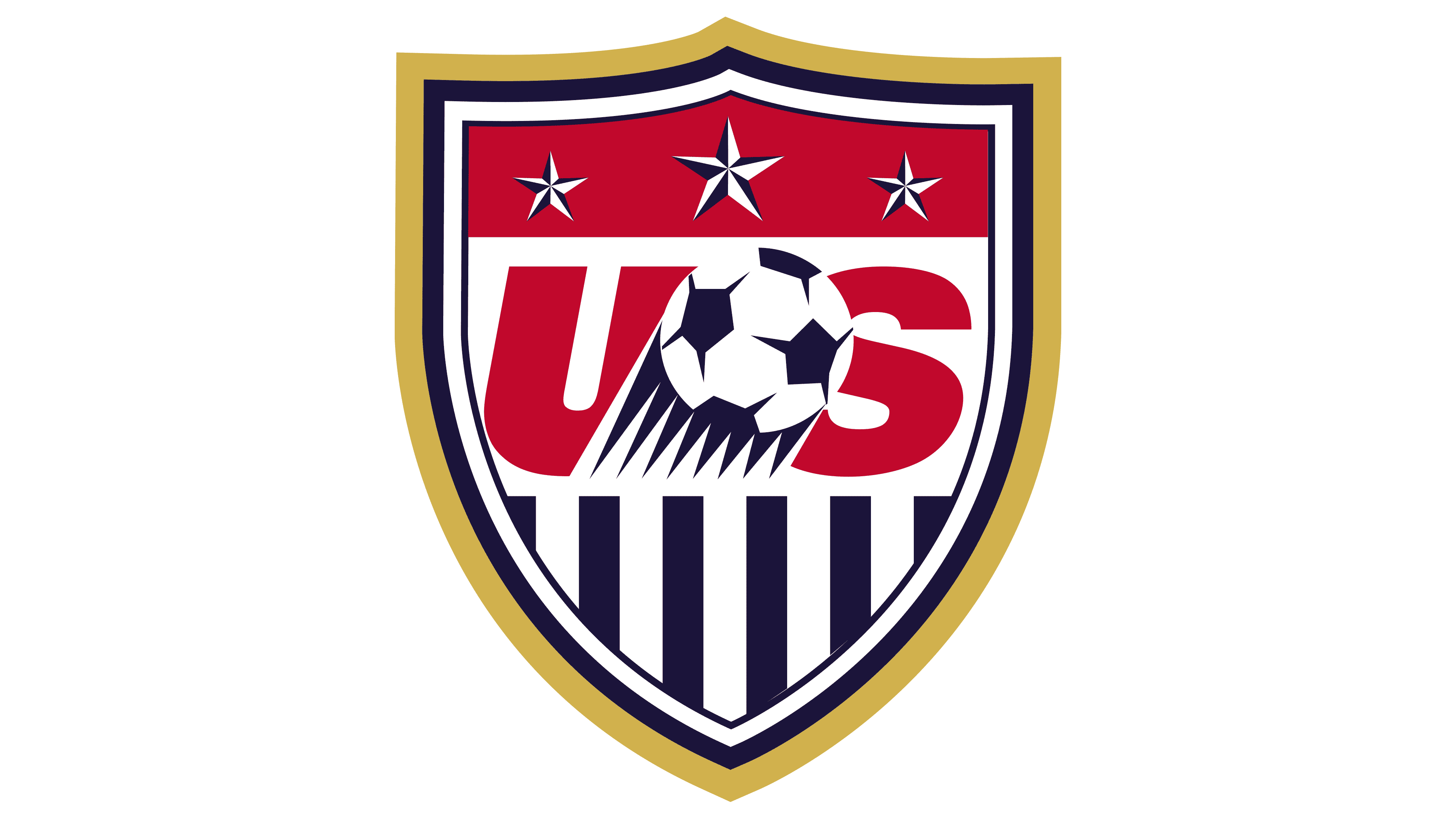
The main element of the emblem is a shield at the center against a dark red circle. The top line of the shield is formed by two smooth curves ending in three sharp peaks. The shield is layered, with its contours highlighted by white and dark blue lines, creating an effect of volume.
At the top of the shield are three five-pointed stars, representing men’s, women’s, and youth soccer competitions supported by the US federation. Below the stars are the large letters “US” in rich red on a white background. The letters are heavy and slightly slanted to the right. Between them is a soccer ball with dark blue and white segments. From the ball downward, extend dark blue lines to symbolize the trajectory and emphasize the nature of the game.
The lower part of the shield is filled with a white background with vertical blue stripes. The shield is framed by a dark blue ring bearing the full league name, “U.S. SOCCER FEDERATION” at the top and “DIVISION-2 PRO LEAGUE” at the bottom. The white text is set in an even sans-serif typeface resembling Gotham or Avenir. Small white dots separate the side parts of the inscription. A soft gray shadow runs around the entire composition, adding depth to the emblem.
The logo’s colors correspond to American symbolism: blue, rich red, white, and small yellow accents. Despite the league’s short existence, this symbol preserved the memory of the 2010 unification of soccer organizations. It became a vivid reflection of an interim period in US sports history.