


 UEFA Champions League Logo PNG
The UEFA Champions League logo conveys the tournament’s grandeur, where Europe’s top football clubs compete for the coveted trophy. The timeless symbol inspires athletes and fans, fostering a sense of unity. At the same time, the emblem evokes the thrilling anticipation of new matches held each year.
The European Cup began in 1955 after L’Équipe editor Gabriel Hanot proposed a competition for national champions. Sixteen clubs entered the first edition. On June 13, 1956, Real Madrid defeated Reims 4-3 at the Parc des Princes and went on to win the first five tournaments, establishing an early pattern for the competition.
During the 1960s, Benfica, AC Milan and Inter became leading forces, while a 1961 match involving Juventus drew 127,621 spectators at the Santiago Bernabéu. The 1970s belonged largely to Ajax, champions from 1971 to 1973, and Bayern Munich, winners from 1974 to 1976. English clubs collected seven titles in the 1980s, before the 1985 Heysel disaster led to a five-year ban from European competition.
In 1992, UEFA renamed the tournament the Champions League and introduced a group stage, increasing matches, television income, and commercial reach. Olympique Marseille won the first edition under the new format. Runners-up from major domestic leagues were admitted from 1997, the second group stage disappeared in 2003, and a revised qualification system arrived in 2009.
The 2010s brought four titles in five years for the Madrid club, financial fair play rules, and VAR in 2018. The same year, a fourth substitution in extra time was introduced. From 2024, the traditional groups were replaced by a 36-team league format with more matches. Tony Britten’s anthem, written in 1992, remained closely associated with the tournament.
Meaning and History
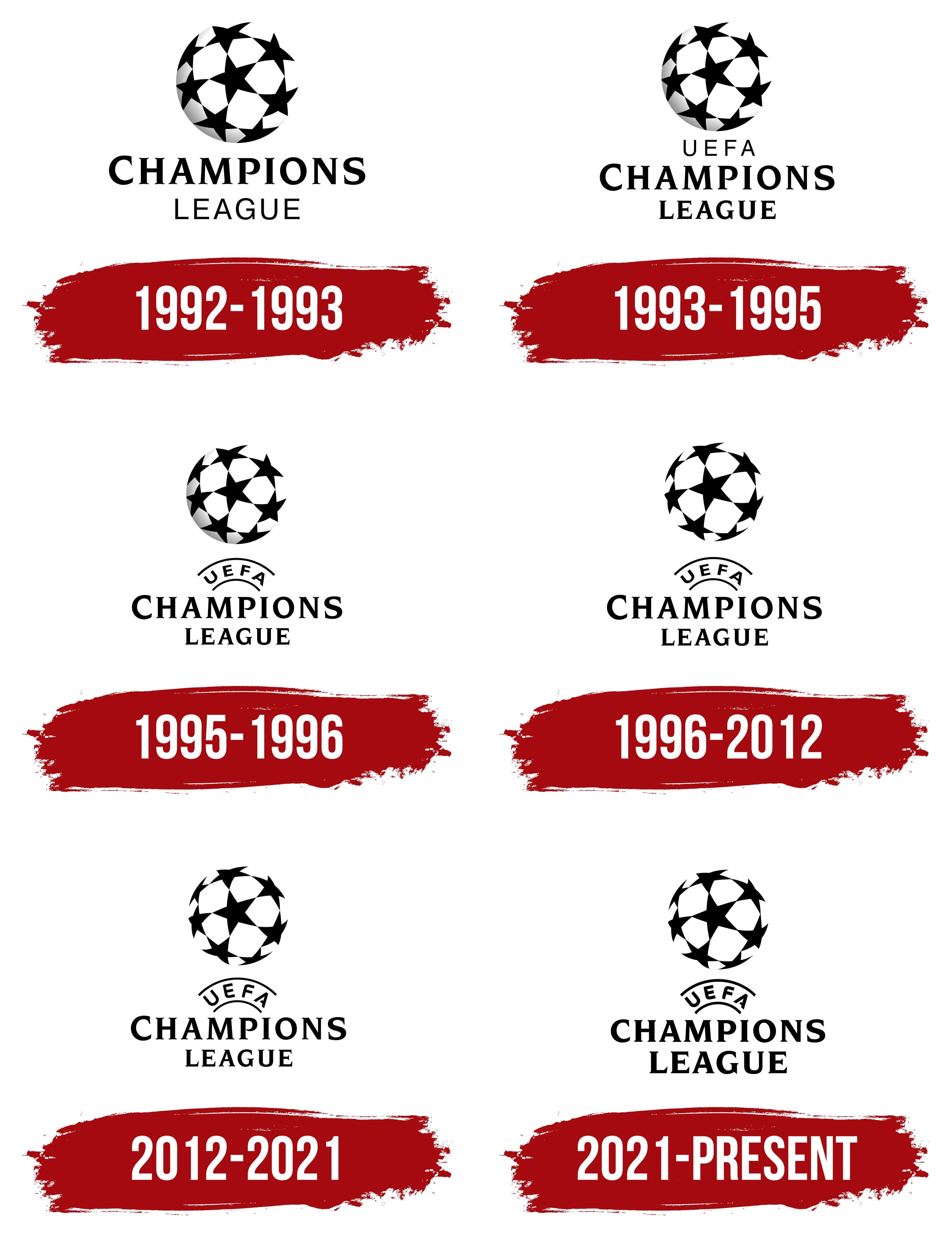
What is the UEFA Champions League?
This is Europe’s largest club football tournament, where the continent’s strongest teams compete for a prestigious trophy. Matches are played in a group-stage and knockout format, culminating in a final that attracts millions of viewers annually. This tournament brings together established football giants and ambitious newcomers, creating thrilling moments, legendary games, and unforgettable goals. The iconic anthem and unique ball design have become symbols of the tournament, emphasizing its status as the premier club competition.
1992 – 1993
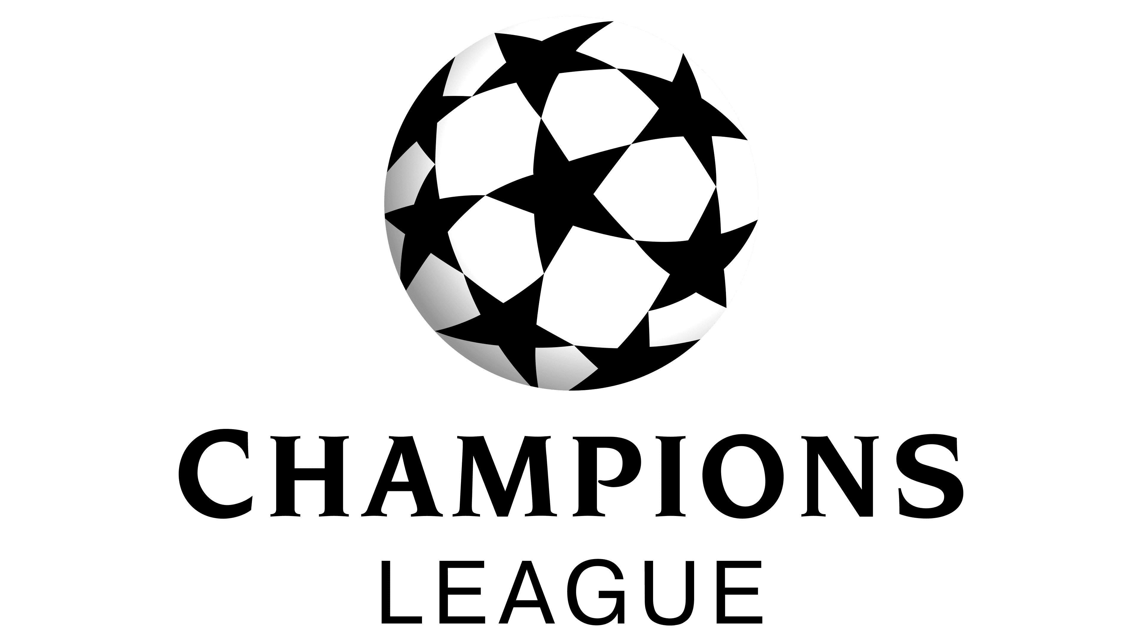
Although the UEFA Champions League was established in 1955, it did not have an official logo for many years. The tournament introduced an emblem only in 1992, after it was renamed the UEFA Champions League. The competition’s primary visual symbol became a stylized ball, whose surface is covered not with standard polygons but with black five-pointed stars. These stars represent the successful teams that reach the prestigious club championship.
The spaces between the stars on the ball are filled with neutral white, and only the left side features a gray gradient in the shape of a crescent. This smooth transition of shades transforms the flat circle into a three-dimensional sphere. The sphere represents the Earth, symbolizing the tournament’s global nature and attracting fans worldwide. It is not merely a ball but an entire football planet. The gradient adds dynamism, creating the impression of motion.
However, the logo’s main “star” sits at the bottom: the “CHAMPIONS LEAGUE” inscription reminds viewers that the tournament is no longer called the European Cup. The phrase is divided into two lines and uses two different fonts. The first word is written in ITC Novarese with prominent serifs, while the second is in a thin, grotesque font resembling ParaType’s Pragmatica Book. In both cases, the letters are uppercase and black. The text color conveys restraint, professionalism, and sophistication.
1993 – 1995
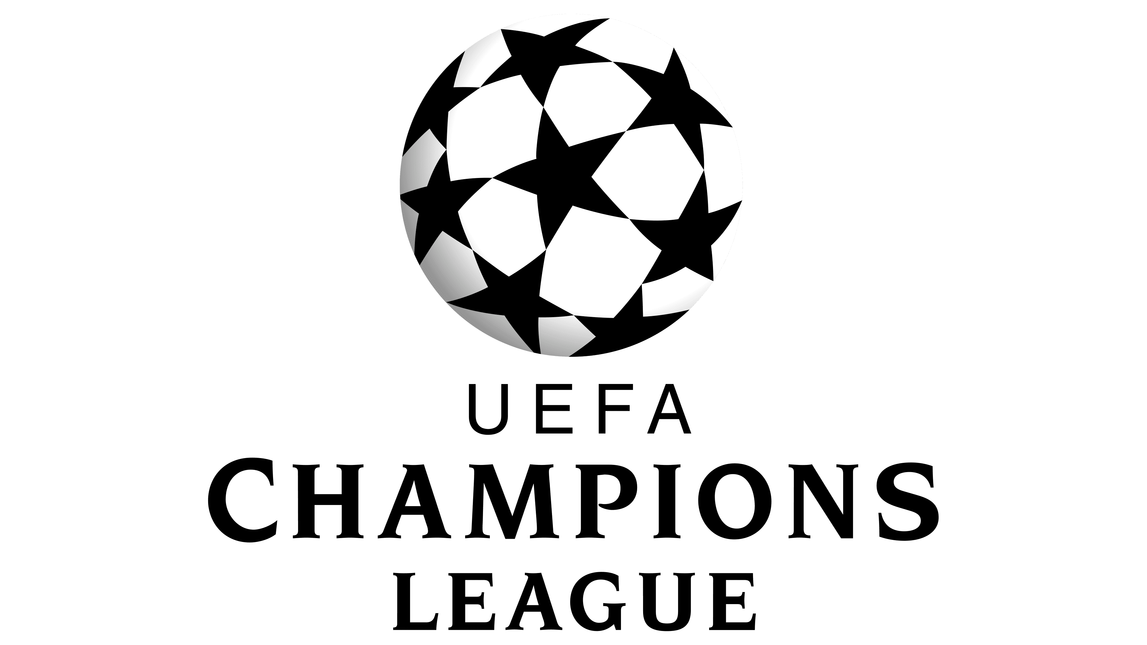
The 1993 logo features a circle formed by eight black stars, representing the leading clubs of the Union of European Football Associations. Gray shadows from the left side transform the two-dimensional figure into a three-dimensional sphere, reinforcing its association with a ball.
The “starry” ball is not just resting on the ground; it is in motion, presumably heading toward the goal. Whether a goal will be scored depends entirely on fortune. This simple black-and-white emblem captures the game’s most suspenseful moment, followed by either fans’ disappointed cries or jubilant cheers.
The name “UEFA Champions League” appears as three tiers of text at the bottom of the emblem. The abbreviation on the first line is rendered in a simple, thin sans-serif font. The remaining two words use a bold serif font resembling ITC Novarese. The text is center-aligned, creating visual balance among the three differently sized words.
1995 – 1996
The ball covered with black stars has remained virtually unchanged, as it is the tournament’s primary symbol. It still features a faint gray crescent-shaped shadow that gives the image a three-dimensional effect, hinting at the Champions League’s progress and modernity.
The only change in this logo is the “UEFA” inscription: the standard abbreviation was replaced by the new emblem of the Union of European Football Associations, introduced in 1995. It consists of two arcs with the organization’s abbreviated name written in Arial font between them. The arc symbolizes the unity and commitment of football associations to advancing the beloved sport. The curved lines also emphasize teamwork, a key to victory.
The lower text, “CHAMPIONS LEAGUE,” is split into two lines and set in a familiar font resembling ITC Novarese. The letters look elegant because of the contrasting stroke thicknesses, enhancing the logo’s dynamism. The short but expressive serifs add sophistication to the inscription, highlighting the prestige of the football tournament, which features only top-division clubs.
1996 – 2012
In 1996, the official logo was simplified, losing the gray crescent-shaped shadow that gave the ball a three-dimensional appearance. The shift from three-dimensionality to two-dimensionality allowed for greater focus on fine details that had previously gone unnoticed. The central five-pointed star stands out, symbolizing the ultimate match winner. All the other stars, arranged around it, represent the clubs competing for the champion title. The stars touching at their sharp points signify the unity of European teams.
Beneath the ball is the abbreviation “UEFA,” shaped into an arc and placed between two thin curved lines. These curved lines are interrupted, stopping short of the large word “CHAMPIONS.” At the very bottom is the slightly smaller text “LEAGUE.” The tournament name is set in the highly legible ITC Novarese font, with sharp edges and clean lines. Combined with the unchanged black color, it conveys prestige, professionalism, and modernity.
2012 – 2021
The UEFA Champions League logo was updated in 2012 to include the new version of the Union of European Football Associations emblem. It remains in its usual position: between the ball made up of eight black stars (above) and the familiar two-tiered text (below).
The letters in the “UEFA” abbreviation became taller and more prominent, increasing the space between the two arcs. Some corners were rounded (in the “E,” “F,” and “A”), softening the text. However, the diagonal cut on the crossbar of the “A,” which removes its left side, counteracts excessive smoothness and adds dynamism to the glyph. At the same time, the unique open shape lends the inscription a sense of lightness, subtly hinting at the agility of athletes on the soccer field.
The five-pointed stars still form a circle, vaguely resembling a ball. This represents the unity of the tournament’s most successful teams. The large, elegant “CHAMPIONS LEAGUE” inscription underscores the competition’s prestige, as its refined serif font evokes associations with grandeur, ceremony, and magnificence.
2021 – today
In 2021, UEFA redesigned its arched emblem, requiring the Champions League to update its logo again. The letters in the abbreviation became smaller and bolder. However, this did not affect their shape: the “E” and “F” still have rounded corners, and the “A” crossbar remains shortened with a diagonal cut. These small details make the text distinctive, making it easy to identify the organization that hosts competitions between European football clubs.
The designers chose not to alter the stylized ball, ensuring it remains a timeless symbol of sportsmanship, passion, leadership, and triumphant victories. The eight stars, arranged in their traditional pattern, form a circle and a three-dimensional sphere. This effect comes from their shape, which gives the flat image a “convex,” volumetric appearance.
The lower text font changed significantly. First, the size difference between the “C” and the other letters is now almost unnoticeable (for many years, the “C” was taller). Second, the designers modified the standard ITC Novarese font by replacing the familiar thin serifs with sharp triangles. This was not a random experiment but an intentional attempt to visually connect the “CHAMPIONS LEAGUE” text with the stars, which have triangular points.
The color scheme, however, remained classic. The monochrome logo effectively conveys the solidity and prestige of the annual tournament, featuring the best of the best. The restrained black-and-white combination creates contrast, highlighting each graphic detail and emphasizing the elegance of every letter.