


 Utz Logo PNG
The Utz logo embodies the ideas of naturalness, safety, and exceptional taste, which have earned the trust of the most discerning customers. Adding the image of a little chip lover to the logo made it unique, easily recognizable, and memorable. The emblem invites every customer to open a bag and enjoy the crispy treat, delivering a moment of joy with every bite.
Utz was founded in 1921 in Hanover, Pennsylvania, when newlyweds William “Bill” Utz and Sally Utz invested $300 to produce potato chips in their kitchen. They sold small batches to local grocery stores and at festivals, building distribution around fresh potato chips.
During the Great Depression, production moved into a separate building, allowing deliveries to expand into Baltimore and Washington, D.C. World War II created shortages of labor and raw materials, followed by stronger demand for packaged snacks after the war. In the 1950s, Utz added pretzels, corn chips, and other snack products.
From the 1960s through the 1980s, the company upgraded machinery, increased factory capacity, entered larger retail chains, introduced computerized quality-control systems, and began television advertising. Acquisitions in the 1990s widened the product range and gave it access to new regional markets. Utz later developed snack options aimed at consumers seeking alternatives to traditional products.
During the 2000s and 2010s, Utz invested in manufacturing sites, distribution, technology, and further acquisitions. By its 90th anniversary in 2010, it had become one of the largest family-owned snack producers in the United States. The company went public on the New York Stock Exchange in 2020. From 2021 to 2023, it expanded production, upgraded facilities, strengthened national distribution, and added organic and health-oriented snack lines.
Meaning and History
What is Utz?
This American snack giant is winning over people’s hearts with its delightful products. The brand is known for its wide variety of pretzels, potato chips, and other savory snacks, offering everything from cheese balls to popcorn. Due to its Pennsylvania Dutch origins, the company’s products have an authentic homemade touch. The raspberry-colored packaging and unique emblem are easily recognizable on store shelves nationwide.
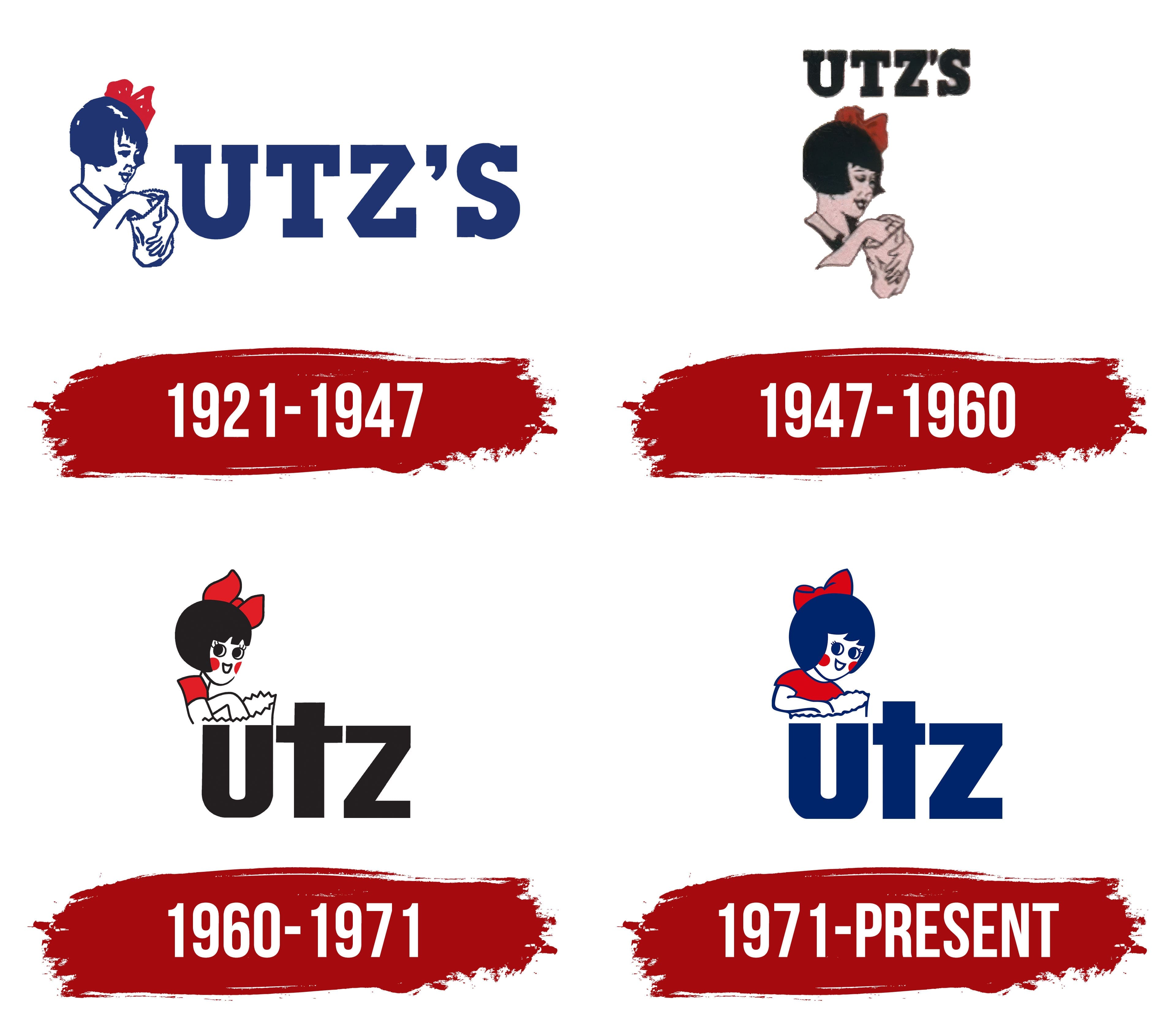
1921 – 1947
The logo of Utz Chips has remained consistent over the years. From the beginning of production, the founders, William and Salie Utz, decided to make Little Utz Girl the brand’s mascot, who has adorned the packaging for many years. This image evokes strong associations with safety, great taste, and homemade food, as everything created for children is considered the most wholesome and natural. The girl in the emblem likely represents the founders’ daughter, Arlene Utz.
The illustration shows a girl with a red bow in her hair, dressed in a fancy outfit with a white collar, reaching for a treat from a bag. Next to her is a large blue “Utz’s” inscription, chosen based on the founders’ last name. The font design, with slightly jagged letter ends, symbolizes the crunchy texture of the chips. The colors highlight the technological innovations in the production process, giving the brand a unique character and high standards.
1947 – 1960
The black and blue color palette, which previously dominated the emblem, was replaced with a more striking black, now taking the lead. The company name is placed at the top of the logo to draw attention, while the image of the girl holding a bag of chips is slightly shifted to the left below. The change in color scheme has given the image added brightness and attracted more attention. The contrast between black, red, and beige creates a harmonious yet expressive combination that appears both understated and celebratory. This updated emblem symbolizes an important milestone in the company’s history, marked by the involvement of Arlene Utz’s husband, Francis Xavier Rice, in the business and the expansion of production, including the construction of a new facility.
1960 – 1971
After the founders handed over management to Francis Rice, he decided to revise and update the brand emblem. The mascot changed, becoming more cartoon-like and now playfully peeking from the side of the logo, adding a sense of dynamism and freshness.
The central element of the logo remains the large letters forming the company name. The girl is positioned right above the first letter, emphasizing her connection to the brand. The bag of chips she holds is partially hidden behind the lettering, with only the top of the bag visible. Her outfit was changed to a red dress, adding brightness to her appearance, and the added blush enhances the liveliness of the illustration. However, despite these details, the absence of a nose in the image gives the character a somewhat schematic look, which adds uniqueness and charm to the mascot.
1971 – today
The Utz logo, featuring the recognizable image of the Little Utz Girl, creates an atmosphere of friendliness and trust. It has long been a brand symbol for high-quality snacks produced over many years. Its simplicity and style remain relevant even after updates.
The logo depicts a girl with a red bow, wearing a simple shirt and holding a bag of chips. This represents family values, traditions, and home comfort, which the brand conveys through its products. The red accents highlight playfulness and childlike innocence, adding a cheerful character. The girl looks directly at the viewer, establishing eye contact and creating a direct connection with the customer.
The primary color is blue, which symbolizes trust, reliability, and professionalism. The return to the blue palette is a nod to the company’s historical roots and a way to reinforce its connection to the traditions it has adhered to since its founding. The emblem appears clean and concise, emphasizing the brand’s commitment to quality and attention to detail.
The lettering is done in a large, bold font. The straight lines and large letters create a sense of stability and reliability, symbolizing the company’s experience and professionalism. This font is easy to read, making the visual mark simple to perceive and remember.
The visual mark was revised when the brand opened two more production facilities. The girl’s signature image became more rounded and proportional, adding softness and friendliness. The girl is holding a large bag of chips, emphasizing the generosity and high quality of the products. The bag appears large, highlighting the packages’ fullness.
The logo symbolizes family values, traditions, and high standards of quality. Thanks to the soft color palette and the positive image of the girl, it looks friendly and invites customers to try chips made by experienced professionals.