


![]() Van Halen Logo PNG
Van Halen Logo PNG
The band’s initials fly up on the emblem like an eagle made from a rock musician’s guitar strings. As the Van Halen logo shows, heavy music is a sharp blade. It hits the target, striking listeners’ hearts with its unusualness and clear rhythms.
Meaning and History
![]()
In 1972, two talented Van Halen brothers (guitarist-songwriter Eddie and drummer Alex) formed their band. They also brought in energetic lead singer David Lee Roth and bassist-vocalist Michael Anthony. The four of them launched a project called Genesis, but, as it turned out, a team with that name already existed. Therefore, the musicians first renamed themselves “Mammoth” and then “Van Halen”.
After the 1978 album of the same name, it immediately climbed to number 19 on the Billboard charts and sold over 10 million copies in the United States. In 1982, the rockers already had four albums that would eventually go multi-platinum. All subsequent albums enjoyed no less success, gaining immense popularity among listeners worldwide. The single-lead jump is recognized as number one in the United States. Gradually, their emblem gained increasing recognition and fame.
1972 – 1974
![]()
At first, the group was called Mammoth. This word was used as a debut sign of her identity. The font was in uppercase. The letters were voluminous but uneven in contour; a “trembling” strip gave the logo a dynamic feel. Realism was also added through cracks, chips, and other damage, generously painted on all the symbols.
1974 – 1978
![]()
After the rebranding, the musicians adopted a new logo. This is the Van Halen wordmark, as suggested by vocalist David Lee Roth. He had a presentiment that such a name would bring marketing, personal, and creative advantages. Mark Stone, the bassist, painted the original logo. The sans serif font is complemented by elongated “v” and “a.” The first has the left side stretched upwards, the second has the right side stretched downwards.
Moreover, they look like notes. Symbols “h” and “l” look like perfectly even stripes, and “e” is made in a different configuration, not usual for this letter; therefore, it is read worse than others. In addition, the “a” resembles a pyramidal sign. The sleek, elegant logo changed only after six years.
1978
![]()
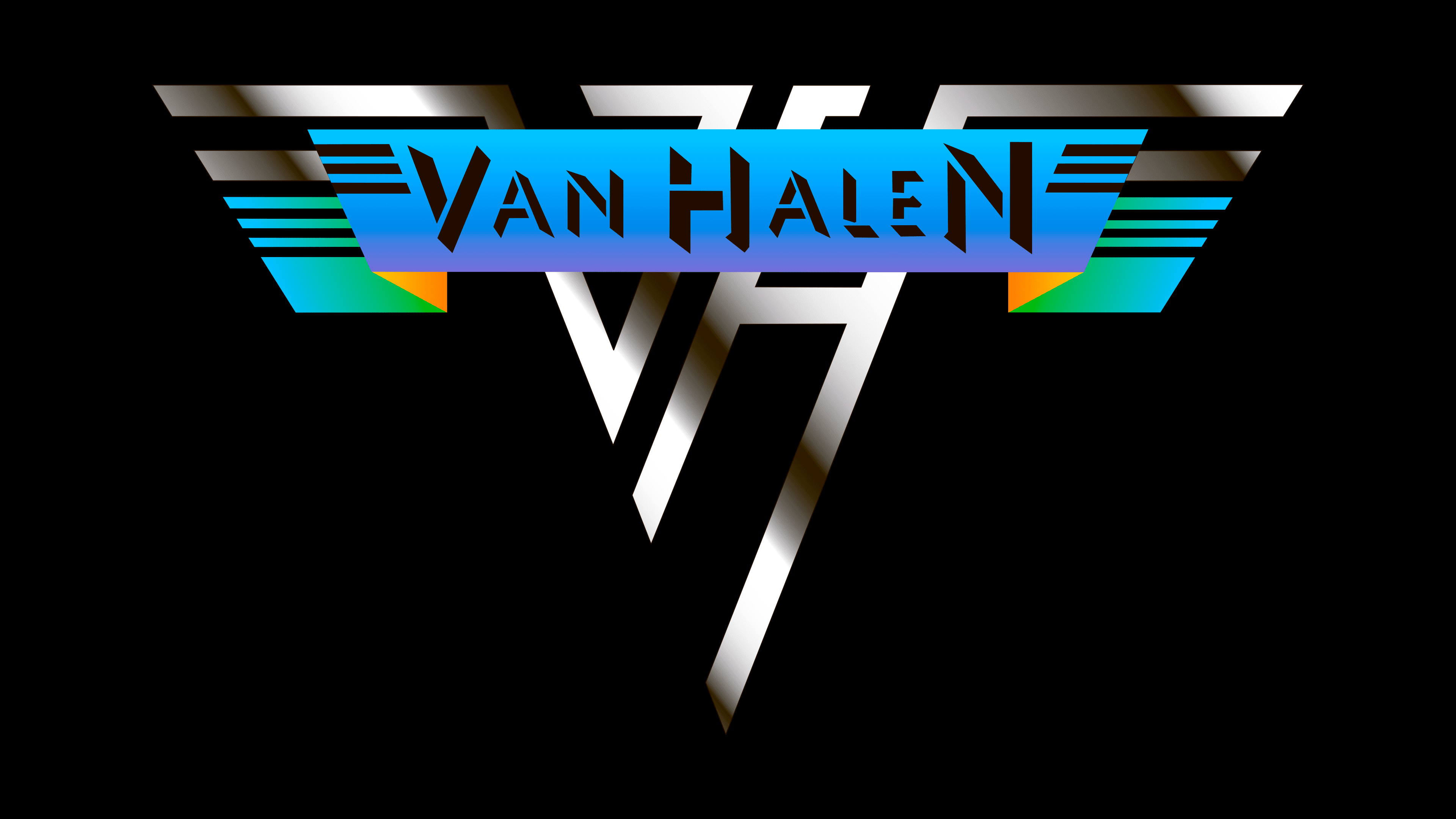
Dave Bhang designed the new logo. It is the most iconic symbol of the rock band Van Halen because the name is encrypted in it. It was used for the debut album. To the right and left of the stylized “V” and “H” are two wings, consisting of six stripes of different lengths and widths. The first letter in the monogram is aligned, the second is at an angle, so it looks diagonal. Above them, in a blue trapezoid, is the name of the band. The shadows gave the inscription a 3D effect. This version of the logo served as the basis for all subsequent ones.
1979 – 1986
![]()
The three-dimensional emblem contains the same elements as the previous version. The exception is the trapezoidal plate, which the authors removed, and a smaller number of horizontal lines (now three). The stylized “V” and “H” are now clearly visible. They consist of strips of the same width but different lengths. Moreover, they have no shadows; their place is taken by white lines that turn the logo into a three-dimensional sign. This effect is created by slightly offsetting the stripes below the letter level. This version of the winged symbol adorned the cover of Van Halen II in 1979.
1986 – 1998
![]()
When Sammy Hagar became the new vocalist of the rock band, a different logo appeared. It, too, was based on the iconic winged prototype created by Dave Bhang. The authors lengthened the horizontal stripes into a circle, resembling a huge ring. The ends of all lines are pointed. Small hand-drawn serif strokes form the ribs. The color is changed to dark golden. This mark was used on the 1986 album 5150.
2012 – 2020
![]()
The cover art for 2012’s A Different Kind of Truth featured an old logo that was used from 1979 to 1986.
Font and Colors

The musical group Van Halen had several emblems, but the monogram “VH” is considered a cult one. It is played in several modifications and reflects the creative atmosphere of the legendary band.
All emblems use an individual typeface. The author of the first-word mark (with letters-notes) is David Lee Roth, the second (with winged elements) is Dave Bhang. The color palette is monochromatic, containing only black and white. The exception is the 1986 logo, which has a dark golden hue.