![]() Veet Logo PNG
Veet Logo PNG
The Veet logo showcases the silky-smooth surface. The emblem visually conveys the results of the company’s work. Compositions for depilation act carefully and gently. No redness or irritation, just clean, beautiful skin.
Veet originated in 1919 in Canada, when Hannibal Pharmaceutical introduced a depilatory cream called Neet. The formula used thioglycolic acid and potassium hydroxide to break down keratin, allowing hair removal without blades.
In 1922, the brand was registered in the United States. In the United Kingdom, it appeared as Veet, while in continental Europe, it was sold as Immac. These parallel names defined regional positioning for decades.
Through the mid-20th century, the segment remained relatively narrow. In the U.S., Nair, launched in 1940 by Church & Dwight, expanded through radio and later television campaigns. Neet and Veet held comparable roles but relied more on European markets.
In 1990, Reckitt & Colman acquired the brand, integrating it alongside Dettol, Disprin, and Harpic. The focus shifted toward restructuring the portfolio and aligning product identity across regions.
In 1999, Reckitt & Colman merged with Benckiser, forming Reckitt Benckiser. By 2002, Neet in North America and Immac in Europe were replaced by the Veet name, completing a multi-year consolidation.
The rebranding was accompanied by increased advertising and product diversification. The line expanded to include creams, gels, mousses, and wax strips, each adapted for different skin types and body areas.
By the 2010s, Veet operated in dozens of countries and remained one of the leading names in chemical depilation. In 2020, Reckitt Benckiser reviewed options to sell brands including Veet, Clearasil, and Scholl, but no transaction followed.
In 2021, the company shortened its name to Reckitt, keeping Veet within its hygiene division as a long-standing product line.
Meaning and History
![]()
The trademark’s personal symbolism is based on its name, adopted in 1922. Initially, the company was called Neet, but it was renamed in the French manner because “veet” means “quickly.” As a result, there was a direct connection between the company’s name and the way the products were operated. Throughout its existence, the brand has had four logos.
What is Veet?
Veet is a Canadian brand of chemical hair removal products produced by the British company Reckitt Benckiser Group PLC (which purchased the trademark in 1990). The product line includes creams, mousses, waxes, gels, and lotions. It was first produced by the Hannibal company in 1919 under the name Neet. The current name, Veet, was introduced in 1922 and means “quick” in French.
before 2013
![]()
This version of the logo represents the word “Veet” in its original spelling. The two letters “e” and “t” are connected by a common line, which is horizontal, and the capital “V” is made in the form of a large checkmark. There is green grass in the middle between the signs (above), consisting of three stems. She says that the depilatory agent’s formulation acts gently and naturally, as if “mowing the grass” at the root. All elements are located in a small 3D circle.
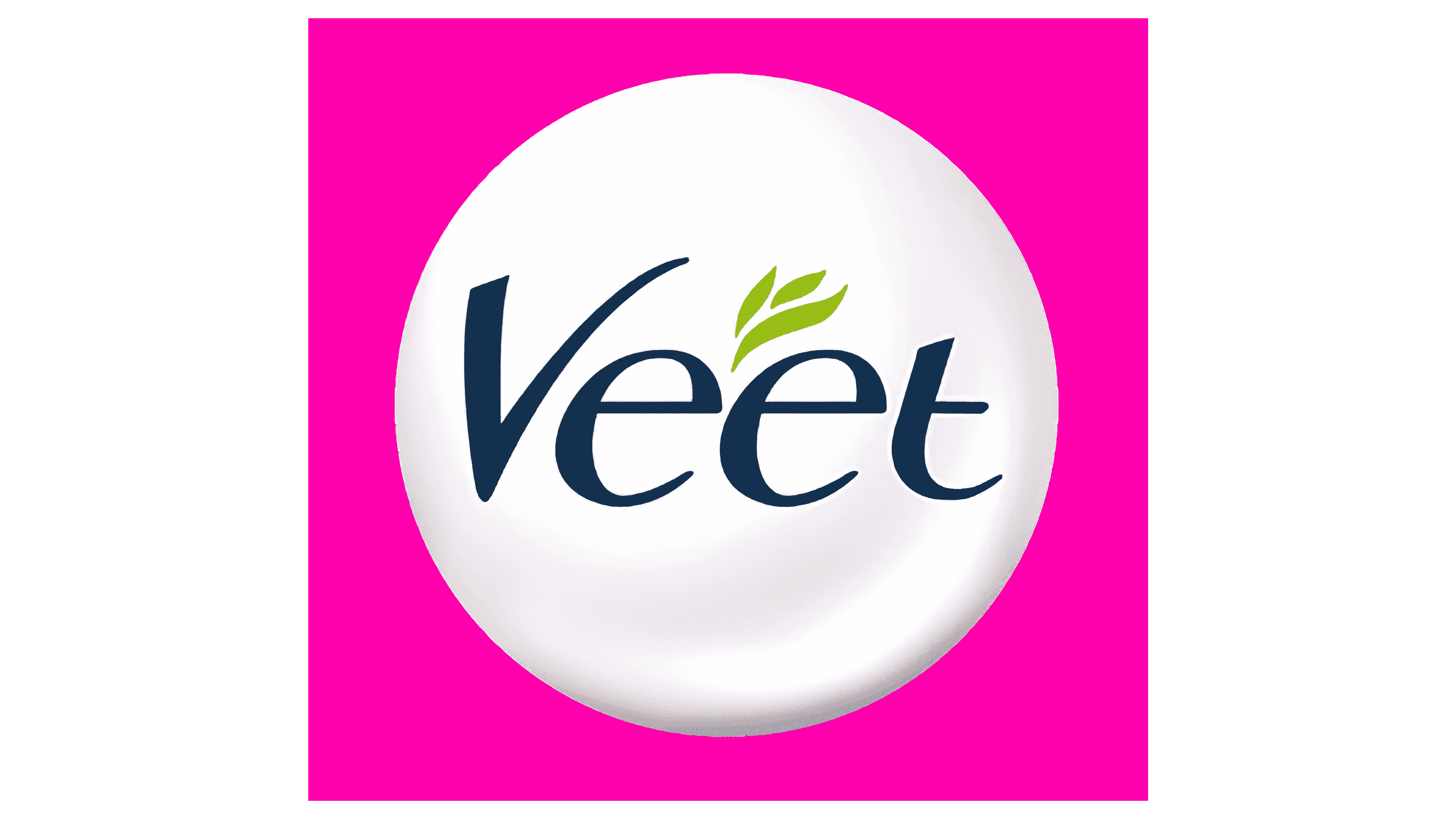
2013 – today
![]()
At first glance, the changes did not significantly alter the Veet logo, but in reality, they did. The designers have removed the similarity between the “V” and a tick: now the capital letter has a curved shape with a left-facing taper, not just a right-facing one. However, they, on the contrary, rounded off the lower corner. The remaining characters have lost their connecting line, so both “e” and “t” are placed separately. The last glyph has half of its crossbar cut off and reduced in size. The grass stalks became smooth, flowing, and tilted to the right, as if they were under the wind’s onslaught. The color scheme has also been drastically changed. The inscriptions are light blue, and the background circle is painted in a gray-white palette, making it look like a mother-of-pearl ball glowing from within.
Font and Colors
![]()
The brand name is set in a custom typeface designed for it. The inscription is a combination of uppercase and lowercase letters. All signs have rounded, and the two “e” and “t” are united by a common stroke. The signature palette consists of blue, green, white, and a subtle pink gradient.