


![]() Velkopopovicky Kozel Logo PNG
Velkopopovicky Kozel Logo PNG
Folk traditions can be traced in the brand sign. The Velkopopovicky Kozel logo alludes to festivities and celebrations where the beer flows like water, and to a rural brewery located in a picturesque place where herds of animals graze nearby.
Meaning and History
![]()
The origins of the brewery stretch back to the 14th century. But it took its present form only in the 19th century. After years of controversy, problems, and gradual decline, the Velké Popovice brewery was taken over by the most successful businessman in the area, František Ringhoffer, an industrial magnate and mayor of Smíchov. In 1875, he opened a rebuilt factory, completely reconstructed and re-equipped. Its production capacity increased from 18 thousand hectoliters per year to 90 thousand hectoliters per year.
The company survived two wars without closing, though it faced significant difficulties. After the First World War, it launched a Bock line, a 14-degree beer whose name translates from German as “goat.” And at the end of the Second World War, the company experienced an acute shortage of raw materials and workers. In 1965, the brand introduced its first bottled beer in tank trucks, marking the beginning of the mobile tank pubs.

The story behind the unusual name dates to 1919, when a stray French artist accidentally stopped by Velké Popovice. In gratitude for his hospitality, shelter, food, and drink, he drew a logo for the brewery, inspired by what he saw nearby: a grazing goat. Since then, the animal’s figure has adorned the label, serving as the company’s mascot and the beer’s name.
In 1930, management decided to introduce the tradition of keeping goats on the brewery’s premises. This approach helped the company strengthen its marketing strategy and gain wide popularity. Since the 1970s, the animal has been called Olda. This tradition is associated with Oldrich Lenz, the employee who looked after this pet. Now Olda XV lives at the brewery. In 2009, the artist Jan Capek from the Czech Republic introduced a beer mug with a handle shaped like a goat horn.
What is Velkopopovicky Kozel?
Velkopopovicky Kozel is a Czech alcoholic brand that represents low-fermented beer. It belongs to the company Pivovar Velké Popovice, located near Prague. The brand was founded in 1874, a year before the production facility opened. It was named in honor of the goat depicted in a drawing by a French artist who thanked the brewery for shelter (in fact, he gave it the logo). The company’s creator is Franz von Ringhoffer II. The current owner is the Asahi Group.
Old
![]()
The logo of Velkopopovicky Kozel features the mascot of the Czech brewing company: a goat. The iconic character is in profile, facing left. He is holding a large mug, from which you can see the white cap of a foamy drink flowing down. The goat and the mug are not homogeneous in color: they are painted in bright hues, clearly standing out against a black background. Among them are red, yellow, and emerald blue.
Above the animal, an arch is formed by the first part of the brand name, “Velkopopovicky,” with a diacritical mark over the “y.” Below is the word “Kozel,” written in a large white font with a black outline around the edge and broad shadows at each letter. The syllable “zel” is underlined by a band tapering to the right. Of all the characters, only the “K” is upper case, and the others are lower. At the very bottom, the year of the establishment of the beer brand is indicated as 1874. It is colored red and framed on both sides with a scroll.
New
![]()
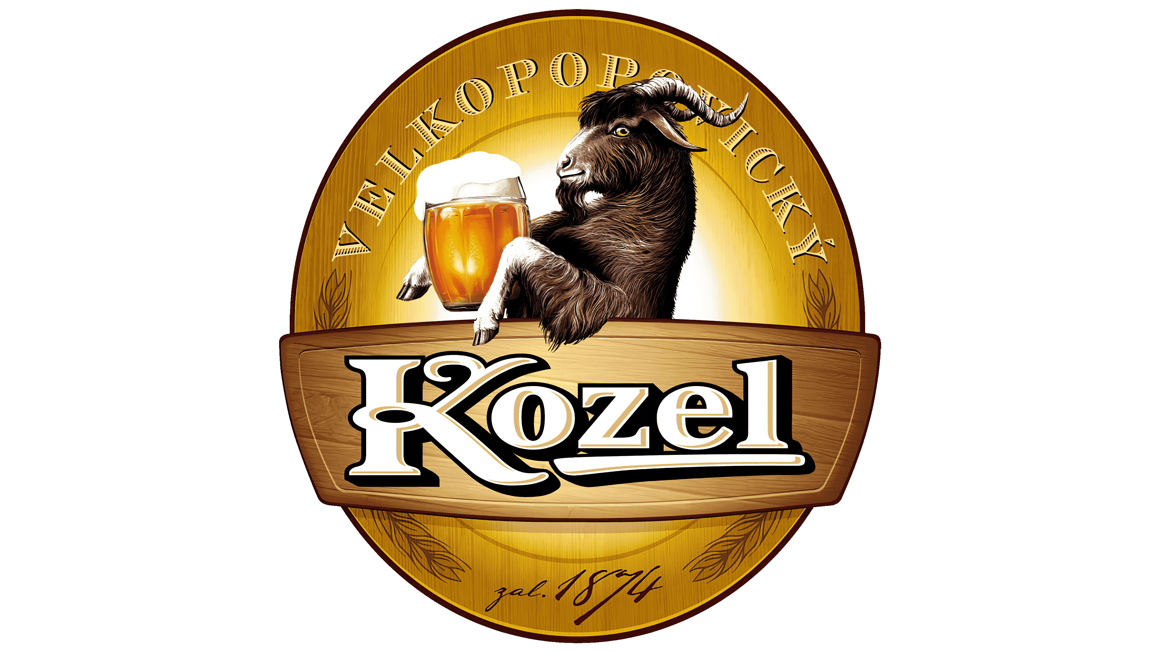
The emblem, which now adorns bottles and cans of Czech beer, also depicts a goat. But his style is completely different. In this case, his image is monochrome, where the dominant colors are dark brown and white. Thanks to the short and long lines on the light background, the historical character that inspired the beer brand is visible. He has thick hair, a long beard, an enthusiastic look, drooping ears, curved horns, and a large beer mug that he clutches between his hooves.
In the early version, the drink is colored naturally yellow; in the later version, it is colorless. The only thing they have in common is the white foam that rises in a cap over the mug’s edge and slides down a bit. Under the Velkopopovicky Kozel mascot, there is an abbreviated name, or to be more precise, its second part. The letters are fully consistent with the old manner of writing, with a curly “K” shaped like horns.
Font and Colors
The image of the goat, given by a misguided French artist, is still in use today. After all, despite the complete absence of any connection between this parsnip and beer, it still exists – at the historical level of a particular locality. The traveler drew what immediately catches the eye in the village of Velké Popovice and what characterizes it. By combining two processes (brewing and cattle grazing), Velkopopovicky Kozel developed a distinct identity that is now recognized worldwide.
The inscription in the logo is in a personalized font, designed to feature the mascot image. It can be seen in the letter “K,” which is shaped like a sharp goat’s horns. The rest of the characters are squat, smooth, with serifs. The brand palette is restrained, closer to monochrome, except for the yellow beer mug. The early version also features red, emerald, yellow, and black.