![]() Velux Logo PNG
Velux Logo PNG
The Velux logo conveys a sense of seriousness. It is a practical symbol that effectively represents the skylight window company, portraying it as a responsible, professional, and reliable manufacturer that prioritizes customer comfort.
Velux: Brand overview
Villum Kann Rasmussen, a Danish engineer, established the company in the Danish municipality of Østbirk in 1941. Rasmussen’s creative concept of designing a roof window that could successfully convert dim attic rooms into light, livable places marked the beginning of its history.
The founder himself created the name ” Velux.” It is a combination of the words “ventilation” and “lux” (light in Latin) and represents the main purpose of the company’s product.
1942, the first roof window was built at a Technical University of Denmark school. This occasion was a critical turning point in the business’s history and showed how Rasmussen’s creative concept might be used in real life.
The company concentrated on improving its product and growing Danish production throughout the 1940s and 1950s. The organization consistently endeavored to enhance the appearance and performance of roof windows to make them more user-friendly and energy-efficient.
International expansion began in the 1960s. In 1965, the company established its first overseas office in Germany and started selling its goods to other European nations, paving the way for global growth.
Growth continued in the 1970s, breaking into the US and Japanese markets. The range of products was expanded to include sun protection accessories for roof windows, such as shutters and shades.
Substantial technological improvements were made during the 1980s. The first roof window with an electric motor was released, greatly improving the product’s usability, particularly in difficult-to-reach areas.
In the 1990s, the focus shifted to creating more energy-efficient products. Roof windows with improved thermal insulation capabilities were introduced in response to increased demand for energy-saving solutions.
A significant turning point occurred in 2001 with unveiling the “House of the Future” concept, which presented a vision of comfortable, energy-efficient homes that use natural light and ventilation.
The “Model Home” program, introduced in 2005, involved constructing test homes worldwide to show how roof windows could create livable, healthy, and energy-efficient environments.
In 2011, the firm celebrated its 70th anniversary. At this point, products were supplied in more than 40 countries globally, and production facilities were located in 11 nations.
In 2015, a new generation of roof windows with enhanced sound and thermal insulation and integrated smart home systems was unveiled.
In 2018, the company introduced its “healthy buildings” program, emphasizing natural light and ventilation and focusing on people’s health and well-being.
An ambitious sustainability plan was unveiled in 2020, with the goal of offset the company’s past carbon footprint and becoming carbon neutral by 2030.
In 2021, the company celebrated its 80th anniversary, solidifying its status as a pioneer in ventilation and natural lighting advancements. To mark this achievement, a global campaign called “Bringing Light to Life” was launched to increase public awareness of the benefits of daylight and clean air for human health and wellbeing.
In 2022, notable advancements in sustainability were achieved. A new range of recycled-material skylights was introduced, greatly reducing the production’s carbon impact while meeting high-quality criteria. The window collection and recycling program was expanded to support a circular economy.
Significant advancements in digitalization occurred in 2023. A new line of “smart” skylights was debuted, featuring advanced sensors and integration with smart home systems. These windows can adjust illumination and ventilation based on user preferences, air quality, and weather data.
In 2024, the focus shifted to expanding the global footprint. New manufacturing facilities were established throughout Asia to address the increasing demand for premium natural lighting solutions in fast-developing nations.
Further studies on the impact of daylight on human health were conducted in the same year. An extensive research initiative was launched to examine the effects of natural light on circadian cycles and general well-being in collaboration with top universities and medical facilities. The findings were intended to enhance product development and indoor quality-of-life initiatives.
Meaning and History
![]()
What is Velux?
It is a Danish company known for manufacturing and selling skylights, solar tunnels, and related products. The company specializes in creating solutions that bring natural light and fresh air into buildings, improving indoor environments and energy efficiency. The products are used in residential and commercial buildings to improve daylighting, ventilation, and indoor comfort. The company offers a range of accessories, such as blinds and shutters, to complement its window and lighting systems. It provides products that enhance living spaces by promoting energy efficiency.
1941 – 1970s
![]()
The style of the Velux emblem can be described as strict, businesslike, and presentable. While it doesn’t directly reveal the company’s field of activity, it subtly hints at it through several key factors, including:
- the shape of the logo;
- its composition;
- the type of font used.
The letters are unique, classic glyphs with sharp edges and perfectly structured forms, even with serifs. These serifs resemble large elements—like window or door hinges and handles. In other words, all the symbols have been graphically adapted to reflect an individual style. Through this, the skylight window manufacturer draws attention to its products, emphasizing its high professionalism and ability to craft window frames of any shape. With such a bold typeface, the visual identity of the Danish company is perceived as both daring and highly practical.
The solid glyphs suggest that all branded products are reliable, functional, timeless, and capable of withstanding environmental challenges. The design conveys that the products have a long lifespan and are flaws-free. This concept is perfectly reflected in the textual part of the emblem, which occupies almost the entire space.
The logo’s shape also relates to skylights, often rectangular windows. This geometry is connected to wind and snow load, as elongated windows better withstand these pressures. The rectangle is black and serves as a background for the brand name, shaping the company’s image and linking it to the technical features of its products.
The emblem’s composition is equally noteworthy, combining a simple geometric figure with a complex printed font. At first glance, the placement of the text stands out, as it appears to “float” above the dark space. The distance from the edges of the letters to the top, bottom, and sides is perfectly even. This design choice once again mimics a window frame. Additionally, signage with this logo looks very balanced, conveying the company’s meticulous attention to precise measurements.
Another factor showcasing the brand’s high professionalism is the color. It plays a special role by confirming the products’ reliability, durability, and practicality. Monochrome is subtle and utilitarian, while the combination of black and white is classic, evoking a sense of elegance, nobility, and refinement. These colors also symbolize stability and calmness.
1970s – today
![]()
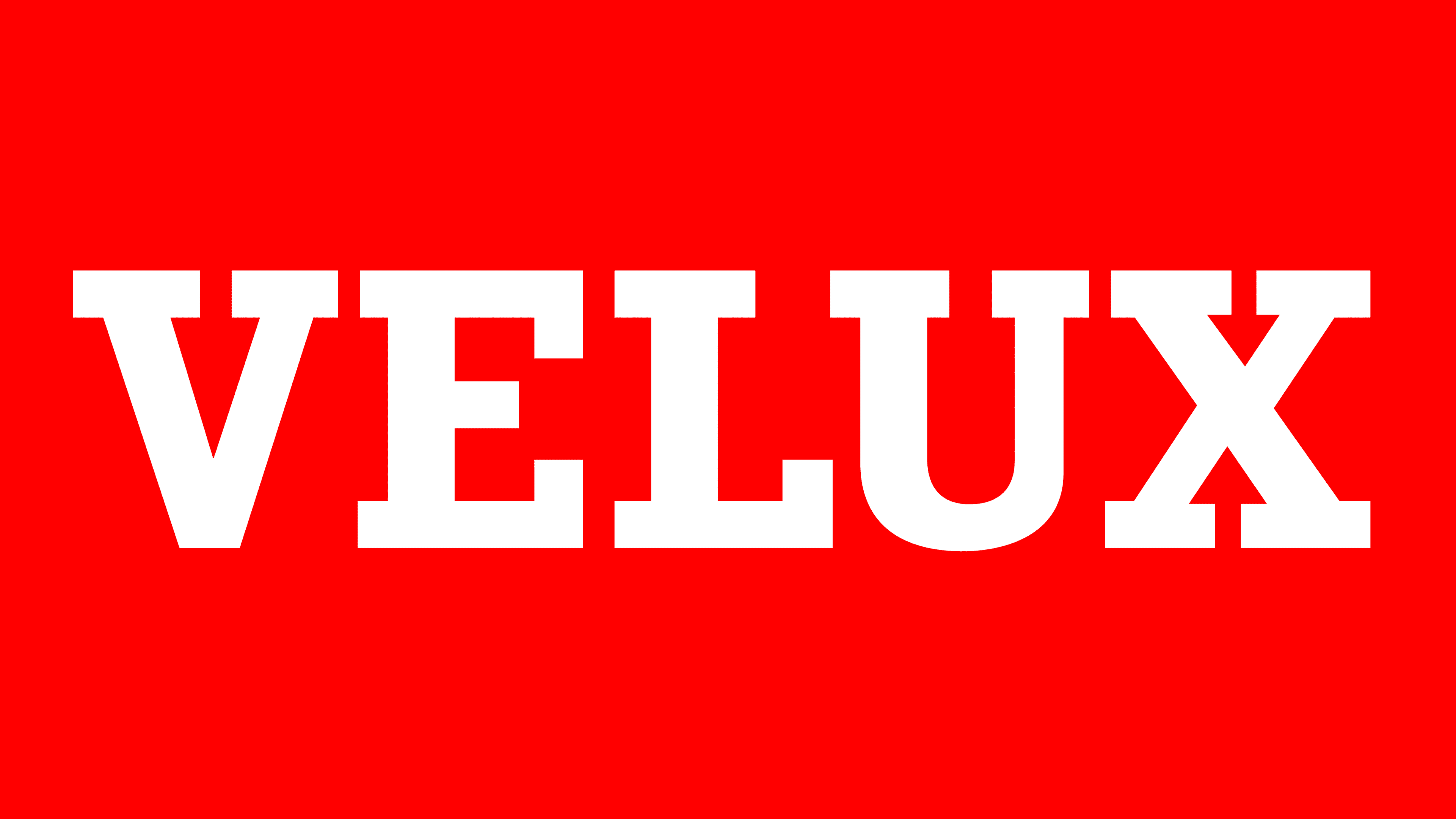
After unveiling the new logo, it became clear that Velux had moved away from the standard shape of a long skylight window and focused solely on appeal. The company wanted its visual identity to grab attention and, to achieve this, made it bold, vibrant, and even slightly shocking. What we see now is the result of this combination. The emblem is striking and unusually crimson.
The color stands out immediately, as it’s not typically associated with a window system manufacturer, making it seem out of sync with the logo’s theme. However, this isn’t the case. It’s important to remember that the brand is Danish, and the flag of Denmark features a red shade of this tone. The company showcases its heritage, placing the country of origin at the forefront of its identity. Moreover, the national flag combines crimson with white, symbolizing hope, purity, and sincerity.
The result of this redesign is a bright and energetic color palette. It adds internal dynamism to the static elements and encourages action. Additionally, red is a popular color in visual identity. It’s eye-catching and positive, creating a favorable mood due to its association with the sun and warmth—factors closely tied to the company’s focus on skylight windows.
The brand name is placed inside a long crimson rectangle. As before, it’s centered within the geometric shape, equally distanced from all edges, giving the impression that the text is floating in the red space. The chosen font is formal, but the letters are now short and compact rather than tall and elongated. This design choice made the text more compact without affecting readability.
The typeface consists of bold, capitalized, serif, and geometric glyphs. The letters are closely spaced, almost touching the rectangular serifs, but they don’t look unrefined, evoking a retro style. The large, blocky letters make a favorable impression, suggesting the reliability and quality of the company’s products while maintaining the brand’s positive image. The large white text on the red background creates a striking and impactful look.