


![]() Venmo Logo PNG
Venmo Logo PNG
The money transfer service’s Venmo logo is simple yet symbolic. The emblem embodies the instantaneous movement of funds on users’ accounts and emphasizes the brand’s business nature. At the same time, the emblem looks friendly because the service must be trustworthy.
Venmo is an American mobile money transfer service based on a P2P peer-to-peer architecture. With it, account holders can instantly send and receive payments through an application on their smartphone. However, both the recipient and the sender must be in the United States. The service was launched in 2009 to support relatives, acquaintances, and friends by enabling them to share funds to pay for tickets, rent, food, films, and more. Money is transferred instantly, and transactions are tracked in the application’s social feed. Andrew Kortina and Iqram Magdon-Ismail organize the service. It belongs to PayPal and has been adapted for Android and iOS platforms.
Venmo was created by two friends who met while freshmen studying at the University of Pennsylvania. They thought about such a service when solving problems with opening a store. Then, friends realized how difficult it is for commercial enterprises to use software. Once, at a jazz show, they figured out how to instantly purchase an MP3 file with just one text message.
The idea got stuck when Iqram Magdon-Ismail forgot his wallet when traveling with a friend. Therefore, they soon began implementing the idea of transferring money using mobile phones. But instead of texting, they had to tackle applications. In 2010, the new company received $ 1.2 million in start-up capital from RRE Ventures. It started and continued until it was bought by Braintree in 2012 for $26.2 million. In the winter of the next year, the parent organization switched to PayPal, which paid $ 800 million for it.
In 2020, PayPal allowed several cryptocurrencies, including Bitcoin, Litecoin, Bitcoin Cash, and Ethereum, to be purchased and used through Venmo. This decision took effect in the first half of 2021. The only limitation is that only a select group of users has access to this function. Developers will massively connect the rest of the base in the spring and summer. For security, PIN codes will be used as before.
Meaning and History
![]()
For its identity, the payment service has chosen an inconspicuous, strictly textual sign of personal identity. This was done for promotional and informational purposes to help people remember the new organization’s name.
In addition, this is a convenient form of marketing, the transfer of information during communication, because the visual component is closely related to the text. In this way, it is easier for users to learn about this service and for it to expand its coverage. Therefore, the owners rely on the word mark, painting it in different colors or making it catchier with a single bright tint.
2009 – 2010
![]()
The word “logo” consists of a single inscription: “Venmo.” It is typed primarily in lowercase, except for the first letter, which is in uppercase. At the same time, the symbols are multi-colored: red, yellow, green, and blue. Each of them has a thin black border. ‘V,’ ‘e,’ and ‘n’ are outlined together, and the rest of the glyphs are outlined separately. The designers added another personal touch to the emblem: they turned the “e” sideways, placing it diagonally and slightly overlapping the neighboring “n.”
2010 – today
![]()
This logo lacks the colorfulness of before; it is monochrome. But at the same time, the emblem remained bright, as the designers opted for a rich shade of blue. This color emphasizes the service’s business nature and digital focus well because many popular Internet platforms, services, and communities prefer it. The font has also been changed. Earlier, it was a mixture of two registers (upper and lower); here, all the letters are lowercase. There is more free space between them because the glyphs are farther apart than before. Among the same type of characters, “v” stands out: it has original typography with the right side curved outwards.
Font and Colors
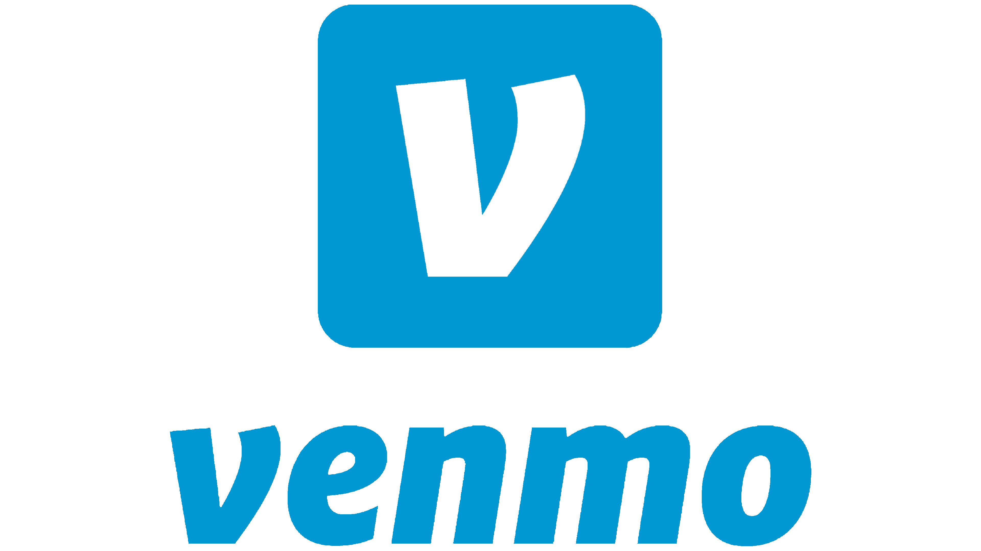
A square occupies the upper part with rounded corners. It is colored light blue and is located in the middle. Inside is a white “V” formed by wide lines. Its left side is flat, and the right side is curved, slightly rounding at the top. Because of this protrusion, her legs are slightly misaligned in height. The lower part of the letter is not pointed, as usual, but is cut off, which gives it a stable platform. She personifies the strength and reliability of the payment system.
![]()
The service’s full name is located under the icon. It is executed in wide-format lowercase characters. The letters are optimally spaced relative to one another (neither too close nor too wide); therefore, they read very well. The name “Venmo” has a slight rightward slope, except for the “V,” which matches the graphic symbol exactly.
The logo uses the typeface Helvetica Neue with minimal adjustments, with the “V” turned into an icon. It’s a sleek, bold sans-serif typeface.

The basic logo palette is blue and white. In the upper part, blue serves as the background for the white letter, whereas in the lower part, the blue inscription is on a white background.
![]()