“Our company is the best. There is no one bigger and more reliable,” says the Verizon logo. The symbols encoded confidence in their abilities and the desire to serve subscribers, providing uninterrupted communication using the most modern technologies.
Verizon: Brand overview
| Founded: | October 7, 1983 |
| Headquarters: | New York City, New York, U.S. |
| Website: | verizon.com |
Meaning and History
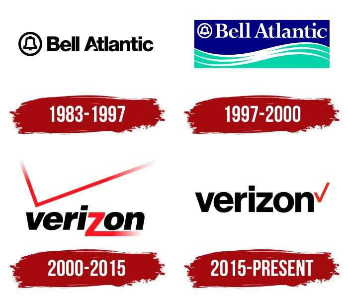
Before becoming Verizon, the company was called Bell Atlantic. Its distant ancestor was the AT&T corporation, created based on the Bell Telephone Company in 1899. Many rebranding, divisions, and mergers have affected the identity. This led to the fact that there are several diverse emblems in the history of the provider by which it can be easily recognized.
What is Verizon?
Verizon is the commercial arm of telecommunications giant Cellco Partnership and the largest mobile subscribers operator in the United States. It is located in Basking Ridge, where it appeared in 1998.
1983 – 1997
In 1983, Bell Atlantic Corporation, the successor to the Bell System, was founded. In addition to telecommunication lines, she received the famous bell symbol, created in the second half of the 1960s, by designers from Bass & Yager. It was surrounded by a black ring and was to the left of the company name. The first letter in the word “Atlantic” was decorated with a short white wave-shaped stripe.
1997 – 2000
At the end of the 20th century, both the bell and the word mark turned white. The designers placed them on a blue background at the top of the rectangle. The bottom half of the logo was cyan, with three wavy white lines.
2000 – 2015
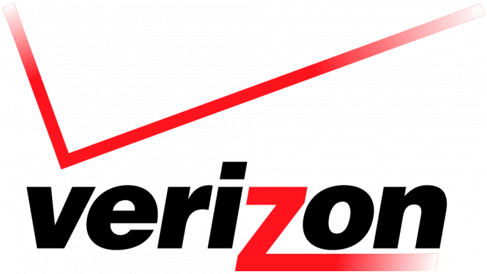
The first Verizon emblem appeared in 2000, two years after the merger of GTE and Bell Atlantic. It was developed by Landor Associates, a brand consulting firm. The designers took the company’s name as a basis and supplemented it with a red checkmark in the form of two perpendicular lines.
Critics considered this logo too complex. Graphic designer Armin Vit saw it as a parody of a corporate symbol:
- A gradient was used in several places, making it difficult to reproduce the image on different media.
- The stylized “z” did not match the italic letters and looked like an inappropriate broken line.
- The huge checkmark above the word broke the overall symmetry.
2015 – today
Due to many inconsistencies, Verizon updated the logo, entrusting this task to the Pentagram agency. Michael Bierut’s team of specialists made just a few fixes. The designers removed the italics but left the font bold and black. Also, they made the “z” normal, without the long fire tail.
Another change was made to the checkbox. This element is shifted to the right and reduced. Now the two lines converge at one point at an acute angle. The gradient disappeared, making it much easier to reproduce the logo.
Verizon: Interesting Facts
Verizon is a big company that helps people talk to each other and use the internet. It started in 2000 when two companies, Bell Atlantic and GTE Corp, joined.
- How It Got Its Name: Verizon combines a Latin word for truth with “horizon” to show that it’s all about reliability and always moving forward with new ideas.
- Leading in Technology: Verizon was one of the first to bring faster internet to phones with 3G and then the first to make 4G work well. This means people can use the internet on their phones quickly.
- First with 5G: Verizon was the first to use 5G in 2018, making the internet even faster, especially at home.
- Buying Verizon Wireless: Verizon Wireless was partly owned by another company from Britain, but Verizon bought it all for a lot of money in 2014, making it the only owner.
- Caring for the Planet: Verizon wants not to hurt the environment and plans to not add to air pollution by 2035 by using clean energy and doing other good things for the Earth.
- Making New Things: Verizon was the first to use 5 G for cool stuff, like sending data over a new network to a phone.
- Helping People: Through the Verizon Foundation, they put money into making things better for people in schools and hospitals and ensuring everyone can use energy wisely.
- Buying Other Companies: Verizon expanded by buying other companies, such as AOL and Yahoo, which helped Verizon enter the digital media and advertising business.
- Faster Internet at Home: In 2005, Verizon started offering a super-fast internet service called Fios, which uses special cables to make the internet fast at home.
- Helping in Emergencies: Verizon has a special service for emergency workers like firefighters and police, ensuring they can always talk to each other, even when it’s busy.
Verizon has made many firsts, like making the internet faster and helping people stay connected. They’re also trying to benefit the planet and help communities with technology.
Font and Colors
After the redesign, the essence of the emblem has not changed. It, as before, is a wordmark complemented by a red checkmark. The V symbol confirms Verizon’s reliability. All details are balanced and aligned to keep the image symmetrical.
Representatives of the Pentagram agency used the Neue Haas Grotesk for the inscription, but not the original version, but a modified font of the typographer Christian Schwartz. The word “Verizon” consists of black lowercase letters and contrasts with the red checkmark (shade # CD040B).
FAQ
What font is the Verizon logo?
The logo uses Neue Haas Grotesk, a modern take on the classic Helvetica typeface. The brand has moved towards simplicity and clarity in its visual identity. The customized letterforms from previous designs have been removed. The brand name is now presented in a straightforward and clean typographic style.
Christian Schwartz from Commercial Type fine-tuned this font to fit the brand’s needs. His adjustments ensure the font looks modern and professional.
The color red has always been important for the brand. It has been updated to a brighter and cleaner shade. This new red adds a fresh and dynamic touch to the logo. It contrasts well with the black or white text, making the logo stand out and easily recognizable.
What is the symbol for Verizon?
Verizon, with the ticker symbol VZ, is a well-known telecommunications company. It is listed on the New York Stock Exchange (NYSE) and the NASDAQ Global Select Market, showing its strong presence in the financial markets. The dual listing lets more investors trade its stock, which reflects the brand’s solid financial performance.
Investors and analysts use the symbol to track the stock’s performance and review financial reports. The brand’s listing on these exchanges shows its adherence to strict regulatory standards, ensuring transparency in its financial disclosures.
What is Verizon’s logo?
The modern logo features black letters spelling out the company’s name. It uses bold Helvetica font, known for its clean geometric shape. This choice shows the brand’s focus on simplicity and clarity in its visual identity.
The logo includes a small red checkmark, adding a touch of color and a distinctive mark. Positioned at the end of the company name, it gives the logo a balanced and complete look.
The combination of bold black letters and the red checkmark creates a strong visual contrast, making the logo recognizable and memorable. Using Helvetica conveys modernity and professionalism, aligning with the brand’s image as a leading telecommunications provider.
Does Verizon have a new logo?
Yes, Verizon introduced a new logo in 2015 after buying AOL. The new design is a modified version of the previous one. Designers replaced the large checkmark with a smaller, minimalist icon and removed the gradient effect.
The updated logo shows the company’s name in a clean, simple font with a small red checkmark at the end. This redesign shows the brand’s focus on modernity and simplicity, making the visual identity clear and recognizable. The changes create a more streamlined and professional look, aligning with the brand’s image as a leading telecommunications provider.
What is Verizon’s brand?
Verizon is a major brand under the telecommunications company Cellco Partnership. It is the largest mobile operator in the United States. The brand has a unique name and trademark, making it stand out.
The brand is known for its wide network coverage and reliable service. It offers various services, such as mobile and fixed-line communications, broadband, and digital television. The brand always improves its infrastructure and expands services to meet customer needs.
The brand’s identity focuses on delivering high-quality, dependable telecommunications solutions. This reliability and focus on customer satisfaction have made it a leader in the industry. The branding highlights modernity, simplicity, and professionalism, reflected in its visual identity and marketing strategies.
When did Verizon change its logo?
The company changed its logo in 2015 after using the old emblem for 15 years. This redesign happened with the acquisition of AOL and showed the brand’s aim to update its identity.
The new logo was a big change. The designers removed the large checkmark and used a smaller, simpler version. They eliminated the gradient effect, creating a cleaner, modern look. This update aimed to give a fresh, clear visual identity to appeal to consumers and show the brand’s focus on innovation. By adopting this new logo, the company signaled a new era.

