ViewSonic: Brand overview
James Chu founded Keypoint Technology Corporation in California in 1987. Three years later, the company launched the ViewSonic line of computer monitors and, in 1993, rebranded the entire corporation to ViewSonic. Within the first decade, the brand became a prominent name in the monitor industry.
In the new millennium, ViewSonic went public and passed the billion-dollar milestone while diversifying its product lineup. This diversification extended to LCD TVs, projectors, and other interactive digital solutions. The company’s global workforce grew to over 1,000 employees, and the headquarters was relocated to Brea, California.
However, the 2000s were not all smooth sailing as ViewSonic faced a downturn caused by the emergence of more cost-effective competitors. A strategic move into specialized markets, such as digital signage and interactive whiteboards, helped the company regain its footing. More recently, ViewSonic has regained market share and has become a leader in interactive displays.
The company continues to be a leader in visual display technology, serving a variety of industries, including business, educational institutions, and residential. Remarkably, even more than three and a half decades after the company’s founding, founder James Chu continues to steer the ship as CEO. ViewSonic’s journey has been one of dramatic rise, midlife challenges, and rebirth – all under the watchful eye of its perpetual founder.
Meaning and History
1990 – today
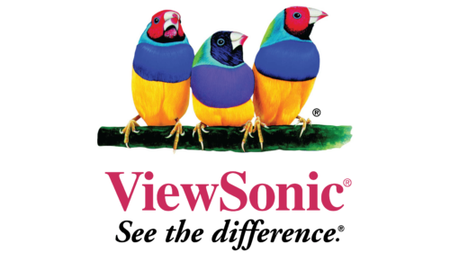
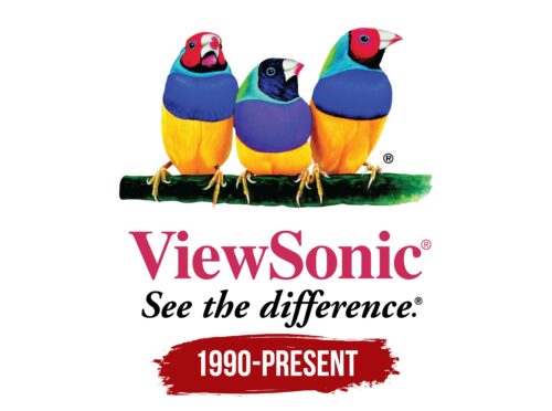
The logo of this electronics company is unusually colorful and unusually natural because technology-oriented companies usually stick to a corporate style. However, this Taiwanese corporation has chosen the colorful Guldi finches for its symbolism. Three birds, colored yellow, blue, teal, green, and red, sit on a mossy branch and look in different directions. Under them is a two-level text: the first line is the company name, and the second – is the slogan. The fonts are different: the first one is bold, smooth, and Roman and the second one is bold and handwritten.
The birds look like they came from a painting or a documentary about nature; they shimmer with all the colors of the rainbow. Each of them seems to be thinking deeply or maybe looking for something to do. A branch of moss gives the whole image a relaxed and calm atmosphere. The mixed fonts are like two different voices: one is formal, and the other is a bit casual, as if you were talking to friends.
ViewSonic color codes
| Rose Red | Hex color: | #cb2b5c |
|---|---|---|
| RGB: | 203 43 92 | |
| CMYK: | 0 79 55 20 | |
| Pantone: | PMS 191 C |
