


 Vine Logo PNG
The symbol on the Vine logo depicts a looping video. The emblem is easy to read and concise, as are the messages sent. The sign demonstrates communication within a social group with common interests.
Vine is an American social network designed to share short looped videos no longer than 6-7 seconds. It allowed users to publish clips on certain Internet platforms and view thematic videos. It was a direct competitor to Instagram and Pheed. It launched in the summer of 2012. That same year, another social network, Twitter, acquired the service. Three months later, the new owner changed the video-hosting format, and the final release took place in 2013.
Dom Hofmann, Colin Kroll, and Rus Yusupov founded Vine. They launched a web service in June. In October, he switched to Twitter, which paid him $30 million, and later became Intermedia Labs. Under its original name, the service relaunched in January 2013 as a free iOS app. In June of the same year, it released versions for Android and Windows Phone. Within two months, the utility became the most popular in the video-sharing industry. In May, it expanded to include video viewing.
In 2017, the social network Twitter announced the reboot of its program. Users could download and watch videos but not upload new ones. It also announced that everyone could download previously published videos. The reason was the parent company’s problems and the outflow of visitors to other resources. As a result, a stripped-down version called the Vine Camera appeared in 2017.
Meaning and History
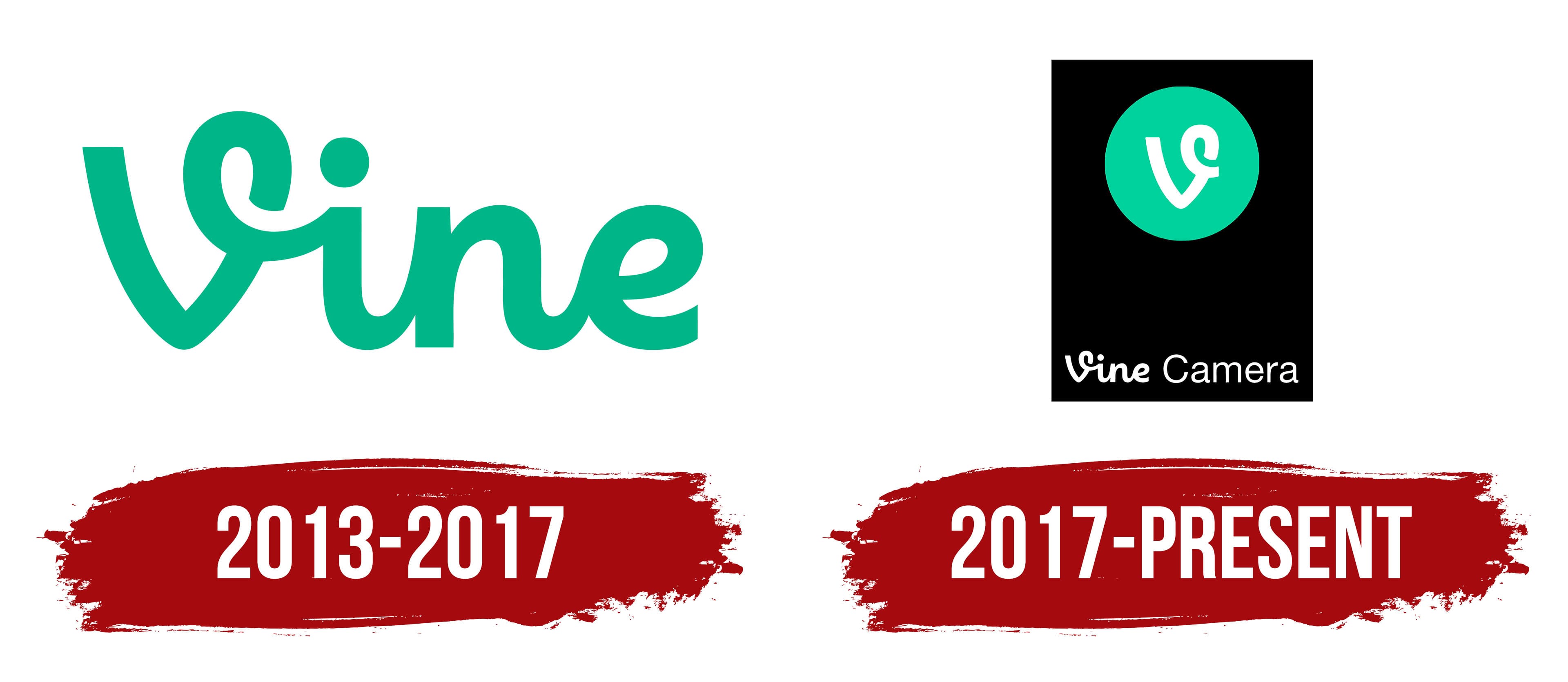
The debut wordmark Vine was based on a prototype with a similar inscription, but in black rather than turquoise. The fonts varied, especially the lowercase “i.” Over time, the designers refined the letter shapes, and a badge with a large “V” appeared in 2013. The original symbol was carried over almost unchanged to the Vine Camera app logo. This happened in 2017, after Vine relaunched under a new name.
What is Vine?
Vine was a service that allowed users to exchange short video clips or publish them on their profiles. These were looped video clips, each lasting no more than 6 seconds. The Vine app launched in 2012 and ceased operations in 2017. It could not withstand competition from other popular platforms with similar functionality. The brand’s legacy continues in short videos on social networks like TikTok and Instagram.
2013 – 2017

As former employee Bobby McKenna emphasized, the team created the logo quickly. The decision to launch the application was sudden, so the designers made the logo associative, starting from the name. The process “from and to” took them one day. The word “Vine” is the first letter, which is depicted as a curling vine on the logo. The connected inscription was made by hand, but not obliquely, but straight. All letters connect as if executed in one stroke. A loop in the upper-right part of “V” smoothly transitions into “i.”
2017 – today

In 2017, the program was suspended and restarted in a new format. Naturally, this required a redesign. The owners left the usual application interface but reduced its functionality, which affected the logo’s appearance. The capital letter “V” in the original spelling remained from the previous sign. Its background is a mint-colored circle. Below is the full name of the renamed service, “Vine Camera.” All elements are located inside a black extruded rectangle.
Font and Colors

Both versions share common features. In particular, the handwritten, lowercase, straight lettering, the mint-and-white combination, and the well-recognized “V” with a curl at the top. Despite the rush to create the icon, it echoes the name well, playing on a curling-vine shape.
Moreover, the emblem evolved from simple to complex: earlier it consisted of one element, and now it has four. And she has her secret. If you turn the logo upside down, you can make out the number “6” in the curl. This is important to the service, since videos were originally designed to be only a few seconds long.

The emblem contains one phrase, executed by two different typefaces. The word “Vine” is set in a custom font, similar in style to Verse Sans, but with the signature “V” featuring a curved top. For “Camera,” I used the neo-grotesque, geometric Caliber from the Sans Serif group, developed by Kris Sowersby. The logo colors are stable and include white, black, and mint green #00bf8f.