![]() Vinted Logo PNG
Vinted Logo PNG
The Vinted logo represents a modern online system for selling used clothing, remaining widely recognizable in American and European markets. The emblem is playful, conveying the informal atmosphere of second-hand shopping.
Vinted: Brand overview
Vinted’s history started in 2008 when Milda Mitkute and Justas Janauskas established the business in Vilnius, Lithuania. While relocating, Milda got the original concept and discovered she had too many things that she seldom wore. She considered starting a website where individuals could buy, sell, or trade unwanted apparel.
At first, the website was known as Meilūs Drabužiai, which means “cute clothes” in Lithuanian. It started as a regional initiative for people in Lithuania. Popularity with the local populace, particularly among young ladies, increased rapidly for the platform.
The Lithuanian venture firm Practica Capital made its first investments in the company in 2010. As a result, the enterprise was able to grow its staff and begin enhancing the platform’s user experience.
2011 was a significant year for the brand’s global growth. The business started offering services in Germany under the Kleiderkreisel name, initiating its worldwide expansion.
Accel Partners invested in the enterprise in 2012, enabling the business to expand into new areas and quicken its development. Services were introduced in the USA and France that same year.
The brand saw a notable increase in its user base in 2013. Globally, the company has attained a million active users. The mobile app was released that same year, increasing user accessibility to the platform.
In 2014, the firm secured $27 million in funding from Insight Venture Partners. This money was used to expand into new areas and continue developing the technology platform.
The business had a difficult year in 2015. It had to reorganize after having trouble making money off of its platform. As a consequence, Thomas Plantenga was chosen as the new CEO.
The organization modified its business plan in 2016 by charging merchants a commission. Even while this choice angered some users, it made the business more profitable.
In 2017, the enterprise made a significant step in growing its market share in Europe when it launched in the United Kingdom.
The firm surpassed 20 million global users in 2018. In addition to these new capabilities, the organization introduced the opportunity for users to open their own “shops” on the site.
The company experienced substantial growth in 2019. The business became the first Lithuanian “unicorn”—a startup valued at more than $1 billion—after attracting financing totaling €128 million.
Despite obstacles to the world economy in 2020, the enterprise kept expanding. The business entered new markets, such as the Netherlands and Canada.
The firm raised €250 million in a fresh fundraising round in 2021, raising the company’s worth to €3.5 billion.
The organization carried out its plan of market expansion in Europe in 2022. With the successful launch of its platform in Slovakia, the brand has expanded to 15 countries. The company’s long-term plan to penetrate all European markets included this action.
The enterprise debuted a brand-new feature on its platform that year called “Vinted Go.” This service allowed customers to send and receive goods via a network of automated pickup locations, greatly streamlining the process of trading goods with other customers. Users responded favorably when “Vinted Go” was introduced in several important nations, such as France, Germany, and the UK.
The firm made a noteworthy technological advancement in 2023. The organization used an artificial intelligence system to enhance the classification and description of objects. By improving the accuracy and speed with which consumers created listings for their items, this technology improved user experience overall and increased platform efficiency.
In addition, that year, the organization started a test initiative for recycling and clothes repair in collaboration with neighborhood ateliers in multiple European towns.
The company launched Vinted Pay, a payment system of its own, in 2024, marking a significant advancement in financial technology. Thanks to this technology, users could store money in their accounts for future purchases and access additional simple and secure payment alternatives. Vinted Pay was created with the unique requirements of the platform’s users and the features of the secondary market for items in mind.
Additionally, in 2024, the business launched a beta version of its platform in Canada, extending its reach beyond Europe. This was the company’s initial move into the North American market and the start of its international growth.
Meaning and History
![]()
What is Vinted?
It is an online marketplace and community that allows users to buy, sell, and trade used clothing and accessories. The platform promotes sustainable fashion by encouraging people to recycle and reuse clothes instead of buying new ones. It provides a user-friendly interface where people can create sale ads, browse through different categories to find unique items, and connect with other users to make deals. The service is popular because of its ease of use.
2008 – 2014
![]()
The Vinted emblem from this period is divided into two zones that complement each other, revealing its essence. This approach to visual identity reflects several principles, with the key being clarity. The company approaches the process of selling used clothing thoughtfully without violating the personal ethics of each individual looking to sell or buy on this web platform. Therefore, the logo is bright yet delicate.
The first thing that stands out is the distinctive mark. It is presented as a speech balloon with a non-classical shape—a square with a slightly raised right side, giving it a playful appearance. Inside is an image of a dress with a flowing hem, creating a sense of movement in the emblem as if from a natural breeze.
The clothing is colored white and stands out even from a distance, as the background is vibrant. It consists of numerous colorful patches resembling triangles. This so-called textile mosaic symbolizes that the goods offered on the site are second-hand. Such fabric pieces are cut from unwanted clothes and used for making handmade patchwork quilts.
The patchwork technique best conveys the brand’s concept in the second-hand space. The colorful patterns of geometric shapes in green, purple, blue, orange, yellow, pink, and red successfully symbolize the variety of the product range. This background, paired with the white dress, is advantageous from a marketing perspective but less suitable for advertising on small digital screens because the image is too busy and tends to blend.
The right half of the logo contains the company name, set in refined letters of an original shape. The simple lines maintain a sense of cleanliness and lightness because they are thin and leave plenty of room for internal spacing within the letters. The font lacks serifs or long strokes, adding elegance to the emblem. The neat, rounded glyphs appear fresh and modern, and the combination of the minimalist text with the multicolored mark reflects the essence of the brand, blending the brightness and variety of second-hand fashion with the ease and precision of the digital world.
2014 – 2018
![]()
This version of the Vinted logo stands out for its simplicity. Removing the multicolored background made it more concise than the previous version. As a result, the vividness gave way to a single blue color. What did the visual identity gain from this? Minimalism, lightness, and a thematic focus on clothing. What was lost? Brightness, appeal, and uniqueness. Likely, the new version is more advantageous for the online space because it is easier to distinguish on digital displays of all sizes. However, the charm of distinctive individuality disappeared along with the patchwork-style background.
The company didn’t like that the emblem was more vivid than eye-catching, causing the elements in the foreground and background to blend into one. A convenient solution was found: make the background uniform. This is how the turquoise blue background with a white dress in a speech bubble came about. By the way, it remained unchanged in both size and position. This symbol hints at communication within a community of like-minded individuals, where visitors make purchases and discuss fashion. The speech balloon demonstrates the essence of the online marketplace: it unites all who strive to give clothing a second life.
The brand name is conveniently positioned on the right side. The smooth black font exudes simplicity, freedom, and lightness, carrying all these qualities to the website designed for browsing and shopping. The shortened “t” at the bottom looks elegant, resembling a mannequin for displaying clothes. The letter is so graceful that it seems to be standing on tiptoe. The “n” before it also has an unusual shape: its top is slightly rounded and widened, giving the legs a slightly crooked appearance. However, this imperfection does not spoil the glyph—on the contrary, it adds a sense of playfulness and ease.
2018 – 2022
![]()
To achieve a universal logo, Vinted decided to radically redesign it. As a result, it became simpler, more minimalist, and truly more versatile. The reason is that the lighter design retained the most important element—the brand name, conveying the airiness of a dress fluttering in the wind, the texture of flowing fabrics, a barely noticeable touch of wear, a color faded over time, and the elegant slenderness of mannequins.
Now, the emblem is text-only because the designers have imbued it with all the qualities previously represented by the patchwork-style symbol with the dress in the middle. As a result, they achieved an interesting version of visual identity that encapsulates the main ideas of the second-hand clothing website. The text is arranged in a single line, positioned horizontally.
The font style is handwritten but not italic—it is straight. The letters stand upright, creating a sense of strictness and slenderness. Almost all glyphs are in lowercase, except for the “V.” This symbol proudly rises above the rest and looks like a checkmark, reminding users to visit the online store and buy clothes. The fact that the items are not new is hinted at by the slightly torn edges of some letters. For example, this is noticeable in the “V,” “n,” “t,” and “d.” Their wavy edges effectively convey a sense of wear.
The stateliness of the mannequins is reflected in the long strokes of the “t” and “d.” They have smooth vertical elements of optimal height, specially designed to showcase outfits. A chain of adjacent letters follows them because “t” and “d” are connected to them: the first group is “int,” and the second is “ed.” This way, the company demonstrates its close connection to fashion and its dedicated community through its online platform.
The palette of the emblem is restrained, leaning more toward pastel rather than bright tones. This was done to better convey the idea of second-hand products, as the turquoise color appears to have lost its brightness over time. But it is also a color of hope, confidence, freshness, and striving for better. It nicely balances the playful and fluid font, adding a whimsical and joyful atmosphere to the logo.
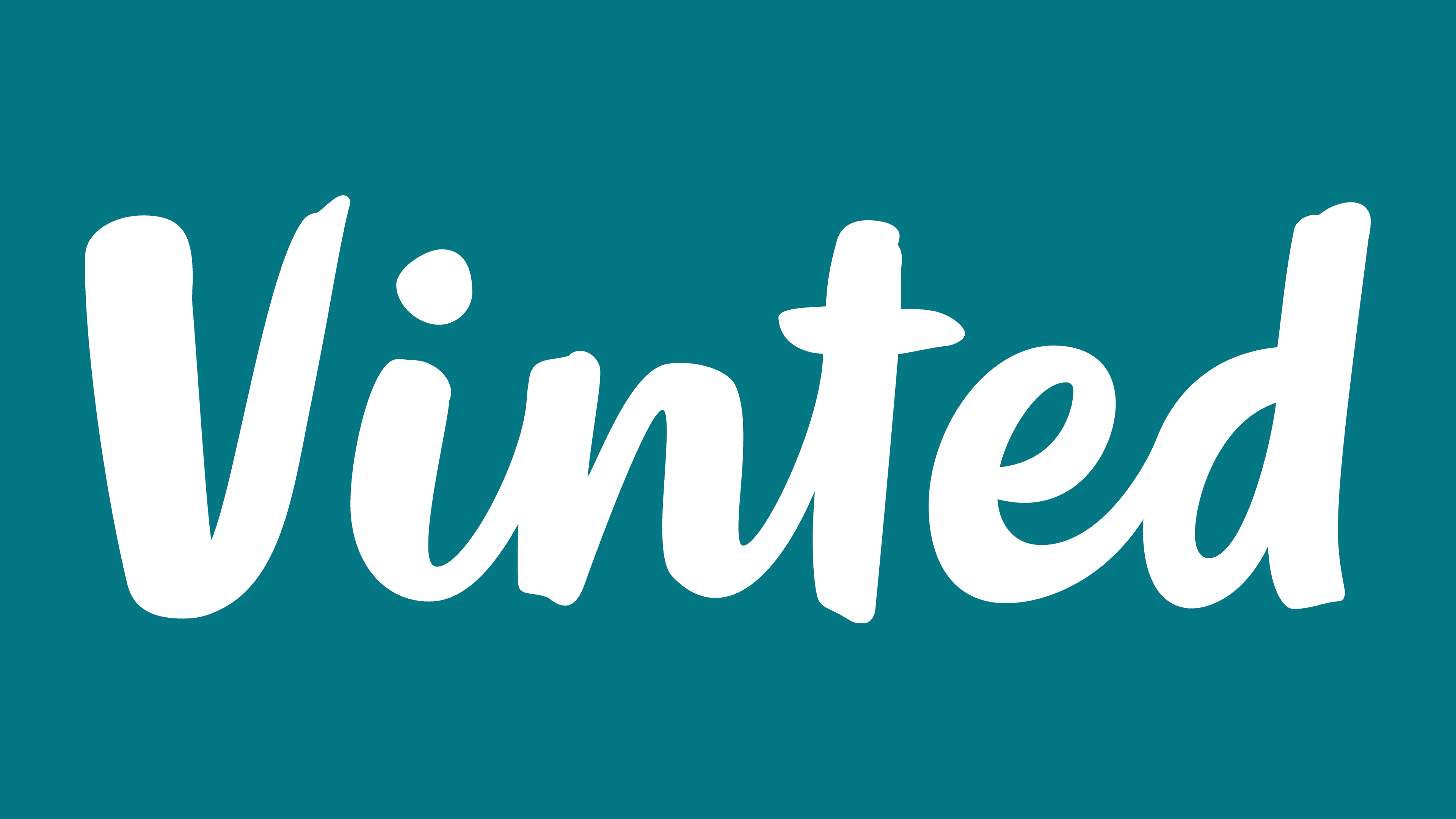
2022 – today
![]()
The new design visually relieves the logo from monotony, presenting it as bright and confident. The font has also been updated: while maintaining a handwritten style, the glyphs have become much more compact, adding clarity to the text. For example, the “t” and “d” have been reduced: the first letter is now shorter, and the second has lost part of its vertical stroke.
At the same time, some symbols have increased in size: this applies to the “n” and “e.” Thanks to successful scaling, they are now the same size as the neighboring glyphs. The capital “V” has acquired a pronounced tilt to the left, adding dynamism to the emblem and stirring up the atmosphere of calmness. Overall, the font has become bolder. Soft curves and smooth lines evoke a feeling of lightness and flow. Notably, the glyphs remain lowercase, confirming the brand’s informality and accessibility for all interested users.
The logo’s playful and refined simplicity perfectly conveys the spirit of a website associated with clothing, as its concept aims to make the exchange of fashion items convenient, pleasant, and accessible. The Vinted emblem also represents a personal symbol of the community, whose members discuss various new trends in the fashion world. It succinctly and accurately reflects the nature of second-hand clothing because it contains miniature wavy lines reminiscent of torn fabric.
At the same time, the logo in a rich turquoise shade conveys a modern and fresh visual image. This color embodies elegance, orderliness, tranquility, and calmness. It makes the visual identity unique because it does not conform to the standard ideas of an icon for a site where used clothes can be found. The turquoise color adds sophistication and inspires the search for unique items.