The Virgin Atlantic logo is closely associated with the large Virgin Group conglomerate, whose subsidiaries operate under a unified brand. The emblems have evolved consistently, receiving minor individual variations depending on their specific area of operation.
Virgin Atlantic: Brand overview
In 1984, Richard Branson, known for his flair and audacity, founded Virgin Atlantic. The idea sprang from a canceled flight to the Virgin Islands, prompting Branson to charter a plane and fill it with stranded passengers. A makeshift sign reading “Virgin Airlines” led to the birth of the new airline.
On June 22, 1984, the inaugural flight took off from London Gatwick to Newark using a Boeing 747-200 leased. With only one aircraft, the company quickly made waves with its unique service approach and vibrant brand personality.
The late 1980s saw the airline face fierce competition, particularly from British Airways. Despite the challenges, the company expanded, adding more routes and aircraft. The brand gained a reputation for passenger service innovations, including introducing premium economy class in 1992.
The rivalry with British Airways intensified in the early 1990s, with the company accusing BA of unfair tactics. This conflict dubbed the “dirty tricks” campaign, culminated in 1993 when British Airways settled, paying compensation and issuing a public apology.
In 1999, Virgin Group sold a 49% stake in the airline to Singapore Airlines for £600 million, bolstering financial stability and enhancing its presence in the Asian market.
Throughout the 2000s, the company broadened its horizons, launching new routes across Asia, Africa, and the Caribbean. The fleet modernization included orders for Airbus A340-600 and Boeing 747-400 aircraft.
2008 marked the opening of the dedicated terminal at London Heathrow, which enhanced the passenger experience and solidified a stronghold in a key market.
In 2012, the company forged a strategic partnership with Delta Air Lines, which acquired a 49% stake from Singapore Airlines. This alliance opened up new transatlantic opportunities.
The airline celebrated its 30th anniversary in 2014, underscoring its status as a trailblazing and highly recognizable carrier.
2016, the company ordered 12 Airbus A350-1000 aircraft, signaling a new chapter and phasing out the older Boeing 747 fleet.
In 2019, the company expanded its joint venture with Air France-KLM and Delta Air Lines, strengthening its transatlantic market position.
Facing unprecedented challenges in 2020, the company underwent significant restructuring, including staff reductions and fleet optimization, adapting to the rapidly shifting conditions of the aviation industry.
Meaning and History
What is Virgin Atlantic?
Based in Crawley, England, this British airline offers innovative and top-notch services on long-haul routes worldwide. Founded by entrepreneur Sir Richard Branson, the airline is known for its distinctive style, excellent service, and advanced onboard amenities. The airline operates a modern fleet of wide-body aircraft, including the Boeing 787 Dreamliner, Airbus A350, and Airbus A330, featuring elegantly designed cabins and premium seating in all service classes.
1984 – 1999
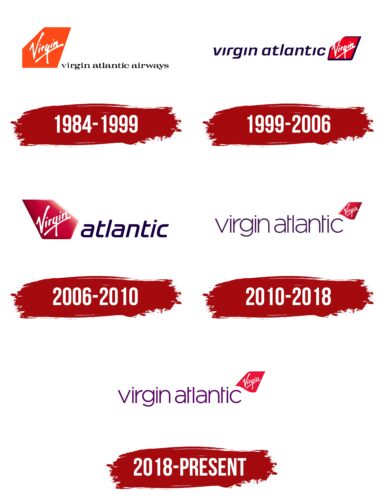
From 1984 to 1999, Virgin Atlantic used a logo that evoked sea travel and adventure. The logo, similar to that of its partner in Australia, Virgin Australia, features an airplane keel resembling a yacht sail. This symbol suggests exploration and fascinating discoveries inherent in the brand’s concept.
The logo notably includes the upward-moving white text “Virgin,” a key element of the brand’s identity. This detail represents the company’s ongoing growth and expansion and its pursuit of new horizons in the aviation industry.
The logo’s color scheme stands out against traditional English symbolism, where red and blue dominate. The bright orange color distinguishes Virgin Atlantic from other airlines and creates a striking visual accent. Interestingly, this color echoes the Falkland Islands coat of arms, a destination planned for flights from London. The orange color of the ship and sail in the logo blend harmoniously, emphasizing the idea of international travel.
The orange hue in the logo conveys warmth, a festive atmosphere, and comfort, which Virgin Atlantic promises to its passengers onboard. The black text of the company name resembles a road, leaving behind a trail, as if from a passing airplane or sailing yacht, symbolizing the brand’s stable presence and reliability in the airline market.
1999 – 2006
Significant changes have occurred in the updated Virgin Atlantic logo, which retains the main symbol of sail, particularly in the color palette. Red now plays a key role in the design and represents speed and energy. This color symbolizes the affordability of the airline’s flights, making its services appealing to a broad range of passengers.
The sail’s dark blue text and edging add depth to the logo’s visual composition. These elements ensure a clear distinction of colors and contribute to visually uniting the various parts of the logo into a cohesive whole. The combination of red and blue recalls the colors of the national flag of England, a deliberate choice. This selection emphasizes Virgin Atlantic’s ambition to compete with British Airways and other leading carriers as the flagship of national aviation.
2006 – 2010
Significant changes in the new version of the Virgin Atlantic logo emphasize the company’s dynamism and commitment to innovation. Previously a key design element, the sail has shifted back to the left and been given a 3D shape. This alteration makes the image more expressive and modern, highlighting the company’s pursuit of the latest technologies and approaches in its operations.
Sunbeams illuminating one side of the sail enhance the visual impact. This lighting effect symbolizes Virgin Atlantic’s high aspirations, emphasizing its goals to reach new heights in the aviation industry. Removing the limiting blue frame from the logo carries profound symbolic meaning. Eliminating this element reflects a new era for the company, opening up diverse flight directions without previous restrictions.
The company’s success in the legal arena, marked by avoiding significant fines from antitrust authorities, is reflected in the new design. This achievement underscores its ability to adapt to changing regulatory conditions and maintain its leadership position in the market.
An additional element of the logo is the lowercase blue-violet text, which visually continues the motion of an airplane moving forward.
2010 – 2018
Significant changes were made to enhance the brand’s visual identity in the latest update to the Virgin Atlantic logo. The traditional company name has been supplemented with the brand name, which has increased its recognition and drawn more attention to the brand itself.
The inscription itself underwent noticeable changes, becoming significantly thinner and acquiring an effect of lightness and airiness. This new font conveys a sense of dynamism and speed, key characteristics for an airline dedicated to providing fast and comfortable flights.
The positioning of the keel-sail has changed. It has now moved to the upper right corner of the logo and decreased in size. This relocation shifts the focus of visual perception, emphasizing the inscription rather than the image of the sail. The keel plays an important role, highlighting the company’s field of activity and its commitment to the aviation industry.
The visual impact is enhanced by the keel raised into the air, creating an association with an airplane soaring into the sky.
2018 – today
In the latest design iteration of the Virgin Atlantic logo, noticeable changes were made to improve its visibility on various platforms, including aircraft liveries. The modern symbol of the company has lost its three-dimensionality, making it flatter and more simplified. This change ensures the logo blends better with the surface of the airplanes, making it more visible and recognizable from a distance.
The color of the Virgin Atlantic inscription has been lightened, adding a sense of airiness and modernity to the logo. This adjustment makes the text easier to read against the contrasting background of the aircraft’s livery, enhancing the brand’s visual impact on viewers and the company’s clients.
The choice of a red-violet color palette was driven by a desire to highlight the brand’s deep internal philosophy, which reflects a passion for innovation and customer focus. These colors strengthen the brand’s identity and express its energetic and dynamic nature, underscoring the company’s ambition to lead in the aviation industry and its commitment to ongoing development.
