The Singapore Airlines logo is forward-leaning, like a bird. The elements of the emblem represent leadership, speed, and passenger care. On board the company’s liners, customers can feel at home.
Singapore Airlines: Brand overview
Singapore Airlines is Singapore’s main carrier, serving up to 11 million people annually. It belongs to the government conglomerate Temasek Holdings. The company’s fleet comprises over 150 aircraft that fly to 35 countries across 130 routes. The carrier’s revenues amount to $4.6 billion.
Singapore Airlines’ story began in 1947 when Malayan Airways Limited (MAL) was established. It started operations with flights between Singapore, Kuala Lumpur, Ipoh, and Penang, utilizing a modest fleet of five Airspeed Consul aircraft. This humble beginning paved the way for the airline’s future as a global aviation leader.
The formation of the Federation of Malaysia in 1963 led to the airline’s renaming as Malaysian Airways Limited. After Singapore separated from Malaysia in 1966, the airline was rebranded as Malaysia-Singapore Airlines (MSA), reflecting its dual-national affiliation.
On October 1, 1972, MSA split into two distinct entities: Malaysian Airlines System (now Malaysia Airlines) and Singapore Airlines. This division marked a significant milestone in Southeast Asian aviation history. The new Singaporean carrier inherited MSA’s international routes and embarked on its journey as Singapore’s national carrier.
Throughout the 1970s, the airline rapidly expanded its route network and modernized its fleet. The arrival of the first Boeing 747 in 1973 enabled long-haul flights to Europe and the United States. During this era, the airline introduced the iconic sarong kebaya uniform for its flight attendants, which became a symbol of the brand.
The 1980s were a decade of significant growth. New routes to North America, Europe, and Australia were established. In 1989, the airline pioneered the introduction of in-flight telephone and fax services, setting a new standard for passenger convenience.
In the 1990s, the focus on innovation and premium service continued. In 1998, the airline unveiled the first business class seats that could be fully reclined into beds on the Boeing 747-400, redefining comfort for long-haul travel.
Entering the new millennium, the airline became the launch customer for the Airbus A380, the world’s largest passenger aircraft. The carrier received its first A380 in 2007 and conducted the inaugural commercial flight for this aircraft type.
In 2004, cargo operations were restructured into a dedicated unit named Singapore Airlines Cargo, enhancing the management of freight services.
Joining the global aviation alliance Star Alliance in 2007 expanded the airline’s cooperative reach with other leading carriers.
In 2011, the company launched its low-cost subsidiary, Scoot, to compete in Asia’s growing budget travel market.
In 2013, a joint venture with Tata Sons resulted in the creation of Vistara, marking the airline’s entry into the burgeoning Indian aviation market.
By 2017, the airline had initiated a significant refresh of its fleet and services, introducing new first—and business-class cabins on the A380 and upgraded economy-class seats on the Boeing 787-10.
In 2018, the airline resumed its longest commercial flight route, offering non-stop service from Singapore to New York on the new Airbus A350-900ULR, reclaiming its status as the longest non-stop commercial flight operator.
Meaning and History
Despite the first logo dating from 1972, the company’s history goes back to the beginning of air transportation in Singapore. Under the name Malayan Airways, several firms served the Malaysian region in 1947. In 1972, the conglomerate split into Singapore and Malaysian Airlines, giving birth to today’s well-known brand identity. The new company’s primary aspiration was to develop international transportation. Therefore, it adopted a fast bird as its symbol. Since then, the carrier’s symbol has undergone almost no changes, emphasizing the reliability and consistency so important to customers.
What is Singapore Airlines?
This is Singapore’s flagship carrier, known for its first-class service and innovative approach to air travel. The company operates one of the youngest fleets in the world, including the Airbus A380 and Boeing 787 Dreamliner. The airline is distinguished by unique offerings such as first-class suites on the A380 and the world’s longest non-stop flight between Singapore and New York. A distinctive feature of the airline is its iconic “Singapore Girl” in a sarong, a recognizable brand symbol. The airline is renowned for its “Book the Cook” culinary program, allowing passengers to pre-order dishes from renowned chefs.
1972 – 1987
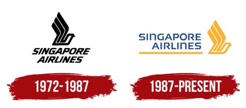
The logo foreground features a schematic bird flapping its wings. The animal figure consists of straight parallel stripes. It’s believed that the drawing was inspired by a spiritual weapon called a kris. This knife is popular in Asian countries and recognized as a UNESCO heritage. The item has a wavy blade made with multilayer welding of iron and nickel-plated iron plates, often consisting of parallel stripes.
The knife is also featured in other company products, such as the SilverKris lounge waiting areas.
The bird’s wings resemble a torch, symbolizing energy and long-distance flights. The company paves its way through the air over impassable lands and transports passengers in bad weather and at night.
Below the picture, the name is placed on two levels. Its strong forward inclination implies speed. The logo looks rapid, rushing into the distance. The uppercase letters convey the carrier’s leading position in the country.
1987 – today
In 1987, Singapore Airlines slightly updated its image by making the logo more vibrant and colorful. The new emblem was designed to reflect the company’s growth and align with its main advertising, featuring the beautiful and colorful “Singapore Girls” in national costumes. This logo update emphasized the company’s focus on cultural heritage and high service standards.
The logo has two main elements: a stylized bird and the company name. The bird, rendered in orange, is the central element and symbolizes freedom, speed, and the aspiration to reach great heights. It has a geometric shape and is directed upwards, highlighting the company’s dynamism and growth. Following the bird is a long orange stripe visually supporting the company name.
The name “Singapore Airlines” is blue and positioned to the bird’s right. The font features strict and clear lines, creating a sense of reliability and professionalism. The use of uppercase letters emphasizes the company’s importance and status. The word “Singapore” is written larger and stands out more than “Airlines,” drawing attention to the company’s origin and national pride.
The logo combines orange and blue colors. Orange symbolizes energy, warmth, and hospitality, aligning with the company’s image and commitment to high service levels. Blue is associated with reliability, stability, and trust, emphasizing the dependability and safety of air travel.
The stylized bird pointing upwards represents pursuing high standards and continuous development. The long orange stripe behind the bird creates a sense of movement and progress, visually supporting the idea of travel and flight. The combination of orange and blue colors underscores energy and reliability, creating a harmonious and attractive image for the company.
Font and Colors
The logo includes a combination of blue and orange colors.
- Blue represents the technical excellence of the planes and the maximum services on board. The shade speaks of professionalism and the company’s well-coordinated work.
- Orange indicates communication. The carrier’s main job is to connect people, facilitate meetings, and maintain international contacts. The hue also conveys the aura of friendliness that reigns on board the liners, in the waiting rooms, and at Singapore Airlines airports.
The inscription font is unique due to the torn glyphs of the letters. Separate elements stretch towards each other, barely touching. This technique demonstrates meeting over distances. The legs of the letter n resemble a gangway attached to an airplane. The even straight letters express confidence and strength—preparedness to deal with any obstacles.


