The bright and optimistic Scoot logo reflects the brand’s focus on the younger generation seeking affordable flights. With its unique emblem, the company is ready to cater to budget-conscious customers and delight them with high-quality services.
Scoot: Brand overview
On November 1, 2011, Singapore Airlines announced the creation of Scoot, a new subsidiary aimed at long-haul budget flights. This decision was driven by increasing competition from other low-cost carriers in the region, prompting Singapore Airlines to diversify its business model. The new airline was conceived as an innovative project, combining low fares with the capability to operate long-distance routes.
On June 4, 2012, the inaugural commercial flight launched from Singapore to Sydney. Initially, the company operated modified Boeing 777-200 aircraft, previously used by Singapore Airlines. These aircraft were adapted for budget travel with higher seat density and minimal additional services.
The route network rapidly expanded throughout its first year, adding new destinations in Asia and Australia. Routes to Taipei, Tokyo, Qingdao, and Seoul were among the new additions, solidifying the company’s position in the long-haul budget travel market.
In 2014, several innovative services were introduced, such as ScootinSilence—a quiet zone in the economy class—and MaxYourSpace, which allowed passengers to purchase additional empty seats for extra comfort. These innovations helped the airline stand out among other budget carriers.
In 2015, plans were announced to upgrade the fleet by ordering new Boeing 787 Dreamliner aircraft. This move aimed to enhance operational efficiency and improve passenger experience on long-haul flights.
The first Boeing 787 Dreamliner was received in 2016, marking the beginning of a gradual replacement of older Boeing 777s. The new aircraft provided better fuel efficiency and increased passenger comfort.
On July 1, 2017, the company merged with Tigerair, another Singapore Airlines subsidiary. This merger combined long-haul operations with Tigerair’s short-haul network, creating a unified budget airline under the brand.
In 2018, expansion into the European market began, launching routes to Berlin and Athens. This significant step demonstrated the feasibility of the budget model on long-haul routes and expanded the airline’s global reach.
By 2019, the fleet continued to be upgraded, fully replacing Boeing 777s with more efficient Boeing 787 Dreamliners. The route network in Asia expanded, and flight frequencies on popular routes increased.
The year 2020 brought unprecedented challenges to the aviation industry, and the company showcased its adaptability by adjusting operations to the changing market conditions. The focus shifted to optimizing the route network and implementing new safety measures to meet evolving standards.
Meaning and History
What is Scoot?
This is a Singaporean low-cost airline, a subsidiary of Singapore Airlines, known for its innovative approach to long-haul low-cost travel. The carrier operates a Boeing 787 Dreamliner and Airbus A320 aircraft, serving destinations in Asia, Australia, and Europe. The company is recognized for its vibrant yellow branding and unconventional marketing, including provocative advertising campaigns. It stands out for its loyalty program, integrated with Singapore Airlines KrisFlyer, allowing passengers to earn miles even on budget flights.
2011 – 2015
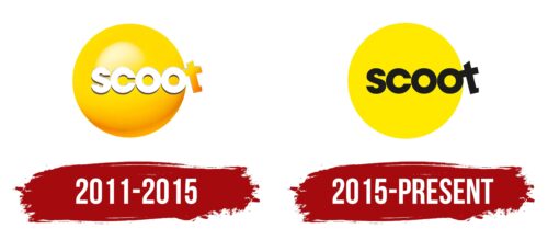
The old Scoot logo features a voluminous orange sphere with a glossy texture. One side is brightly lit, giving it a light shade, while the color darkens near the base, creating a shadow effect. The gradient makes the circle appear three-dimensional and dynamic as if it is rolling forward like a bowling ball, striking the “scoot” text before it. Upon impact, the letter “t” flies off to the side and even changes color: while the letters “s,” “c,” and both “o”s are completely white, the “t” is the same orange as the sphere.
The designers used a dynamic scene to play with the brand name. The word “scoot” is used informally to hurry someone up and get them to act quickly. The rolling sphere acts as an accelerating factor, prompting one to take action before it catches up. This incentivizes using the airline’s services promptly rather than waiting for circumstances to knock you off your feet—the metaphorical emblem targets young customers who can afford only cheap fares.
The glyphs have thin gray outlines of varying thicknesses, giving them sharp edges, symbolizing that the company is ready to face any challenges and will not yield its status as the best budget carrier in Asia. Notably, the “t,” pushed out of the circle, resembles a scooter in shape. This is also a symbolic reference to the name Scoot. The letter is slightly tilted to the left, adding visual dynamism to the logo. This reflects the energy of flying planes, swiftly transporting passengers from one part of the world to another.
The bright orange color is associated with the sun and energy. White represents purity, harmony, and calm. Together, they balance to instill trust in the company’s customers. The bold, sans-serif geometric font creates a sense of rigor. This style emphasizes the seriousness and professionalism of the Singaporean brand.
2015 – today
A flat yellow circle with a matte texture replaced the voluminous orange sphere. Now, it represents a large, bright sun, which holds special significance for Scoot.
- First, it is associated with flight as a symbolic hint at the airline’s business.
- Second, the sun symbolizes prosperity, life, and a successful future. The yellow evokes optimism and joy, aiming to draw attention to the brand’s affordable services.
As for the text, the designers kept the original bold, sans-serif font but slightly altered the letter shapes, making them more open. The new style conveys accessibility and trust, crucial qualities for any company. The smooth curves of the “s,” “c,” and both “o”s appear sleek and soft, suggesting a comfortable flight with all amenities.
The final “t” still extends beyond the circle and leans to the left, creating the impression that it is being pushed out by the other letters. The designers playfully incorporated this element to echo the informal use of the word “Scoot,” which means to hurry or move quickly.
Some might find the black text too dark and sad, but it serves a purpose: dark letters are visible against the yellow background. Using this palette, the company highlights its name, making it sharp and recognizable. The “bee” color scheme targets the youth, the primary audience of the budget brand.
