The Malaysia Airlines logo is filled with vibrant dynamism—the energy that drives the company to reach new heights and expand its route network. Simple imagery, flowing forms, and bright color contrast make the brand recognizable in the international aviation market.
Malaysia Airlines: Brand overview
The origins of Malaysia Airlines can be traced back to 1937 when Malayan Airways Limited (MAL) was formed.
April 2, 1947, marked the airline’s inaugural commercial flight, connecting Singapore, Kuala Lumpur, Ipoh, and Penang.
The airline was rebranded as Malaysian Airways in 1963 following the establishment of Malaysia.
Due to political shifts in 1966, the airline split into Malaysian Airways and Singapore Airways.
October 1, 1972, saw the official establishment of Malaysia Airlines System (MAS), later known simply as Malaysia Airlines, solidifying its modern identity.
Throughout the 1970s, the brand expanded its international reach, incorporating routes to Europe and other Asian regions and introducing wide-body aircraft to its fleet.
In the 1980s, the aviation firm extended its services to the United States and increased frequencies on existing routes while modernizing its fleet.
The 1997 Asian financial crisis presented significant financial challenges, prompting a major airline restructuring.
During the 2000s, the company focused on recovery and modernization, moving to a new terminal at Kuala Lumpur International Airport in 2003 and implementing various financial and service improvements.
In 2011, the airliner joined the Oneworld alliance, enhancing its global connectivity through partnerships with other major airlines.
The airline launched a significant transformation program in 2012 to boost efficiency and financial performance.
In 2014, the company faced two major tragedies: the disappearance of Flight MH370 in March and the downing of Flight MH17 over Ukraine in July, profoundly affecting the brand’s reputation and financial health.
A major restructuring took place on September 1, 2015, resulting in the creation of Malaysia Airlines Berhad (MAB) as part of a broader recovery strategy.
From 2016 to 2019, the air operator focused on restoring passenger confidence, enhancing service quality, and optimizing its route network while updating its fleet with new Boeing 737 MAX aircraft.
In the 2020s, the airline continues to improve its financial performance and adapt to market changes, striving to maintain its status as a leading Southeast Asian carrier.
Meaning and History
What is Malaysia Airlines?
This is Malaysia’s national carrier, based in Kuala Lumpur. It is known for its high level of service and its role in promoting Malaysian culture. The company operates a diverse fleet, including Airbus A350 and Boeing 737 aircraft, allowing it to serve regional and long-haul routes. It is renowned for its “Malaysian Hospitality” program, offering passengers a unique experience that reflects traditional Malaysian hospitality. A distinctive feature of the company is its “Chef-on-Call” culinary program, allowing business class passengers to pre-order dishes from an expanded menu.
1972 – 1987
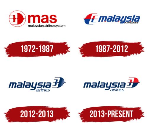
The 1972 logo marks a key stage in the brand’s development, as this was when Malaysia-Singapore Airlines split into Singapore Airlines and Malaysian Airline System. The center of the emblem features the old name, Malaysia Airlines, indicating the airline’s national identity. It is presented as a large red abbreviation, “mas,” next to an important element of Malaysian culture—Wau Bulan. This kite is a traditional symbol of the country, like the hibiscus flower, and is particularly common in Kelantan.
Wau Bulan is used in the airline’s logo as a metaphor for a flying airplane. The aircraft is stylized as a bird with wide wings and a long tail divided into three parts. Thin lines trailing behind it create a sense of rapid flight. The red color further emphasizes the airline’s energy and dynamism—essential qualities.
The logo features only one black element: the phrase “airline system.” It is rendered in the same sans-serif font (Helvetica) as the abbreviation and is entirely in lowercase letters. The minimalist typography reflects the brand’s desire to be simple and approachable, attracting customers with its openness.
1987 – 2012
In 1987, the company was officially renamed Malaysia Airlines and began using a logo with the new name. The name is divided into two parts that differ in design and form. In the word “malaysia,” all the letters are lowercase but very large—much larger than the uppercase glyphs in “AIRLINES.” The colors are also different: the first line is a deep blue, evoking the sky, while the second line is black. The visual contrast highlights the brand’s country of origin.
The noticeable tilt of the inscription creates a sense of continuous movement, conveying the dynamic nature of flying aircraft and symbolizing the company’s commitment to progress. The letters “m,” “a,” and “s” in “malaysia” are accented with small red triangles. These are highlighted to reference the “MAS” abbreviation, honoring the brand’s former name: Malaysian Airline System.
The traditional Wau bulan kite now faces left instead of right. This change in direction helped balance all parts of the emblem and improve its overall perception. Like the inscription, the design has a pronounced tilt, creating the illusion of rapid flight and emphasizing the company’s connection to the aviation industry. The graphic symbol is split in half using two contrasting colors: blue and red. The blue represents the sky, while the red symbolizes passion and energy.
2012 – 2013
The airline introduced the new logo to coincide with acquiring the Airbus A380 aircraft, which joined its fleet in 2012. The emblem is now entirely blue, without red elements. This color signifies confidence, reliability, and freedom. For the first time, designers used a gradient, slightly lightening the nose of the kite. The gradient transition made the symbol three-dimensional and modern, reflecting the brand’s pursuit of innovation. The Wau Bulan is directed to the right as if flying forward to a successful and promising future.
The inscription, as before, is visually divided into two parts that differ in size. However, they now share the same font—Handel Gothic. This strict sans-serif font with clean lines demonstrates the company’s seriousness and professionalism. At the same time, the noticeable tilt and rounded curves of the letters evoke a sense of dynamic movement.
2013 – today
In 2013, Malaysia Airlines joined the Oneworld alliance, marking a significant milestone for the company and strengthening its position on the international stage. The updated logo, emphasizing movement and progress, reflects these ambitions and aspirations. The traditional kite symbolizes Malaysia’s cultural heritage while highlighting the company’s commitment to modernity and innovation.
The new logo features a stylized image of a traditional kite rendered in red and blue. The kite is directed to the right, symbolizing the airline’s global reach and continuous forward movement. The red represents the company’s triumph and pride, reflecting its entry into the airline alliance.
The company name “Malaysia Airlines” is presented in two parts: “Malaysia” is larger and more prominent, emphasizing the brand’s connection to its home country. The smaller size of “airlines” adds balance and focuses attention on the national identity.
The logo’s font remains unchanged. The lowercase letters evoke trust and a sense of security with their smooth curves. The font’s sharp angles and straight lines emphasize the company’s determination and focus. Smooth curves create an impression of stability and reliability.
The combination of red and blue symbolizes energy and confidence. Red underscores dynamism and passion, while blue is associated with reliability and professionalism.
