 Virgin Galactic Logo PNG
The Virgin Galactic logo directly indicates the company’s occupation in space tourism. It conveys its determination, steadfastness, and resolve to undertake journeys to Earth’s orbital space. The emblem reflects the aviation brand’s persistent drive to reach uncharted heights.
Virgin Galactic was founded in 2004 by British entrepreneur Richard Branson as part of Virgin Group. The idea followed Branson’s meeting with aerospace engineer Burt Rutan, creator of SpaceShipOne, the first privately crewed spacecraft. After SpaceShipOne won the Ansari X Prize in 2004, Branson backed a commercial venture offering suborbital flights to tourists.
In 2005, Virgin Galactic and Rutan’s Scaled Composites agreed to develop SpaceShipTwo for six passengers and two pilots. Construction of Spaceport America in New Mexico began taking shape in 2006. WhiteKnightTwo and a SpaceShipTwo prototype appeared in 2008, followed by the first spacecraft, VSS Enterprise, in 2010.
A 2014 test-flight accident destroyed VSS Enterprise and killed one pilot, suspending the program. VSS Unity replaced it in 2016 and reached 82.7 kilometers on December 13, 2018. In 2019, Virgin Galactic listed on the New York Stock Exchange. Tests continued in 2020, alongside the release of the cabin layout.
VSS Unity flew from New Mexico on May 22, 2021, and Richard Branson joined a full-crew flight on July 11. Further missions followed in 2022, while VSS Imagine introduced the SpaceShip III class with a modular structure for maintenance and upgrades. In 2023, commercial suborbital flights began with paying passengers, alongside plans for a larger fleet. In 2024, the company announced an early low-Earth-orbit spacecraft project and research partnerships for experiments during commercial missions.
Meaning and History
What is Virgin Galactic?
It is a British-American aerospace and space tourism company within the Virgin Group, founded by Sir Richard Branson. The company aims to provide suborbital space flights for tourists and explorers, making space travel accessible to individuals. Space flights take passengers to the edge of space, where they can experience a few minutes of weightlessness and see Earth from a great height. The company’s VSS Unity spacecraft launches from the VMS Eve carrier aircraft and ascends more than 50 miles above the Earth’s surface. The company innovates in the burgeoning space tourism industry, focusing on safety and unforgettable spaceflight experiences for its customers.
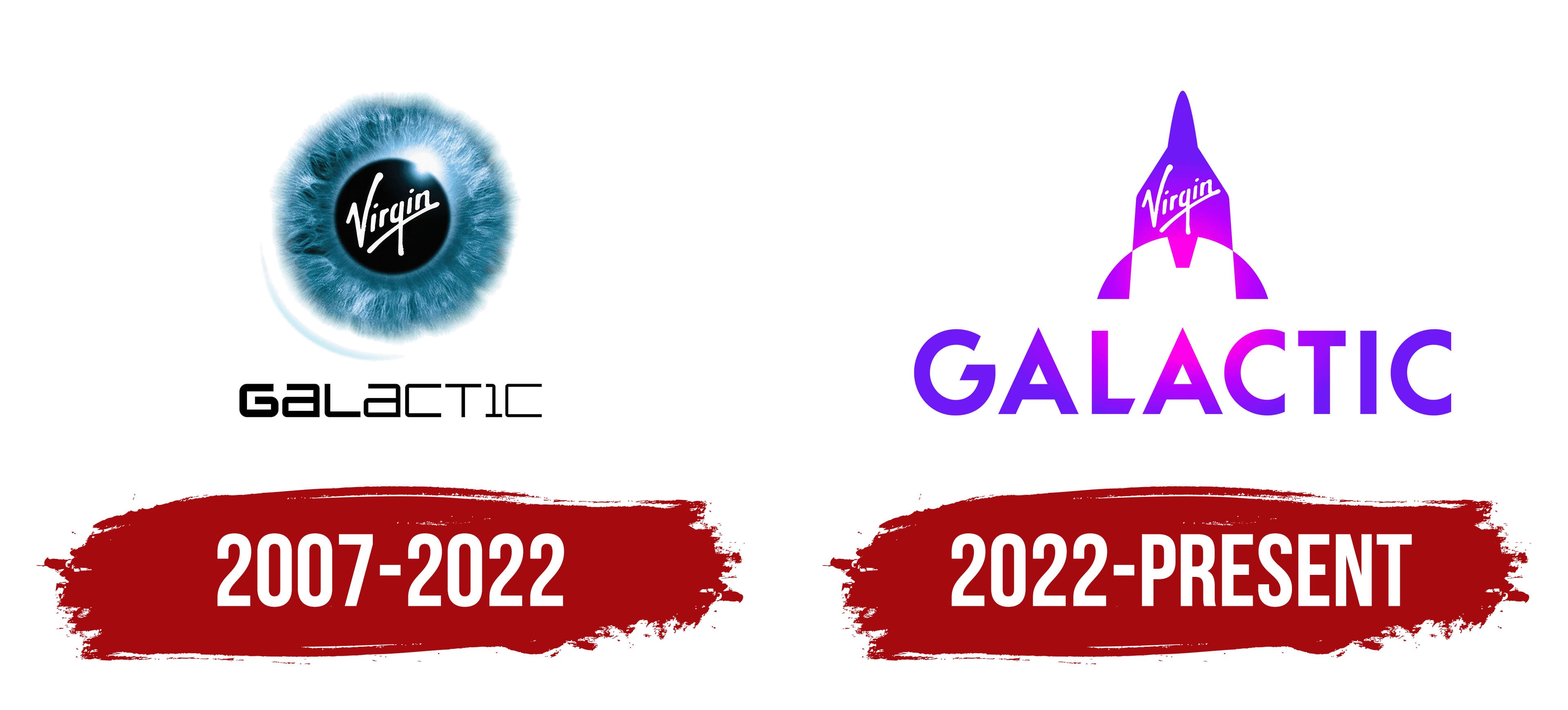
2007 – 2022
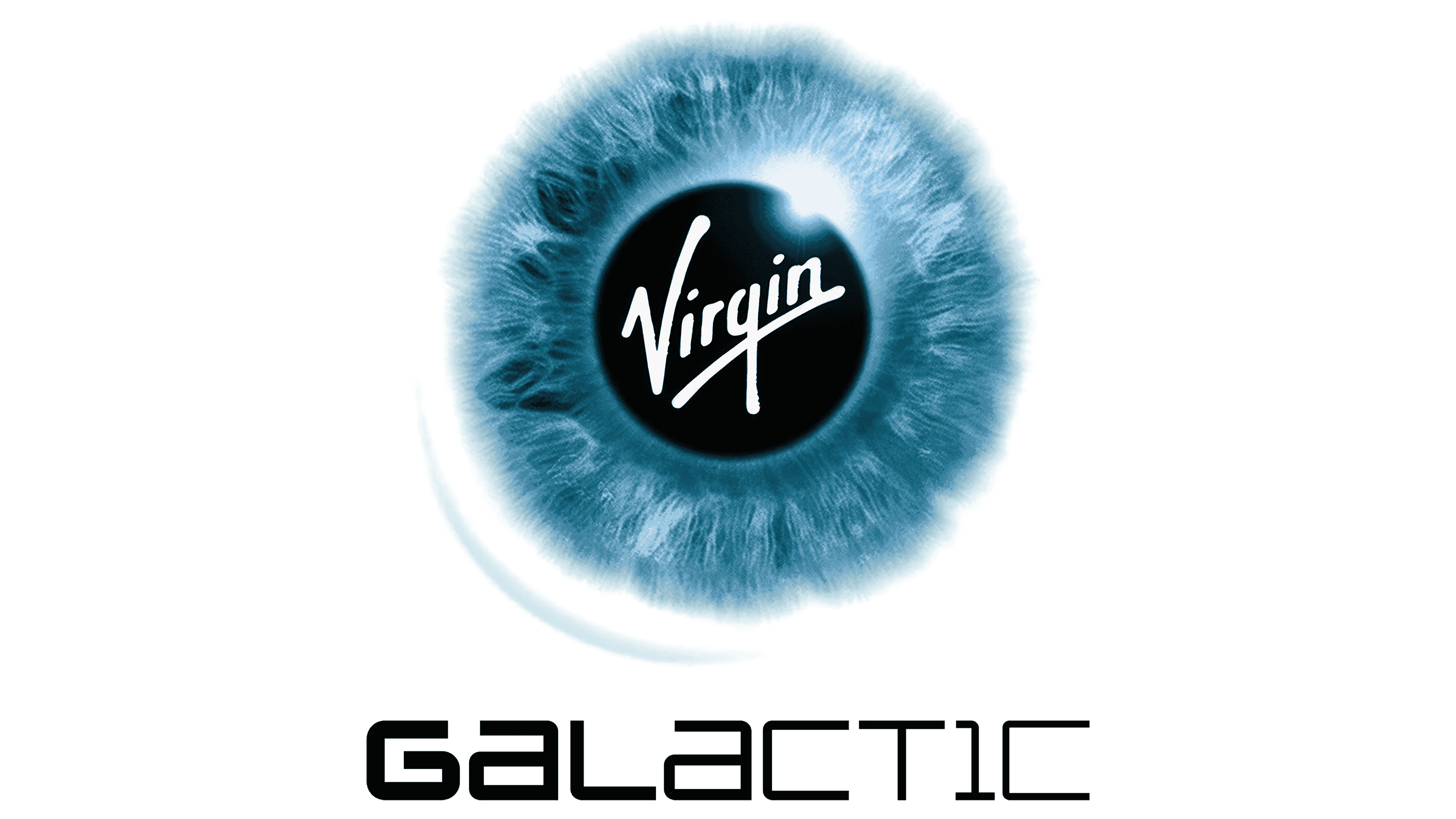
Virgin Galactic’s emblem is as complex as the mission the company has undertaken, for taking tourists to orbit is no easy task. However, this complexity helps the logo remain modern and does not hinder its perception, as it contains minimal elements that express a profound idea. Therefore, despite the trend toward simplifying design, this symbol conveys a powerful message to the public and harmonizes with the declared concept. It serves as an excellent marketing tool, attracting attention and inviting those eager to take advantage of a unique opportunity to see the universe with their own eyes.
Based on this idea, the logo features an eye image. This is its originality. The eye is so realistic that it precisely conveys every stroke of the iris, suggesting the thought of gazing into space. The gray-blue veins with a dark hue invite one to look into the unknown and enjoy the fantastic spectacle. The colors transition into an emerald shade, adding mystery and elegance to the emblem. Moreover, the edges of the eyeball blend so harmoniously into the light surrounding it that it does not come across as off-putting.
In addition, the designers drew a parallel between the gray-blue eye and our planet, which looks like a sphere of the same color from space. Thus, the idea of viewing Earth from afar is accurately realized here. To reinforce this feeling, the artists drew a light crescent-like stroke in the lower left, reminiscent of an orbit, making the round logo resemble a blue planet in the boundless cosmos.
In the center of the iris, with its numerous shades and highlights, there is a black circle, representing the pupil and the dark abyss of the night sky. It is also an unexplored galaxy full of mysteries. In the middle lies the first part of the company’s name, “Virgin.” It is written diagonally in a font that imitates neat handwriting. The letters are lowercase (except for the first), bold, and sans-serif. Below the word is a long underline that starts at the “n,” slopes downward, and ends at the tip of the “V.”
The second part of the name is placed beneath the stylized eye. Its unique feature is that the word “Galactic” gradually loses its color intensity: it starts black and ends looking light. The reduction in the boldness of the glyphs achieves this deceptive visual effect. In other words, the strokes of the “G” are thick and massive, while those of the “C” are narrow and thread-like. This adds variety to the emblem and makes it dynamic.
2022 – today
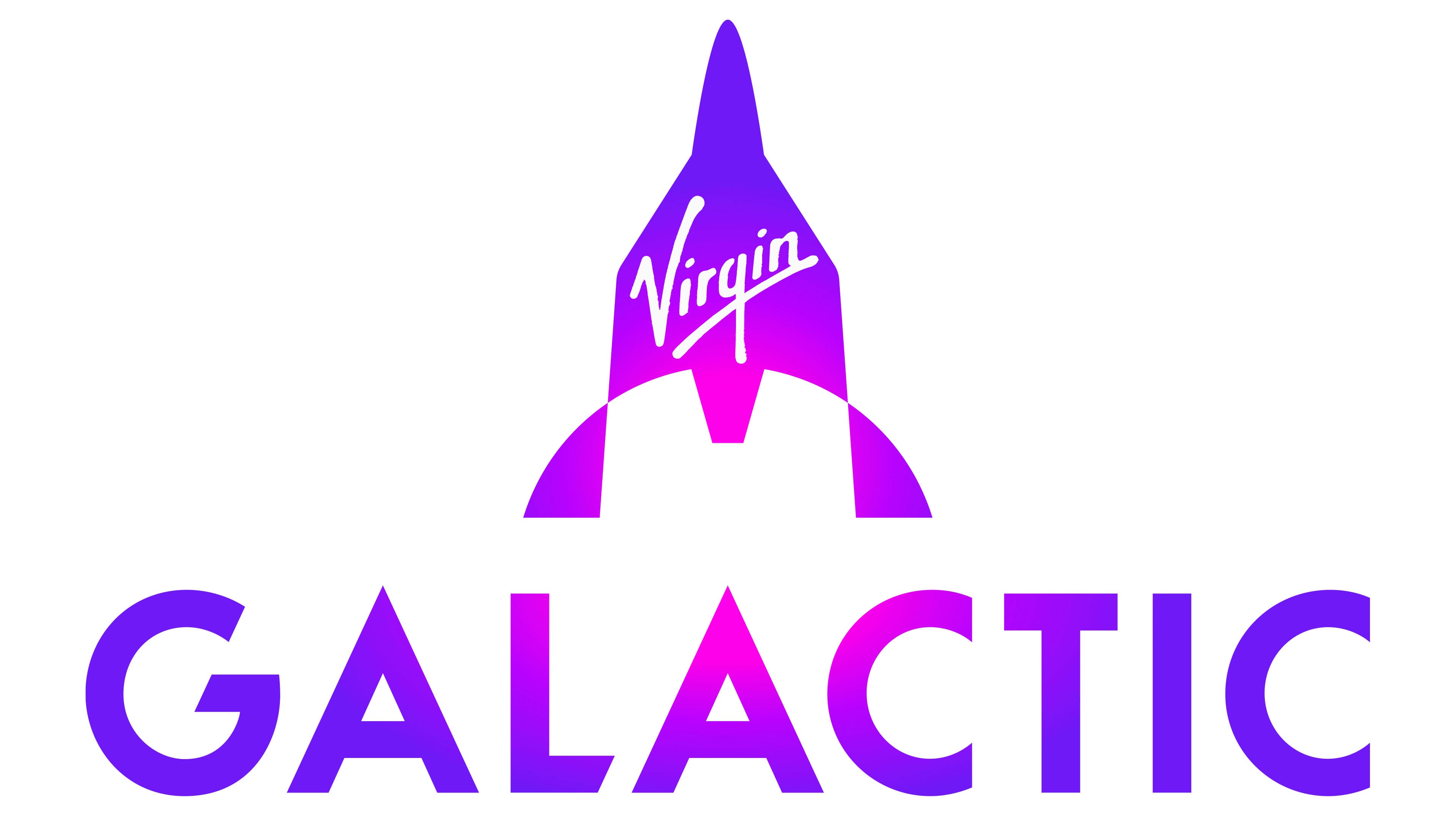
The Virgin Galactic logo has undergone a major transformation: from an abstract, figurative 3D effect to a realistic, flat object. It features many completely new details that still promote the idea of space tourism, but in a different, more straightforward, and more traditional form. The main focus is on recognizability, aiming to attract more customers who grasp the concept instantly without symbolism or hints, since the target audience consists of businessmen, who are the primary market for costly journeys to Earth’s orbit.
The main feature of the emblem is a rocket pointing upward. It is depicted in a cubist style, with many geometric shapes with blurred edges. This restrained avant-garde approach fits well with the new logo because it helps to represent not only the rocket but also the Earth from which it launches. The spacecraft’s main components are visible, and the first part of the company’s name runs diagonally across it, ready to send tourists on journeys beyond the clouds. The lettering precisely matches the previous version, with no differences.
However, the second half of the name surprises with its size: it is much larger than the upper inscription and serves as a platform for launching into the universe. The word “Galactic” is set in uppercase letters, with both “A”s mimicking the shape of the rocket, and the “L” between them has a diagonal cut at the bottom, fitting harmoniously into the design. The glyphs have no serifs but do have rounded elements that effectively balance the angles. Overall, the text is much wider than the graphic symbol, highlighting the insignificance of human achievements compared to the vastness of the galactic system. This is also the company’s way of showcasing its boundless potential.
The Virgin Galactic logo’s color deserves special attention, as it is very unusual and sharply contrasts with the traditional image of a blue-and-white planet. In this case, the designers were not aiming to depict Earth; instead, they sought to show space with an invisible ultraviolet spectrum, as “ultra” suggests going beyond something, and “violet” is associated with purple. Ultraviolet radiation lies between the visible and X-ray regions of the electromagnetic spectrum, suggesting it can be seen in the invisible.
The lower inscription and the rocket are entirely purple, varying from barely noticeable pink to deep violet. The gradient coloring makes the emblem even more mysterious, as it spreads not vertically but in a circular pattern from a light center to dark edges. As a result, the logo appears to shimmer under bright light.